The Scary Thing About The Colonial Electrical
/In this case it meant the Colonial electrical needed some serious work before it would even be insured.
Read MoreIn this case it meant the Colonial electrical needed some serious work before it would even be insured.
Read MoreI thought today we could get you some reveal photos of our cali casual living room, since we probably won't be getting to much else in the room for quiet a bit with our baby boy on the way.
Read MoreOver the last 7 weeks we have dealt with a lot of late nights and nap time projects while designing and constructing this natural & soothing boy's nursery. Honestly though, we are so grateful it’s done and that the One Room Challenge helped us complete the nursery before the baby arrives. It very well will be the only room in this Colonial we will complete for a long while, so we made it count!
This post may contain affiliate links.When you click on a link and purchase I will get a small compensation at no extra cost to you, win win. Read the full disclosure here.
We knew this would be the nursery right away, with its little nook area and original closet/ doors, it already had the character and room we wanted.
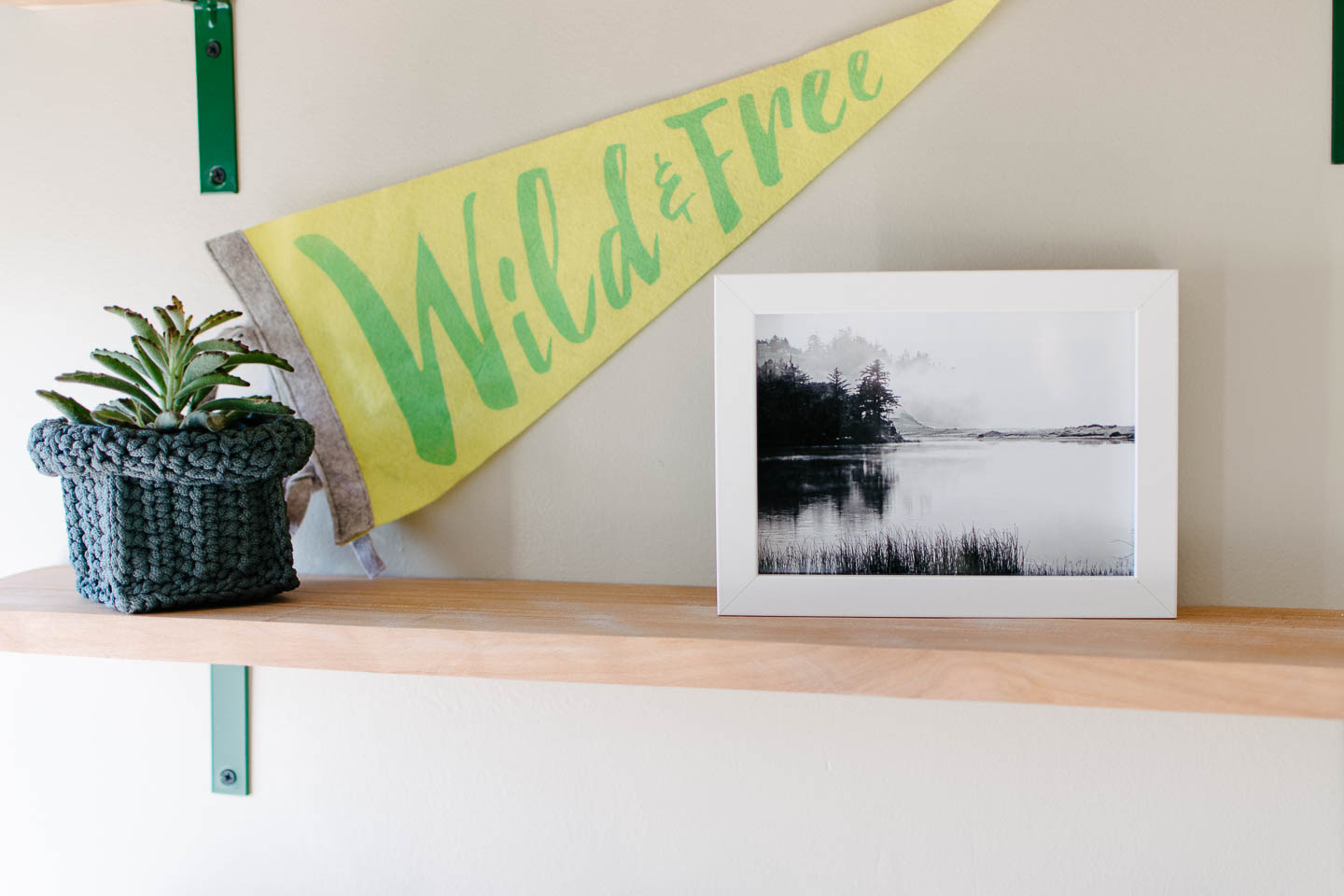
Shelving wasn’t hard to think up for this spot since we still have wood that was milled from a beech tree at our old house. With some very inexpensive hardware and hunter-green paint, we wrapped up the nook shelving on no time.
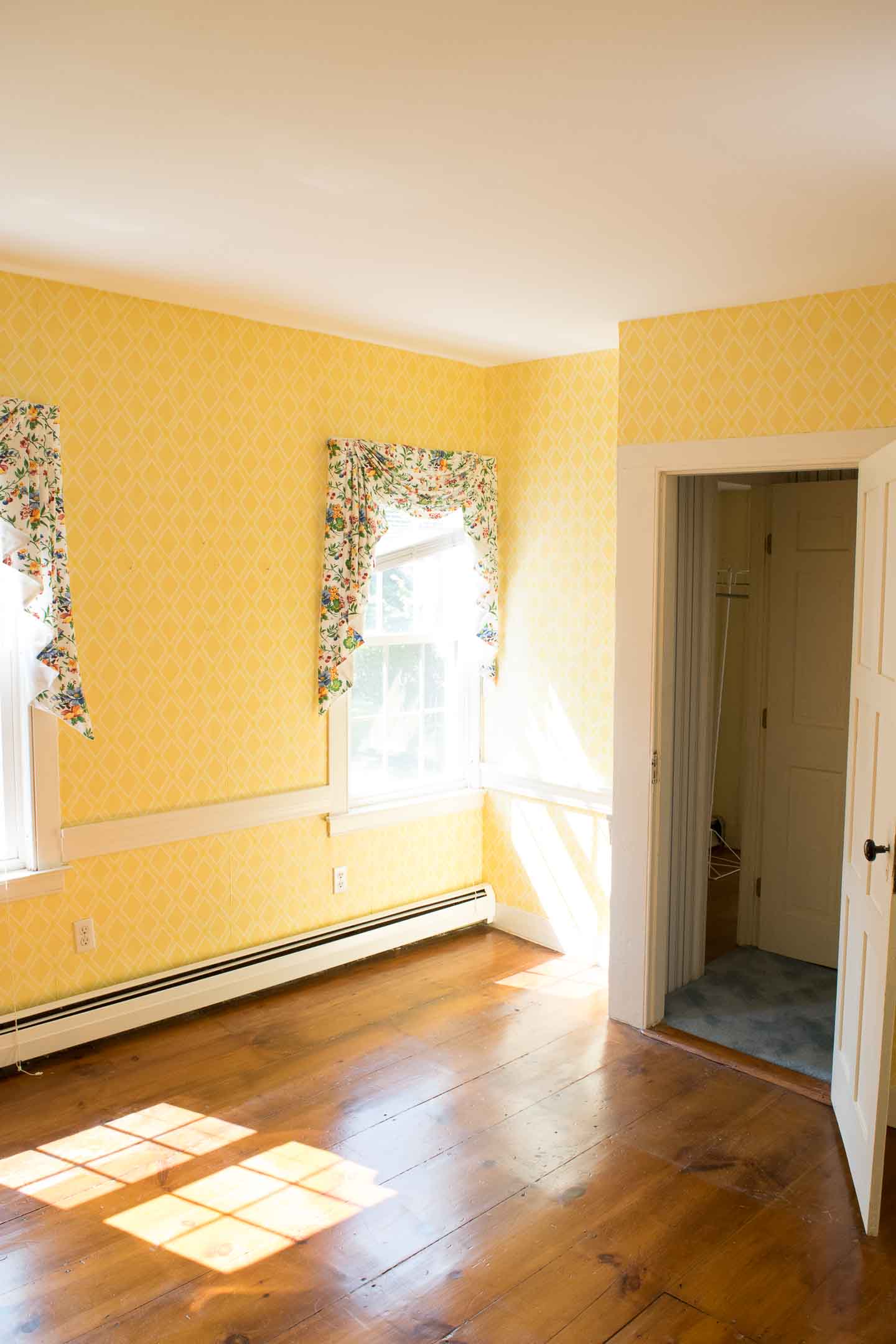

It only took half a second for me to realize the wallpaper was not going to work, with the windows facing south this room gets a fair amount of light that only further excentuated the extreme yellow. So we took it down in favor of a painted design and opted out of more wallpaper which would have been costly; and I couldn’t bare to put any up after painstakingly taking so much down.

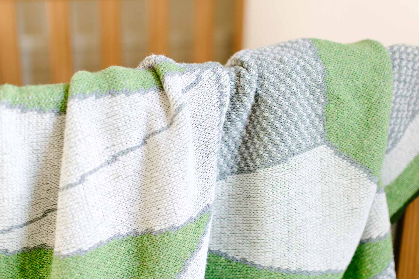
Using green as our accent was an easy decision after we found this geometric baby blanket at a local store. The blanket really kicked off the entire rooms design but it was just one amazing piece we found from local or small makers for this room.
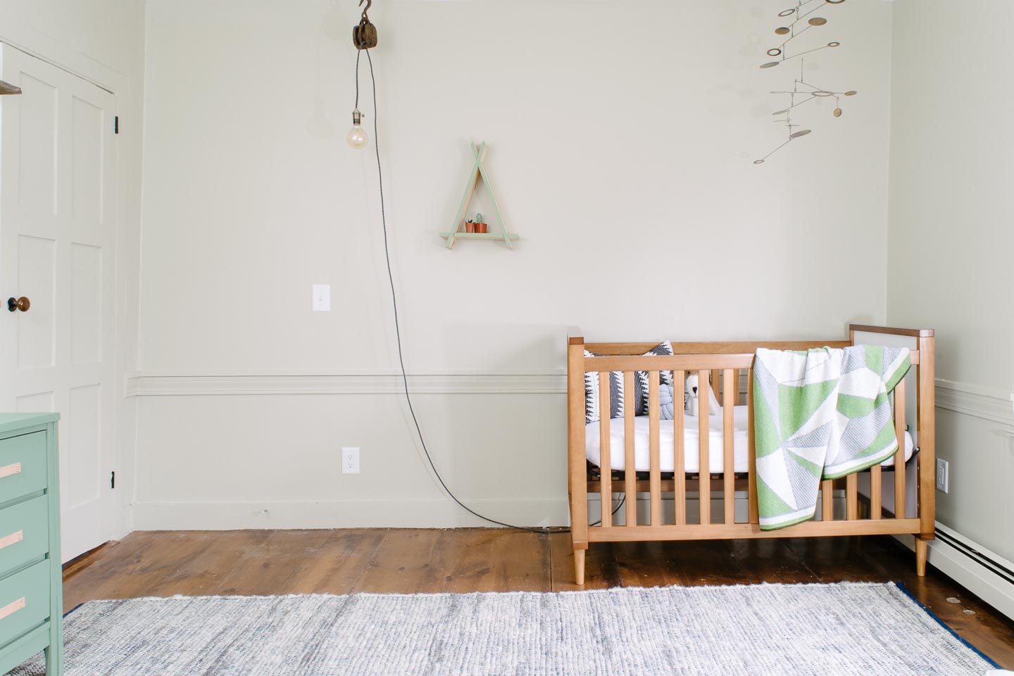
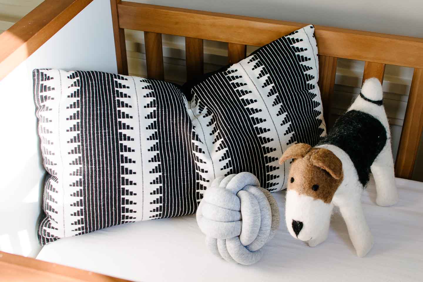
The crib was reused from our daughters nursery to save funds for other splurges, and because I’m not sure I could find another crib we love as much as this one. When we got it in 2015 (it’s discontinued) we wanted something gender neutral so that it could be reused.

We painted this vintage mid-century dresser to use as our changing table and added long leather pulls for a natural element.
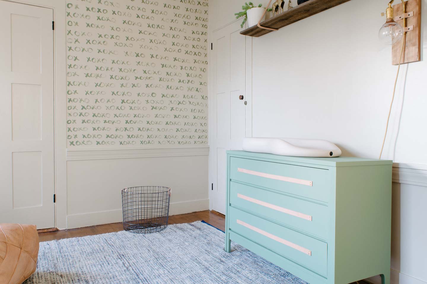
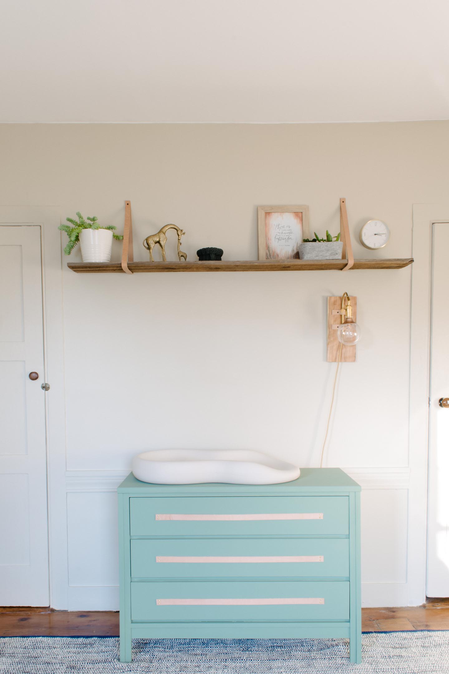
The leather strapped shelf above the changing table was hung extra high (hey were super tall folks) so no head bashing would occur in the middle of the night. And that left ample room for the night light sconce we made to hang on the wall.
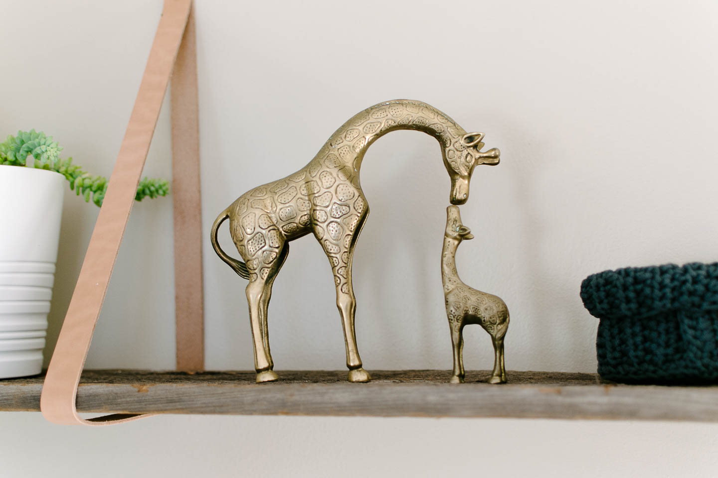
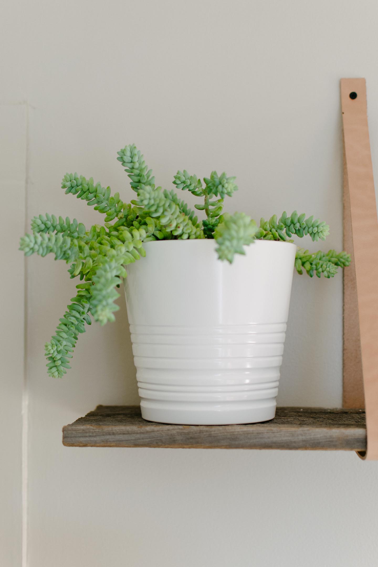
One thing we worried about was that the room would get too busy with all the things needed for a baby. So we kept the art minimal but meaningful.
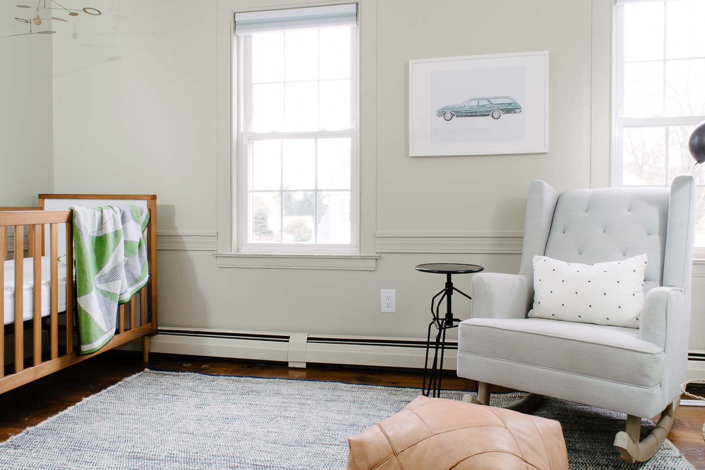
I commissioned an Etsy artist (shop here) to create a print of our 67’ Chevy Bel Air Wagon as a mini-surprise for Mitch, but our daughter is the one that fell in love stating that was her vroom vroom!

We made the art impactful without breaking the bank by only picking items that had a link to us in some way.
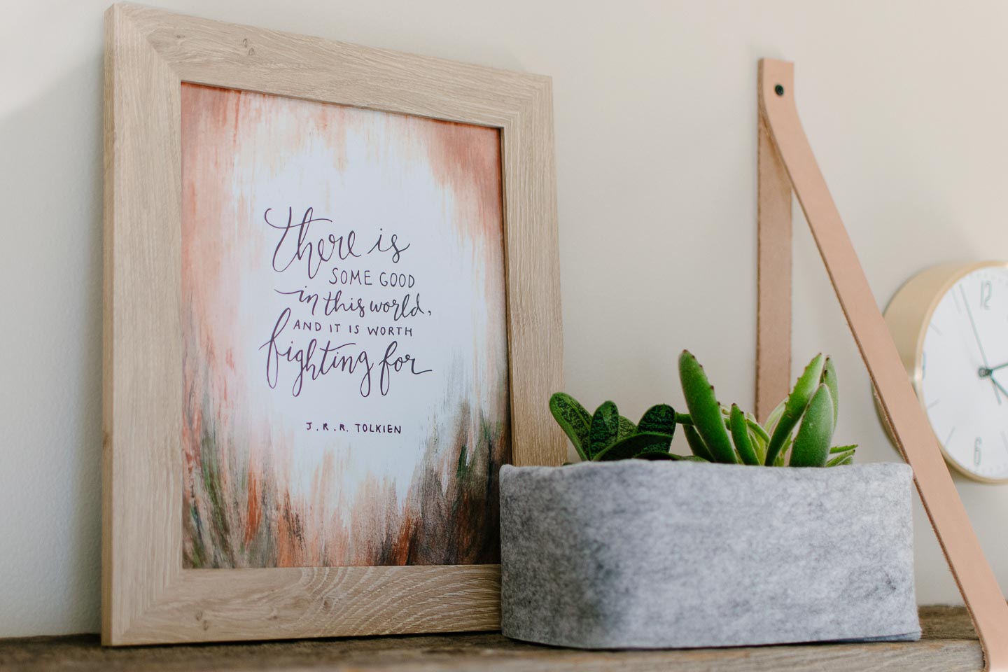
I started by narrowing down some fantasy novel quotes I really like and saw before we even knew we were pregnant, some beautiful horse prints to go with the wild and free sign, and a couple of forest prints that sparked joy.
Once I had 6-8 good options I sent them to Mitch for final selection so that they would mean something to him as well. Like the Lord of the Rings quote, (he could care less about anything fantasy related) but picked this quote because he felt it was truly something he wanted his little boy to know and had meaning in the real world.

The rocking chair was another item we reused from our daughters nursery. Having searched to find something both unobtrusive and comfortable for our tall frames, we weren’t ready to give this up. The side table is actually a stool we painted black so it would work with the reading wall sconce.


Lighting was something we really needed to debate for the space, because it didn’t have any overhead lights and we didn’t want to spend more for our electrician just after fixing a bunch of code issues just last month.
So we created a lighting plan that addressed all the areas we would be using. The changing table, a general overhead light and the rocking chair/ reading area.
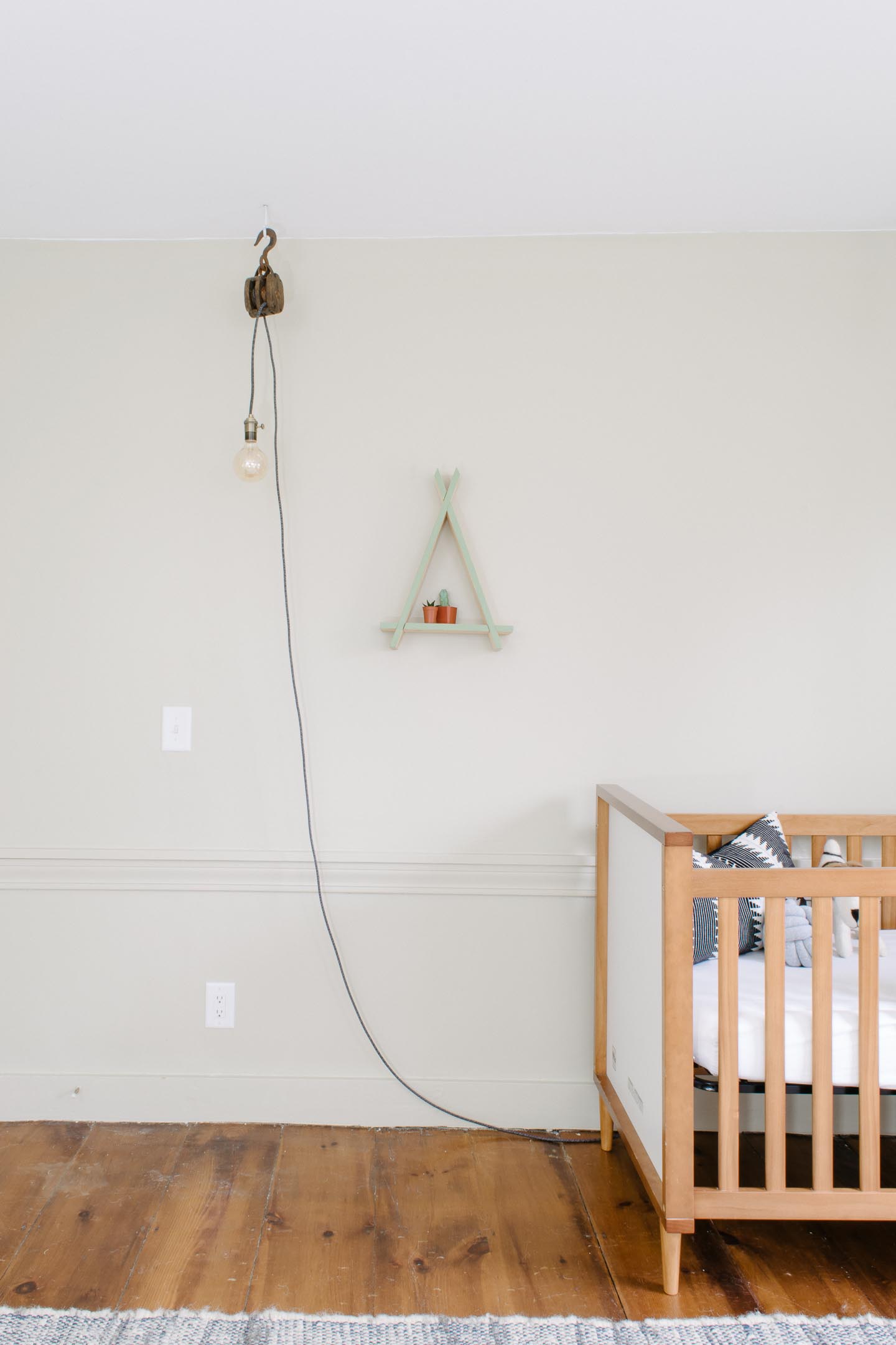
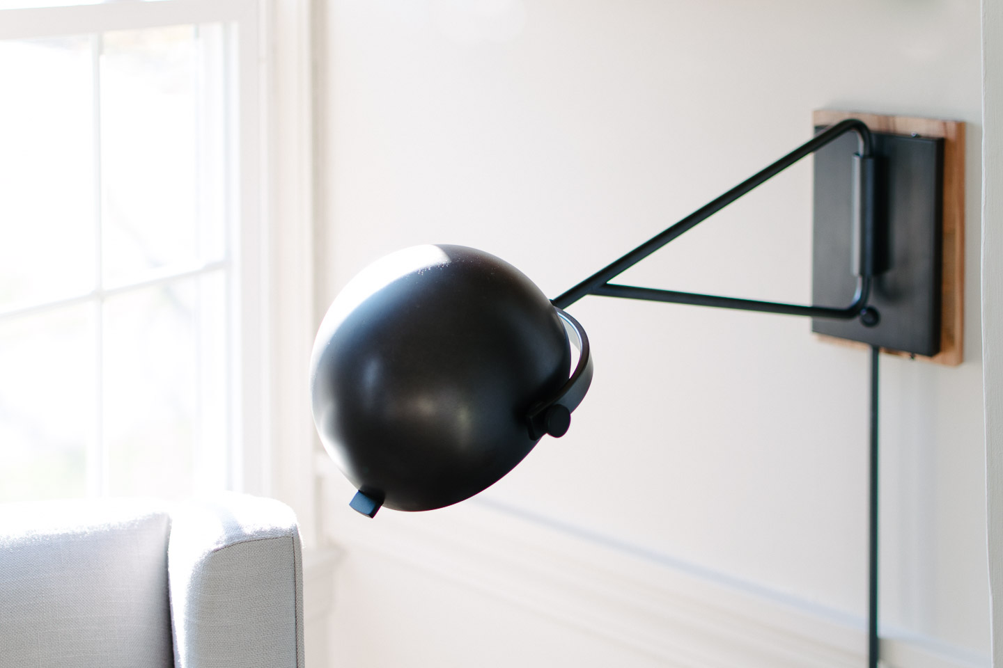
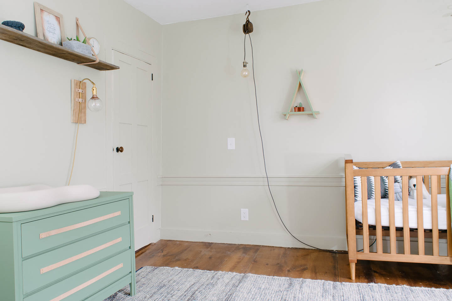

Overall we couldn’t be happier to start spending some major time in this space with our little boy!
Catch up on all the posts here:
The Design | Custom Artwork | Mid-Mod Dresser with Leather Pulls |
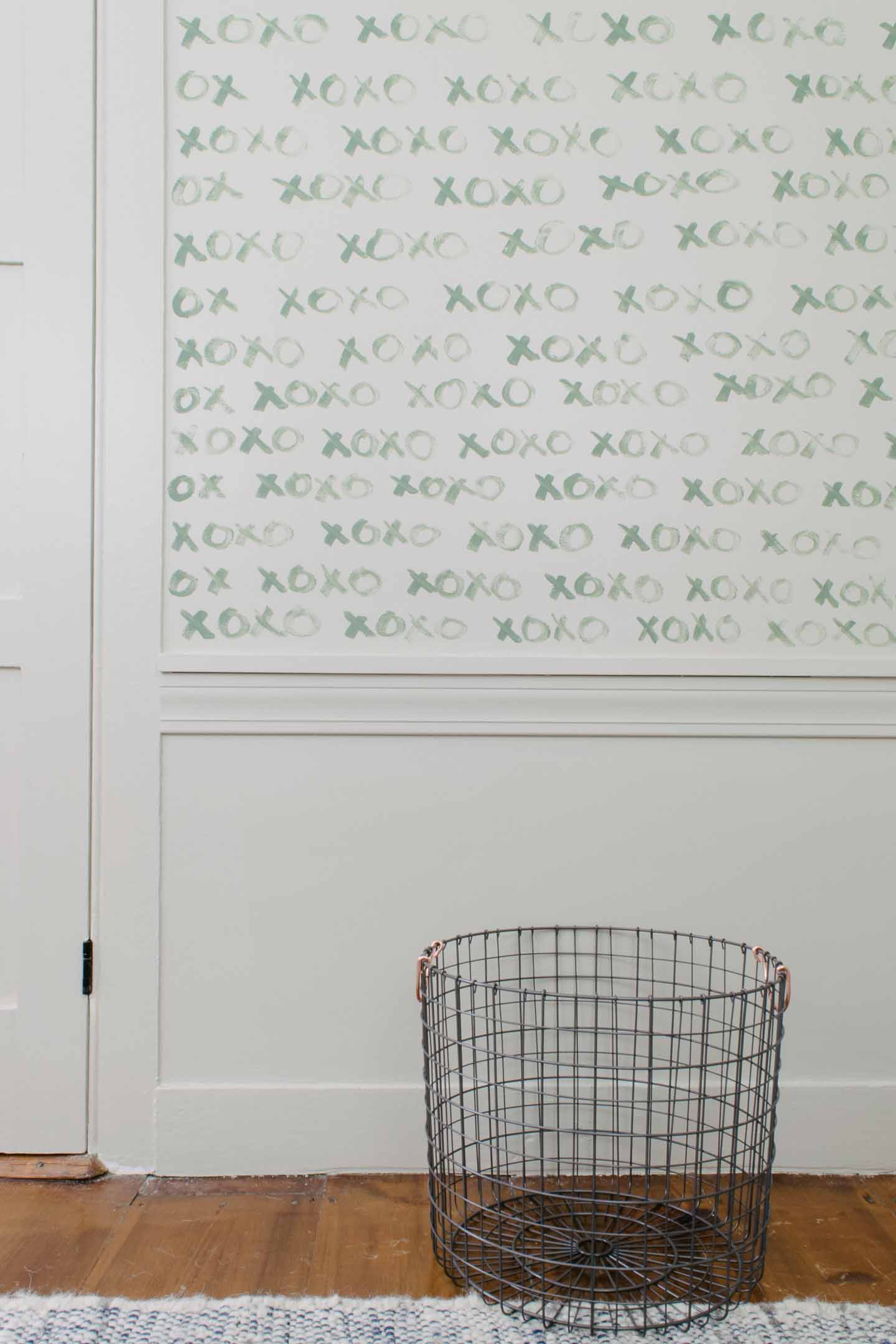
Updates | Nursery Closet | XOXO Feature Wall
Crib (Similar) | Crib Pillow | Knot Pillow | Mobile (2) | Geometric Blanket | Rocking Chair | Side Table (similar) | Leather Pouf | Chair Pillow | Seagrass Basket | Lake Print | Horse Print | Brass Frame | Wild & Free Sign | Shelf Baskets | Brass Giraffes | Wood Picture Frame | Quote Art | Brass Clock | Reading Wall Sconce | DIY Pulley Light | Felt Baskets | Wire Hamper | Changing Pad | Triangle Shelf
Hopefully everyone who needed the extra time because of these crazy natural disasters has been able to finish up, it was so nice of Linda our host to extend the One Room Challenge for everyone.
Let's go check out all of the other
One Room Challenge reveal's shall we?
We purchased a new (to us) home and have been moving in this past week! Eek! I really can't believe it.
Read MoreI recently go the opportunity to work with a wonderful family on a beautiful timeless kitchen design, something I haven't one for a bit.
Read MoreThis home was one of the first pre-fab homes brought in on horse and buggy from the local train depot but needed some serious bungalow character added.
Read MoreIts time for this bungalow entry to finally be revealed! We would also to thank this amazing community of bloggers and readers whom have made
Read MoreLast week we caught every one up on where we are with our porch remodels .This week its time to tell you all about the entryway design plans.
Read MoreIf you haven't been following us on Instagram, you may not know that we have some exciting news! We decided to join in on this Spring's One Room Challenge as a guest participant.
Read More
Like all the rooms in our home, the dining room is still a work in progress. Part of our push in 2017 is to finish our projects we have already started, or need to finish.
So were starting with the dining room in January and finishing a few things that have been lingering since the porch remodels. Things like painting the room, fixing the crown molding, finally installing a light fixture that lights up the table adequately, and putting up some art. Eventually (were thinking next fall) were going to take another stab at our live edge slab table. Which warped on us over the last year.
So its time to start making some product and design decisions. Those can be difficult even for those of us with lots of experience. Heck sometimes I think its even more difficult because I have had so much design experience, I appreciate many styles, textures, and patterns.
When I find it difficult to finalize decisions its usually and indication that I need to slow down, add some constraints or design guidelines, and then look with fresh eyes.
So basically I had to peel my fingers of the pin it button … just walk away from the screen Susie.
First, I go ahead and look at what I have and really think I’m reusing in the current design. Like our live edge table, cafe stools, and mid-century side table.
Then, I take the architecture and homes age into consideration. Since our home has so much character already built in our door casings I don’t want the small rooms to get busy.
So that already narrows down some things and creates some guidelines for the dining room. All the new items will need to work with the items I already have, and our homes bungalow/cottage architecture.
Now, I can narrow down the search. When I come across something I absolutely love (like an idea posted on Pinterest) I can let go of it if it doesn't fit within the guidelines. It makes it easier to find the stuff that will work. Instead of being stuck on too many ideas that won't work and getting overwhelmed.
Once I find inspiration in some photos (possibly with similar items to what I already have), I go ahead and draft a design.
If I’m still having issues with the design and colors, I will make a coloring page. That way I can really feel free to try some ideas (with no one overseeing).

I’ll even create a couple of designs that have different styles (something a little more traditonal , mid century modern, boho, etc).

So that leads me to your free coloring pages. You have a couple of different design layouts and styles to choose from and can play with the colors till your hearts content.
Doesn't it just feel great to make some of those decisions on your own (or as a couple)? You can end up receiving so much advice about designing your space (friends, family, design shows, co-workers) that your really not sure. Going through a process yourself helps calm the nerves and puts you back in the driver's seat.

You can download the three different designs below and try it out yourself. Go ahead and color your pages in. Don't forget to tag us in your posts so we can see what beauties you come up with!
Let us know if these pages were helpful and what styles and rooms you might want to see next in the comments. I'd love to create some more for other spaces and styles you might be looking for.

With my guidelines in tow I find it easier to love something, and then let it go, and not get my mind jumbled with too many ideas. You shouldn't just follow every rule in design blindly, but guidelines can help you let go of too many ideas. Which will help zeroing in on the ideas that will work.
So I ended up pulling some inspiration off of Houzz.com, and if you haven't ever check it out, your missing out.


Once I put together this mood board I realized our colors are very muted. Although my inspirations had white and grey walls, they brought a generous amount of color in with the art and plant life.
I've been playing with my dining room coloring page to see if I'll keep it all muted like below or add color with a giraffe print and plants. The color really looks great in these spaces, maybe I'll embrace the eclectic side and get some more color in everything.
Nothing is ever exactly how you originally envisioned it, the beauty of design is in the process to which you get to the end result (does a room ever really stop evolving?). When I first started designing our dining room table I had decided I wanted to find all different vintage styles of barstools, but it just never lined up where I could find the right height (our table is counterheight) and in reasonable condition to be rehabbed. So we ended up purchasing some and I'm very glad we did, but they still aren't my absolute favorite....

They blend in to the small dining room with a little style, they are so much easier to clean than I would image something we painted would be, and they all came in time for Christmas and guests the year we bought them.
The point is, you don't have to love every single thing in your home to have a wonderfully designed space. Stay tuned in January for how this room comes together, here on the blog, and on Instagram!
Anyone else finally finishing some spaces in the new year?

Follow along with our Giant adventures as we fix up this 1847 Historic Colonial in Western Massachusetts.
P.S. Expect lots of wallpaper removal and don’t say we didn’t warn you!
Powered by Squarespace.