Eclectic Bungalow Entry Reveal | One Room Challenge Week 6
/It's time for this bungalow entry to finally be revealed! We would first like to thank this amazing community of bloggers and readers whom have made Linda from Callingithome.com's and House Beautiful's One Room Challenge such an amazing experience for us (we are so thankful Linda puts this on and that we could be a guest participant). This may have been our first ORC, but I don't think it will be the last with such amazing talent to be involved with.

In our first week we took everyone through the remodel that gave us this front entryway (originally this area was a small enclosed porch that was in terrible condition and faced a busy road). After finishing the remodel (which started 2 weeks after our daughter Haverly was born) we were a little burnt out and left the space like this:
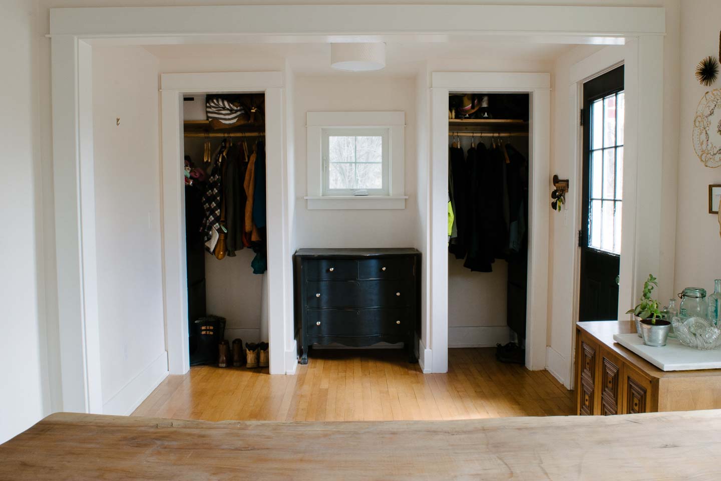
We are so excited to have this space finished and a have it be total reflection of our family, home, and lifestyle.

The closet doors were the first project we started and it was the last to be completed (although they could probably use another coat of paint). We found old solid wood paneled doors that matched out existing/original interior doors at a architectural salvage and cut them in half to create pantry doors for the small closets. Vintage glass knobs were installed and work nicely with the rest of the houses glass knobs.

Our DIY feature wall with Colorhouse paint was a blast to build and the rich moody color really helps balance the dark door, and dresser (which was re-done using chalk paint for a friends wedding years ago).

The print of our Shepherd Trigger who left us last summer after 10 wonderful years, was hung in the entry previously.
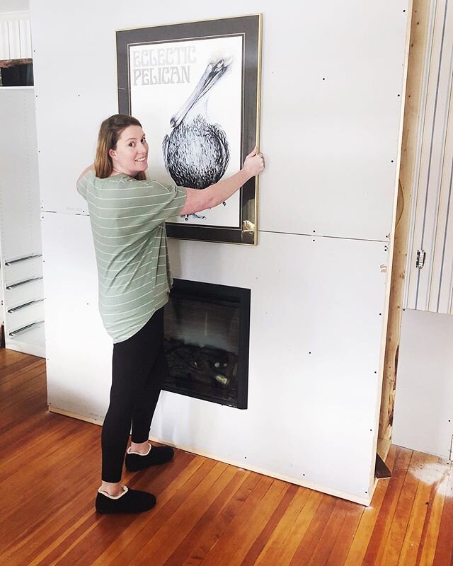
When we went to hang the original it became apparent that it was way too big for the space (it made the bench look teeny-tiny), so a quick trip out to get a smaller print/frame and "voila"!!, a perfect welcome for our dog loving home.

The front door was painted black when the remodel got finished almost two years ago; it was about the only thing I did to style the space in any way. Since the home is an open concept, it creates a little more drama and separation for the space.
The vintage kilim rug was an Ebay find, and although its not big enough to cover the entire space (like I originally wanted), I couldn't find anything big enough that I really adored, and for some reason the colors in this one called to me; bright, fun, and while normally I love my greens and teals, pink and orange just seemed right.

This post may contain affiliate links.When you click on a link and purchase I will get a small compensation at no extra cost to you, win win. Read the full disclosure here.

When things started to get a little hairy over here (we had a family emergency that resulted in the death of Mitch's Dad; a wonderful man that took 24/7 care of his mother, my husband's 93 year old Nana) we opted to purchase a few more items instead of staying with our original plan to DIY.
Purchasing some items like this amazing mid-century modern plant stand allowed us to continue this One Room Challenge; something we felt necessary for our own family.
In Joanna Gaines words "If you can't find happiness in the ugliness, you're not going to find it in the beauty, either." We decided we would keep up with the things that make our house a happy & beautiful place to come home too, and eventually the ugliness will fade.
You can find the DIY for this leather tray here.

I feverishly grabbed this cactus and put it into this hanging planter the second I saw it, knowing the orange, yellow, and pink would be perfect with the vintage rug. Mitch said it "looks like a troll took a s*** on a cactus" therefore it was perfect for our house since our daughter is obsessed with the movie Trolls (like wants to watch it three times a day)!

I know your wondering why the round mirror on the side wall?! I just couldn't get around needing a mirror in the entryway to check things right before you head out.... it's pretty standard.
We hung it somewhere that will be easy for us to lean over and check our reflection, but not be the center of the room . Honestly we just couldn't "put Trigger in a corner", he sums up the whole house, our love, and welcomes us home with open arms.

That bench (which now looks like it was always destined for this space) was not in the original plan. We just love when a project takes an unexpected turn and you go with the flow of it, everything seems to turn out just right in the end.
I could spend this entire post telling you all about my obsession with lighting in this home... but I'd also love for you to keep reading so I'll refrain. If you are a little (or a lot) light-obsessed like me you can check out week 5 where we made these amazing fixtures from Grand Brass Light Parts.

Bungalow Entry Before & After's
Okay so here's everyone's favorite to see.....


Previous Bungalow Entry Posts
Week 1: Bungalow Porch To Front Entry
Week 2: Entryway Design Plans
Week 3: Moody DIY Feature Wall
Week 4: Mid-Century Bench
Week 5: Vintage Inspired Brass Lights
Sources
Vintage Rug from Ebay | Mid-Century Modern Planter | DIY Hairpin Bench Legs | Brass Light DIY | Feature Wall Paint Metal .06 | Round Mirror | Similar Leather Tray | Vintage Closet Knobs | Hanging Planter | Dog Picture Frame | Brass Table Picture Frame | Gingham Pillow Fabric
Sponsors
Big Thanks goes out to our two sponsors Colorhouse for the perfect moody paint color on the DIY feature Wall and Grand Brass for the lighting parts which made both fixtures really shine.
Okay everyone, I hope you go check out all the other reveals because with what has been going on the last few weeks, I don't think these will disappoint! I can't thank all of you enough for this experience, for the support, and all the wonderful folks we have met through this One Room Challenge.
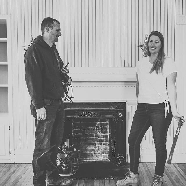
Susie & Mitch


