A Modern Cement Tile Stenciled Fireplace (+ Easy Tutorial)

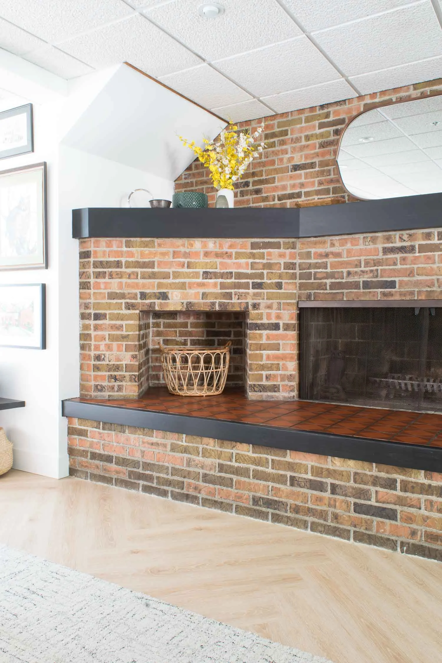
I swore I’d never stencil again, not after the kitchen stenciling I had already done for this Umass Amherst Sorority Project. But then here I was stenciling this mantle hearth while the sisters were moving in. Talk about down to the wire, but that’s how it goes when you have a vision, sometimes you’ve just have to see it through.


New here? Thanks for stopping by! We remodel and DIY our own 1847 Historic Colonial and take on various other client projects. This was a remodel of a UMASS- Amherst Sorority living room we worked on this summer!


A Modern Cement Tile Stenciled Fireplace (+ Easy Tutorial) at this Umass Amherst Chi Omega Sorority House | Designed by This Giant Life

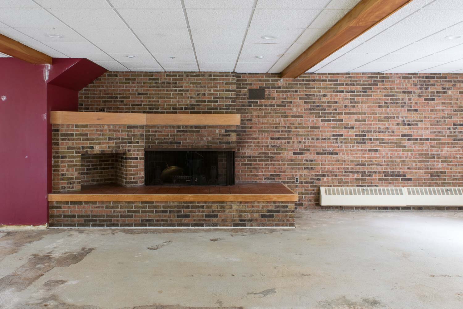
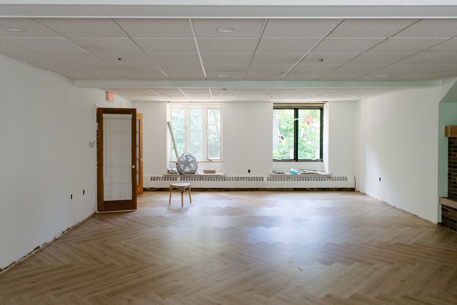
Here’s where we started at the beginning of the summer (flooring was already demoed).

A Modern Cement Tile Stenciled Fireplace (+ Easy Tutorial)-3097.jpg
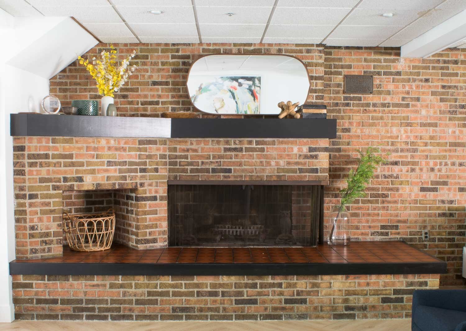
A Modern Cement Tile Stenciled Fireplace (+ Easy Tutorial)-3104.jpg


Now Its a whole different mantle with cement look tile.


A Modern Cement Tile Stenciled Fireplace (+ Easy Tutorial)-3780.jpg

This post may contain affiliate links. When you click on a link and purchase I will get a small compensation at no extra cost to you, win win. Read the full disclosure here.

A Modern Cement Tile Stenciled Fireplace (+ Easy Tutorial)-3106.jpg


Prepping the tile for paint

A Modern Cement Tile Stenciled Fireplace (+ Easy Tutorial)-3104.jpg


Our tiles needed a good scrubbing since the house was built in 1971 and the mantle area I stenciled is horizontal. It’s seen a lot of bottoms sitting on it and feet stepping on it over the years.


TSP is a chemical cleaner that does the trick, but be careful and use high grade chemical gloves when using it. Wear eye protection! 

Mix and use according to the directions.


I was particularly lucky in the sense that these tiles were already matte. Think old restaurant floor tiles. They were similar to concrete tiles, and didn’t need any sanding or deglossing on my part.


A good scrub with TSP insured no grime was left on the tiles and we were ready for paint.


The stencil strategy

A Modern Cement Tile Stenciled Fireplace (+ Easy Tutorial)-4214.jpg

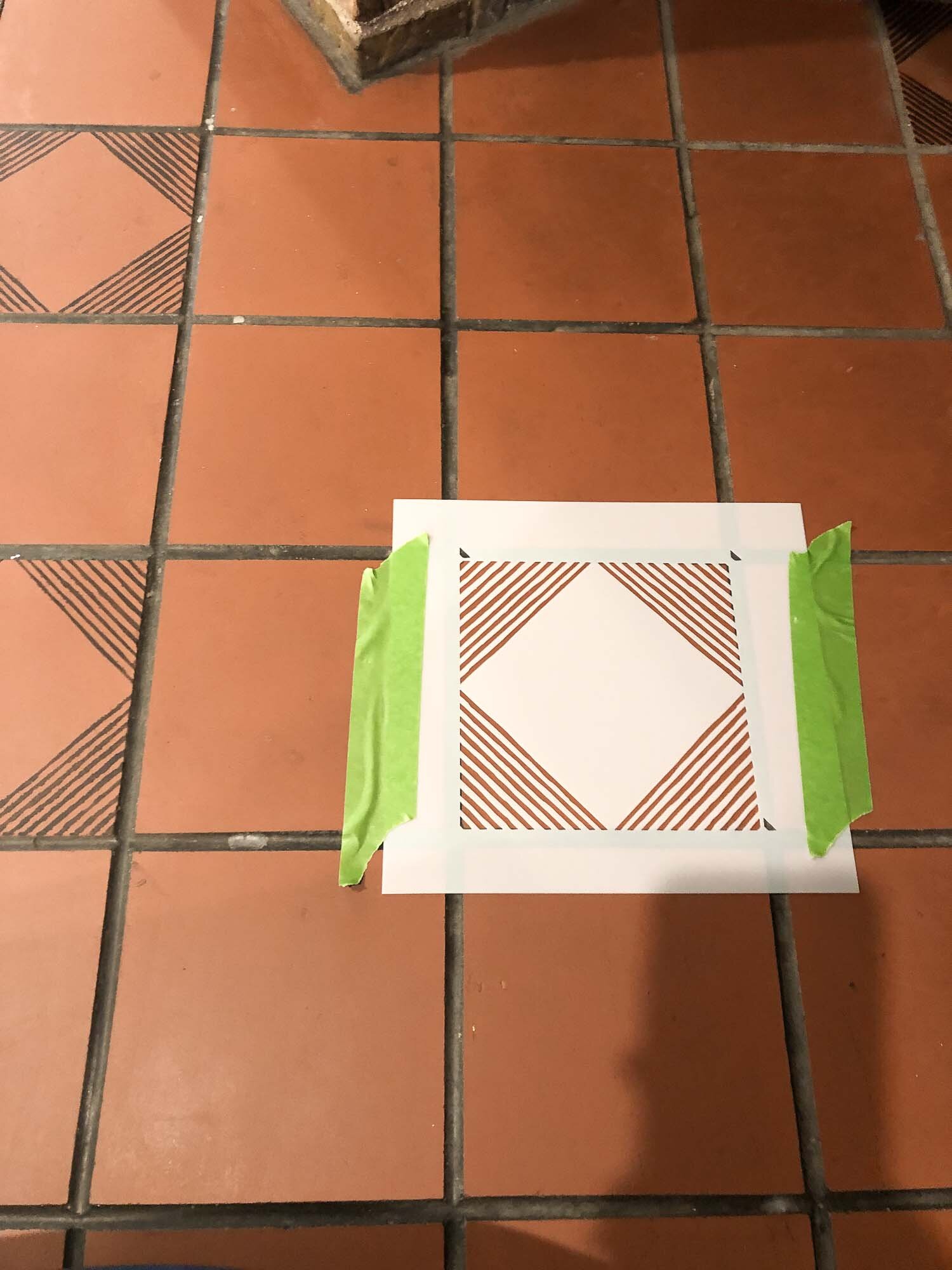
Painters tape helped me ensure the stencil didn’t shift while I was painting. I would keep on changing out the tape when it lost the stickiness.


I also alternated which stencil I used, and which tile, to make sure I wasn’t overlapping before the paint had dried. 


Time for Paint

A Modern Cement Tile Stenciled Fireplace (+ Easy Tutorial)-4208.jpg


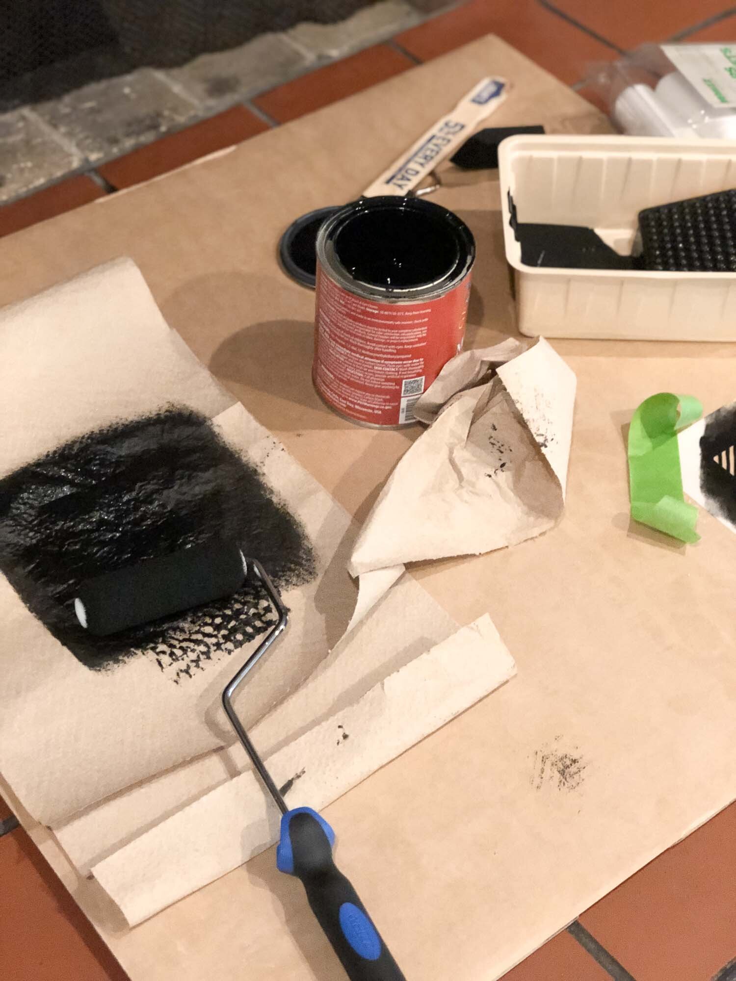
I couldn’t use primer because I wasn’t painting the whole tile. So I decided on milk paint which adheres really well.

You should test on an inconspicuous spot like I did in this fire wood nook, in order to get a rhythm down. Here was my routine: 

  1. Put a little paint on the roller and spread evenly

  2. Roll it off on paper towels

  3. Light-medium pressure on the stencil

  4. Create layers until it looks full

  5. Carefully peel off stencil

*pretty much exactly what the directions say BTW*

Corners and Cutting Your Tile

A Modern Cement Tile Stenciled Fireplace (+ Easy Tutorial)-4209.jpg


Eventually you will need to cut one of your two stencils (you got two right?!) in order to get into corners and odd spaces.


I cut one into half and then into fourths to have options. Depending on the pattern you may need a triangle etc.


Basically the stencil will need to be lightly taped down and bend into the corners. This is no easy task when the cut outs are lines like my stencil. The lines tend to get bigger as you press into the corner, making the result look odd compared to a normal tile.


My only advice. Slow and steady wins the race (not my strong suit). But I made (most) of them look great. 


Reality Check

This was easy, and now that I’ve seen the results (for the price) I would totally do it again. Especially for a phase 1 makeover, I would then save and circle back to replace the tile at a later date.


But getting all the details perfect was difficult, not to mention I tweaked me back which made it impossible to get into that fire wood nook very well.


In the end I had some smudges and figured if anyone had time to sit on that and bend over looking at every detail... they probably should go get a life. It was a $50 makeover. It’s not like I replaced the tile.

It’s a little forward but that my two cents. I’m a little bit rough around the edges y’all!


Love Love,

Susie Q


Why we're simplifying everything (with bathroom tile and life) | ORC Week 3

  You probably noticed we didn’t post on week two because well LIFE. If you have been following along with us for at least a year you’ve probably read all about how moving into a much bigger home, becoming a multigenerational family, and becoming parents has hit us HARD.

I know lots of folks here on the internet make it look easy, and I believe for some it might be, for us it has not been! I struggle with postpartum depression in direct correlation with our sons lack of sleep (big surprise huh).

Why-were-simplifying-everything-with-bathroom-tile-and-life-ORC-Week-3-1186.jpg

You ask why the heck we would join the One Room Challenge then???? Well because we still need to get the Airbnb DONE for lots of reasons I won’t dive into right now (some financial , some personal) . The ORC is a great way to challenge yourself to personal bests and have FUN with other bloggers while doing it. Mitch and I have always been surprised at all we learn over time when we have embarked on this design challenge.

Things are tons better than just a few months ago in regards to our son sleeping better and therefore my postpartum depression is on the mends. SO we figured why not try to wrap up this guest suite and bathroom.

And then my mom tripped outside and broke her arm (She is the addition to our household that makes it multi-gen) she is a-okay and on the mend as well but DAMN. It’s soooo laughable at this point I mean what what!!! Chill out life!

So all the little things my mom helps with that make it so I have time to do projects, write blog posts etc, I’ve been doing again. All the cooking, all the cleaning (okay, okay were not the cleanest household anyways but you get what I mean), running around after a toddler and keeping up with an adorable 8 month old (where the heck did that time go!).

So no two week post, and I hope you will forgive me for constantly apologizing for falling short with this little corner of the internet over the last year. I’m so thankful you even spend time reading this stuff.

Why-were-simplifying-everything-with-bathroom-tile-and-life-ORC-Week-3-1168.jpg

Now that I talked about everything but the project I’ll update you on our tile situation.

If you remember I clearly stated we were looking to do a patterned tile with a historic vibe in week One .  I’m here to let you know I’m a big fat liar!

Here's the bathroom before:

Why-were-simplifying-everything-with-bathroom-tile-and-life-ORC-Week-3-1052.jpg

The only reason I’ve had the chance to write this is because I had to simplify or die y’all.

Why-were-simplifying-everything-with-bathroom-tile-and-life-ORC-Week-3-1107-1.jpg

I tried to come up with a patterned Mitch and I both liked and didn’t think our marriage would end over doing.

See, Mitch wasn’t interested in a pattern at all, it sounded like a lot of fuss to him. I however, felt I NEEDED to create something unique to inspire our readership. I mean what’s the point in reading a blog about home design if they don’t take this risks so you can see !

And then I had this nasty gut feeling I would be sorry if I forced us into a pattern.Like middle of the night fingers bleeding from setting little individual tiles and having my husband pondering my death- kind of regret.

Why-were-simplifying-everything-with-bathroom-tile-and-life-ORC-Week-3-1080.jpg

Then, I would be apologizing and stressing and we would be even further behind and more exhausted.

And just so I could take a risk on our design? But the house is fairly simple for its time. Other additions (like my favorite feature walls) can always be added for a wow factor and can be removed relatively easy in the future.

So we went with a solid warm grey colored penny tile, my marriage is saved, and we can move on to the next thing on this long to-do list!

Why-were-simplifying-everything-with-bathroom-tile-and-life-ORC-Week-3-1058.jpg

Simplifying projects, our home and to-do list is exactly what we did a few years ago in the "tiny house" , without having done that I don't believe we would have even started this blog.

SO, were going back to the basics, everything I get overwhelmed I will try to simplify things in order to create "space" in our lives for us to live healthy and happy.I hope if YOU get overwhelmed and stressed like we do you will embark on this journey.

Look at everything you have to do and see how you can simplify it just a bit....

The bathroom tile needed to be done but not with an complicated pattern.

The to-do list can get cut from 10 things to 3 today.

Just grill the chicken breasts instead of making some elaborate dinner.

Why-were-simplifying-everything-with-bathroom-tile-and-life-ORC-Week-3-1198.jpg

Our families will thank us for being less stressed and finding more time for the things that matter most.

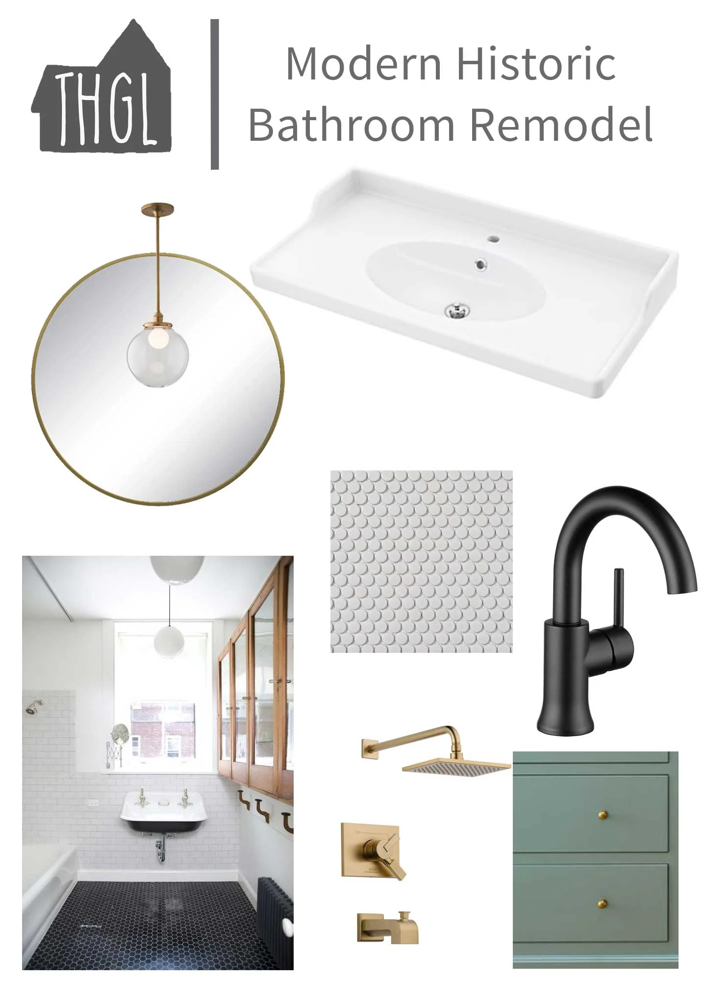
historic bathroom |Our-Plan-For-a-Budget-Friendly-Historic-Bathroom | Bathroom-layout | historic-bathroom-layout | mood-board | bathroom-mood-board | vintage-modern-bathroom-plan

historic bathroom |Our-Plan-For-a-Budget-Friendly-Historic-Bathroom | Bathroom-layout | historic-bathroom-layout | mood-board | bathroom-mood-board | vintage-modern-bathroom-plan

Natural & Soothing Boy's Nursery Reveal | One Room Challenge Week 7

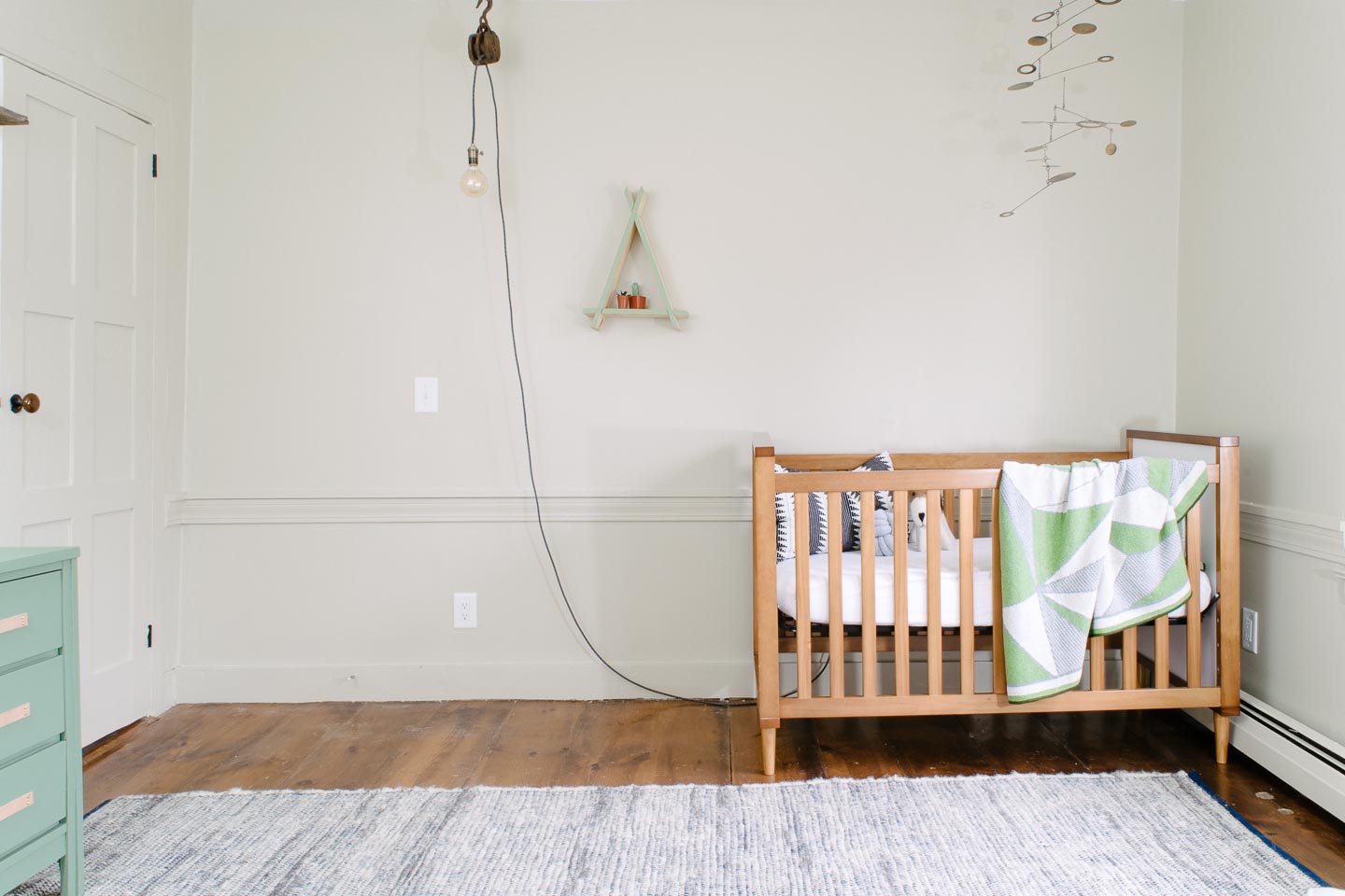
Over the last 7 weeks we have dealt with a lot of late nights and nap time projects while designing and constructing this natural & soothing boy's nursery. Honestly though, we are so grateful it’s done and that the One Room Challenge helped us complete the nursery before the baby arrives. It very well will be the only room in this Colonial we will complete for a long while, so we made it count!


This post may contain affiliate links.When you click on a link and purchase I will get a small compensation at no extra cost to you, win win.  Read the full disclosure here

We knew this would be the nursery right away, with its little nook area and original closet/ doors, it already had the character and room we wanted.

Shelving wasn’t hard to think up for this spot since we still have wood that was milled from a beech tree at our old house. With some very inexpensive hardware and hunter-green paint, we wrapped up the nook shelving on no time.

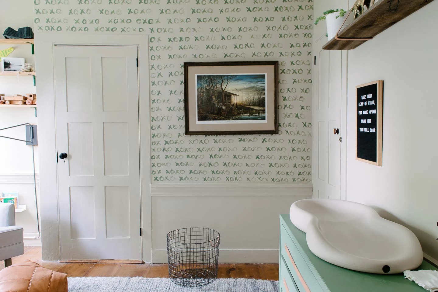
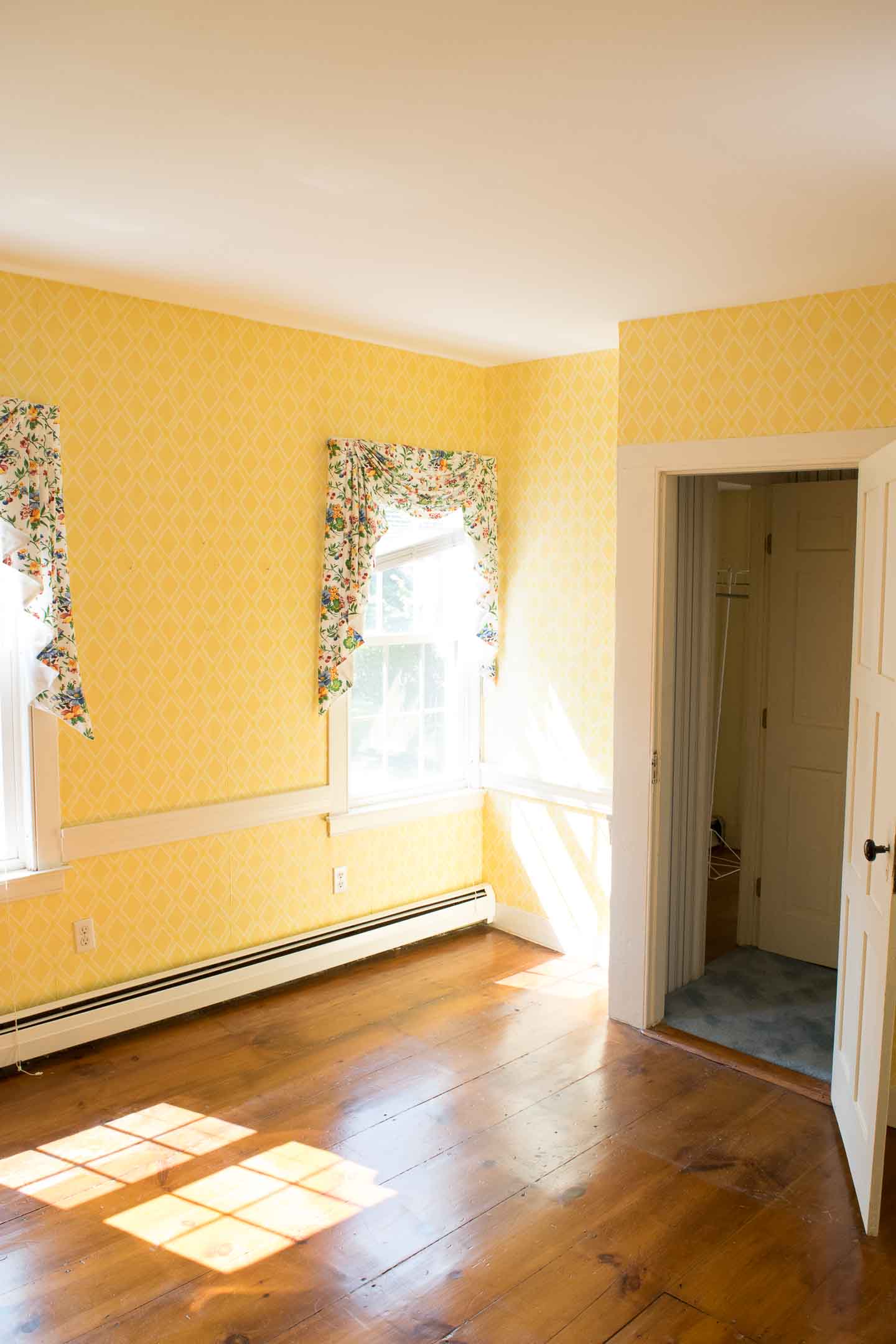
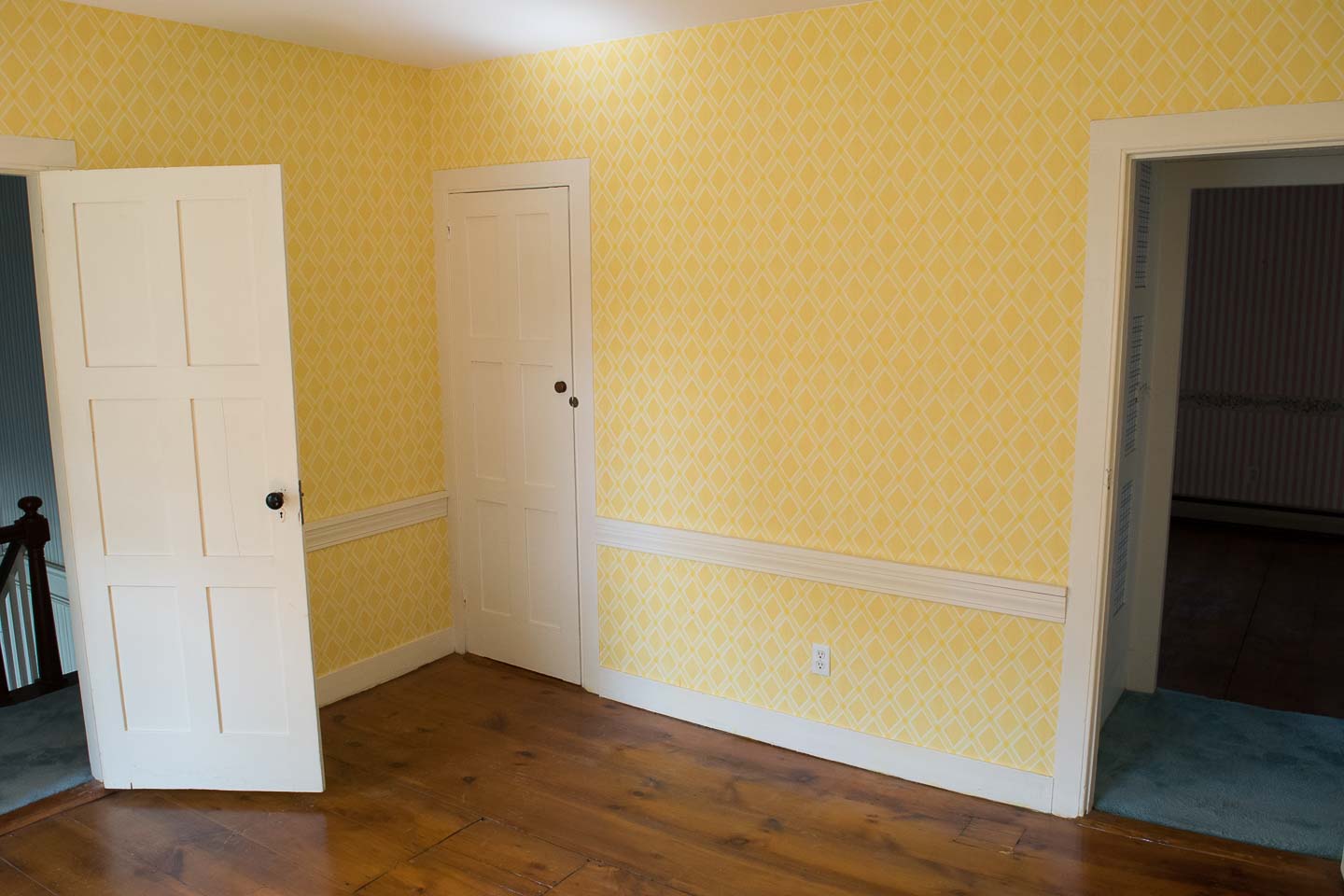
It only took half a second for me to realize the wallpaper was not going to work, with the windows facing south this room gets a fair amount of light that only further excentuated the extreme yellow. So we took it down in favor of a painted design and opted out of more wallpaper which would have been costly; and I couldn’t bare to put any up after painstakingly taking so much down.


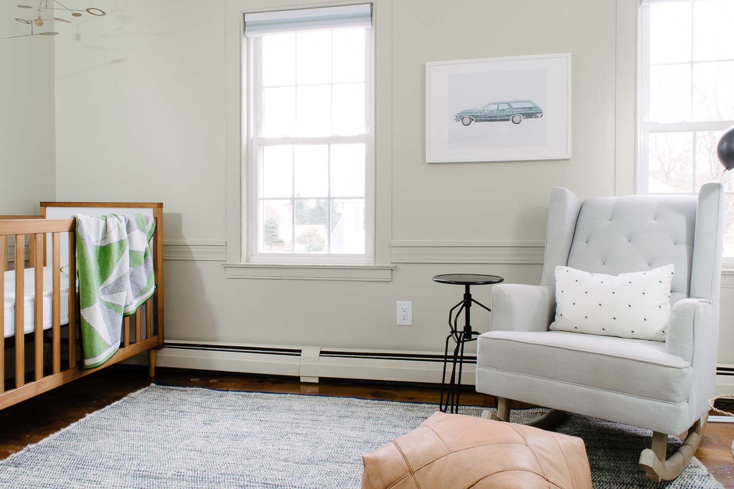
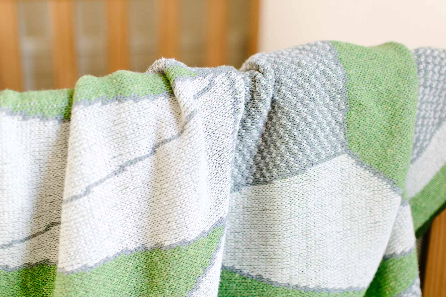
Using green as our accent was an easy decision after we found this geometric baby blanket at a local store. The blanket really kicked off the entire rooms design but it was just one amazing piece we found from local or small makers for this room.

The crib was reused from our daughters nursery to save funds for other splurges, and because I’m not sure I could find another crib we love as much as this one. When we got it in 2015 (it’s discontinued) we wanted something gender neutral so that it could be reused.


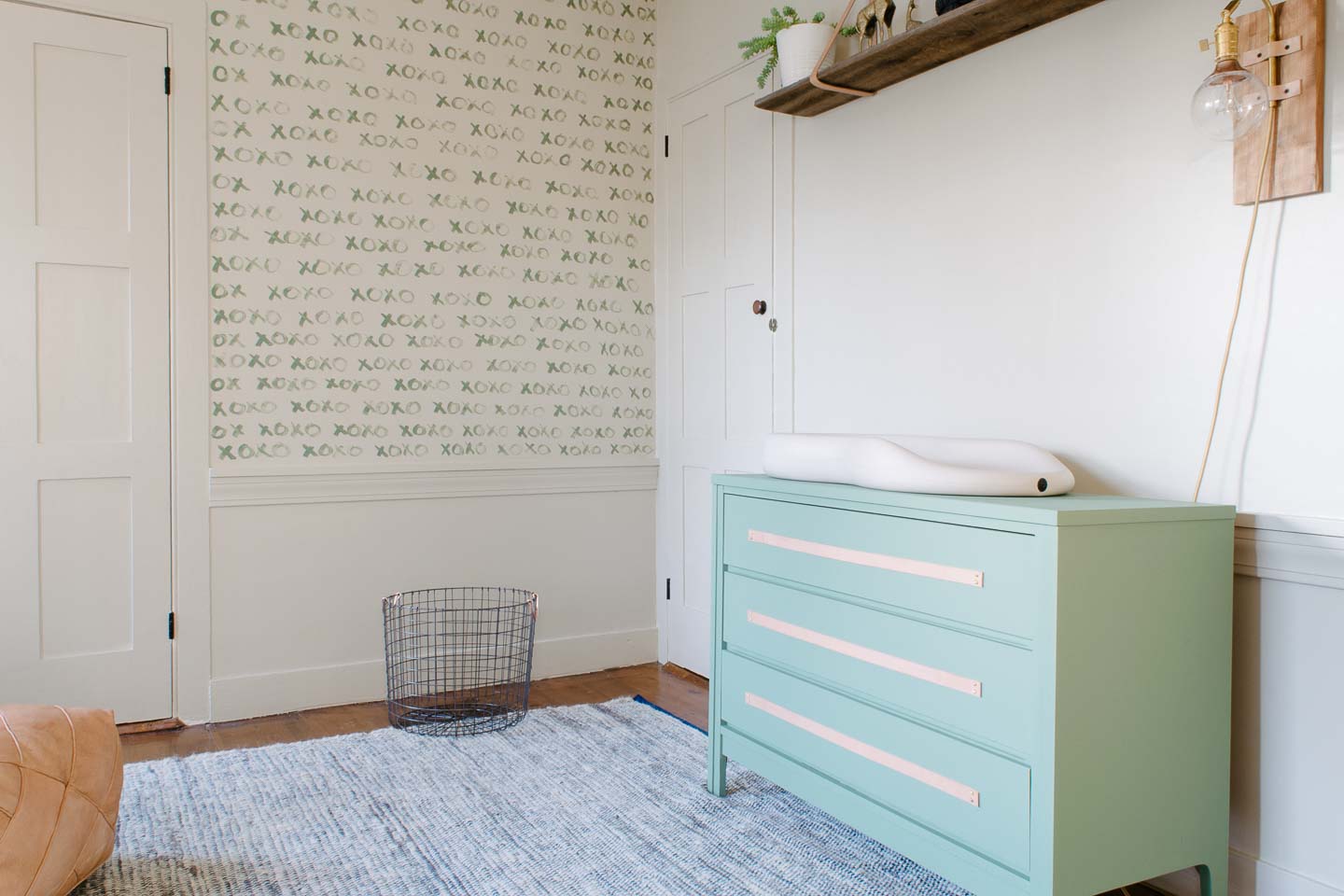
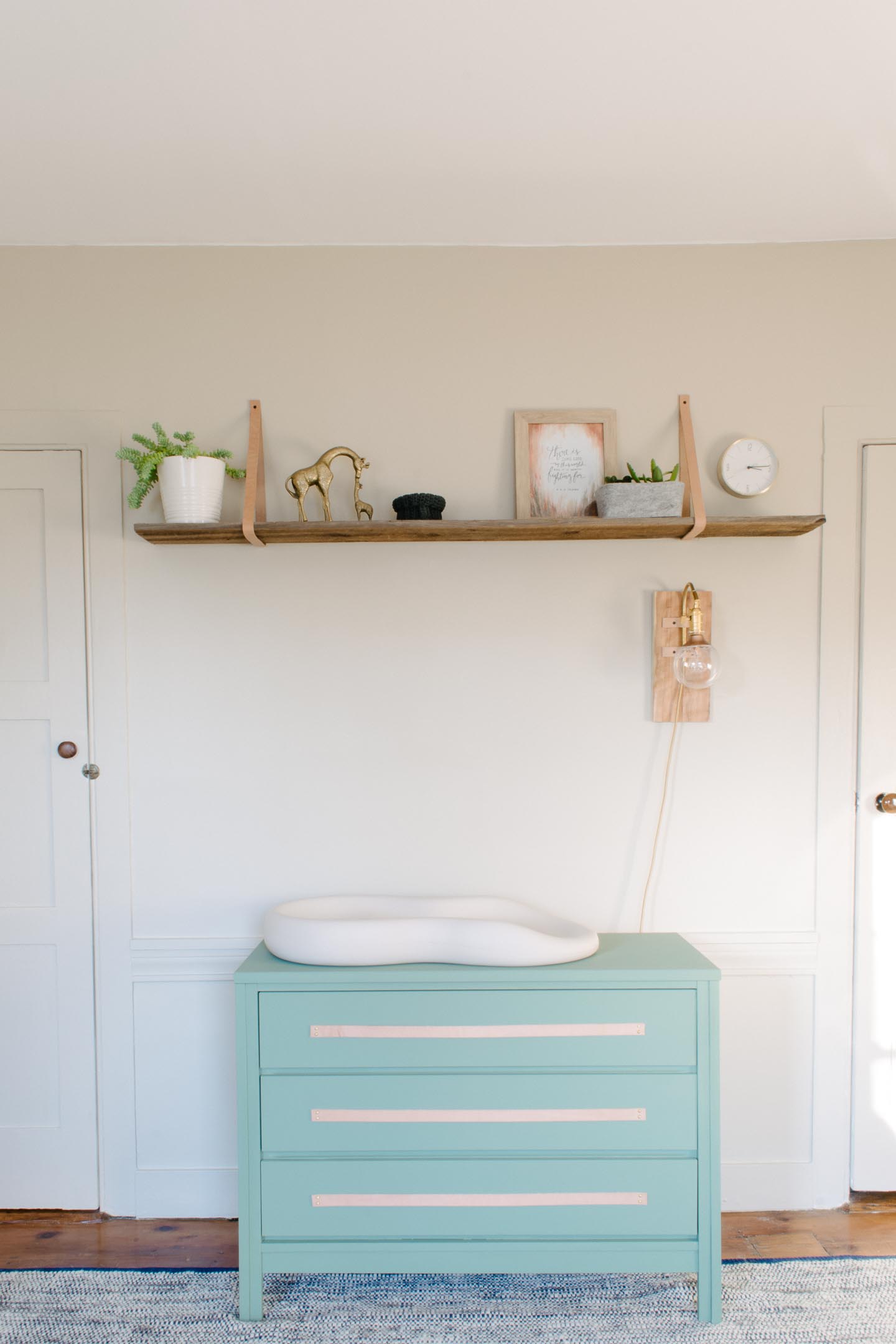
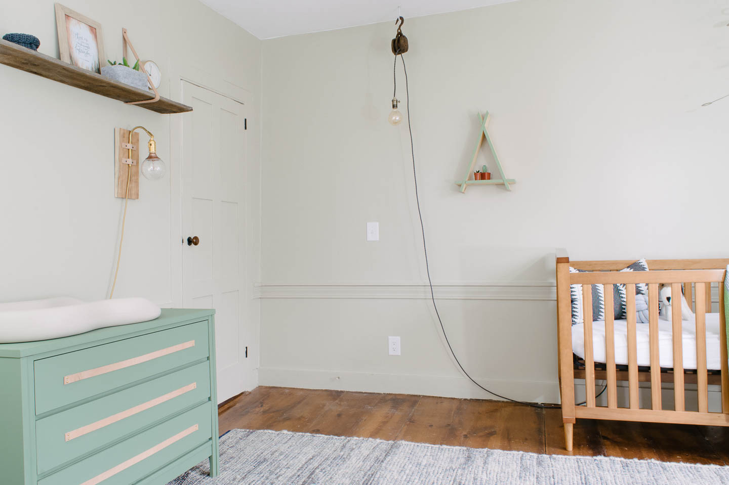
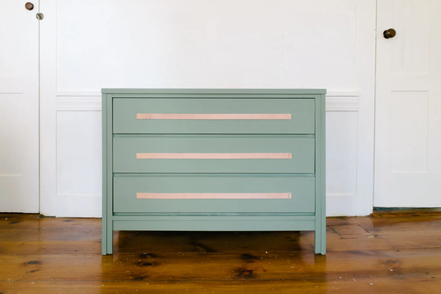
We painted this vintage mid-century dresser to use as our changing table and added long leather pulls for a natural element.

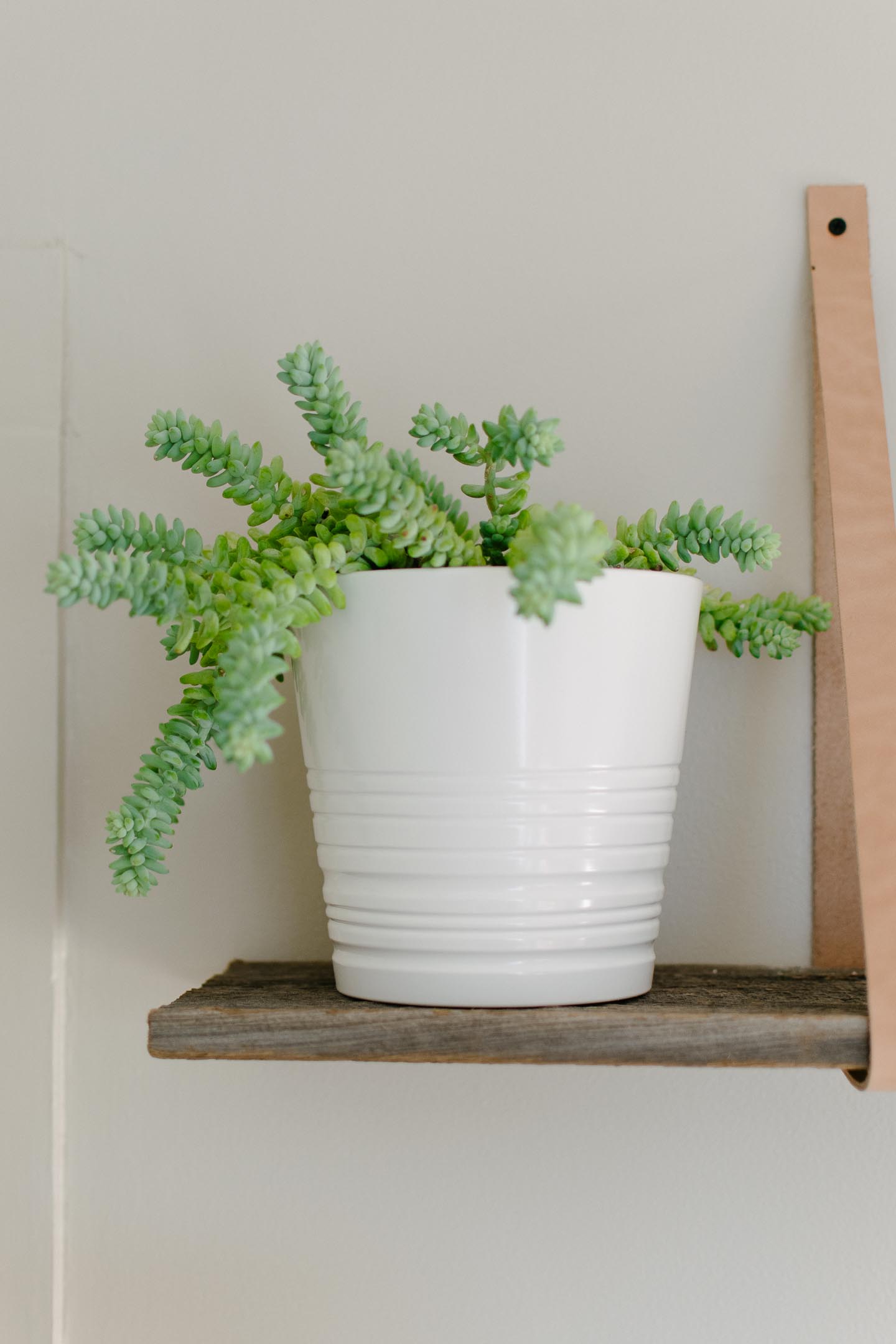
The leather strapped shelf above the changing table was hung extra high (hey were super tall folks) so no head bashing would occur in the middle of the night. And that left ample room for the night light sconce we made to hang on the wall.


One thing we worried about was that the room would get too busy with all the things needed for a baby. So we kept the art minimal but meaningful.

I commissioned an Etsy artist (shop here) to create a print of our 67’ Chevy Bel Air Wagon as a mini-surprise for Mitch, but our daughter is the one that fell in love stating that was her vroom vroom!


We made the art impactful without breaking the bank by only picking items that had a link to us in some way.

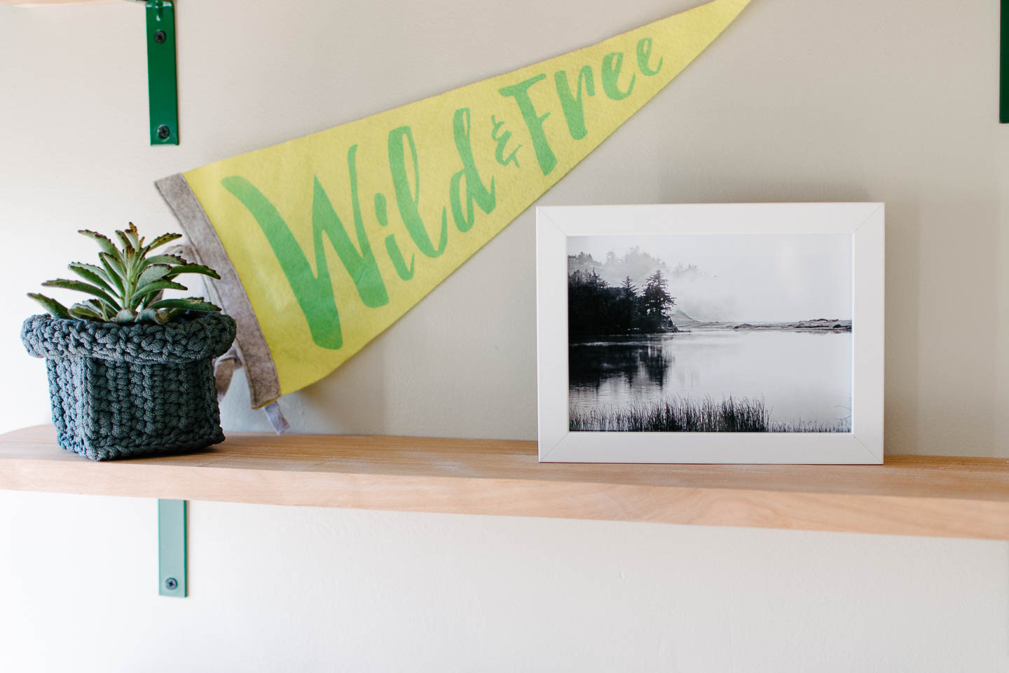
I started by narrowing down some fantasy novel quotes I really like and saw before we even knew we were pregnant, some beautiful horse prints to go with the wild and free sign, and a couple of forest prints that sparked joy.

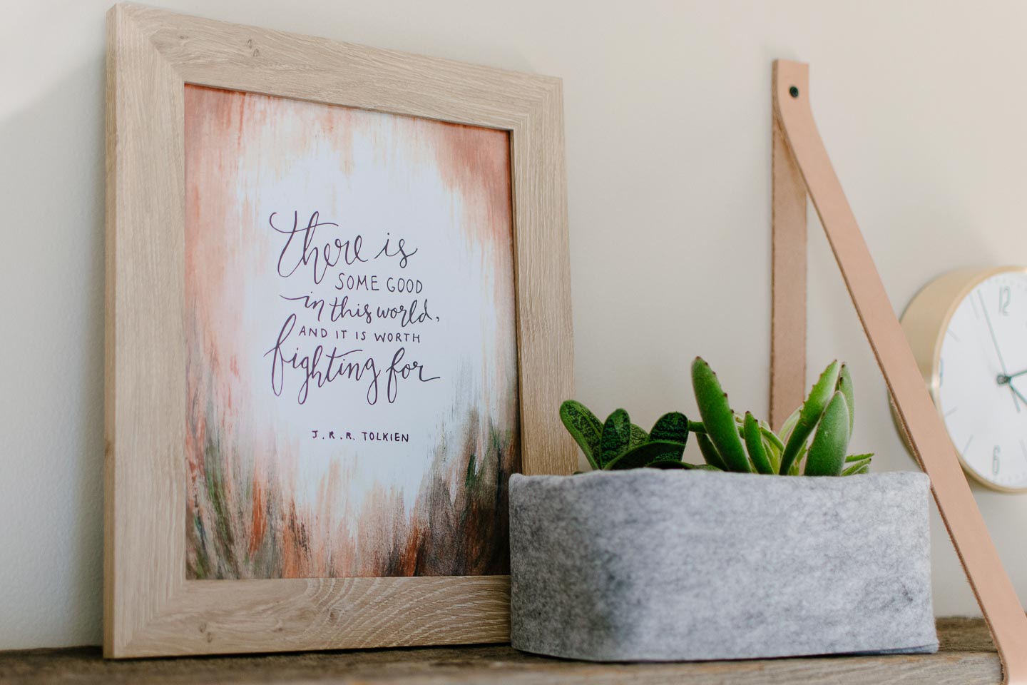
Once I had 6-8 good options I sent them to Mitch for final selection so that they would mean something to him as well. Like the Lord of the Rings quote, (he could care less about anything fantasy related) but picked this quote because he felt it was truly something he wanted his little boy to know and had meaning in the real world.


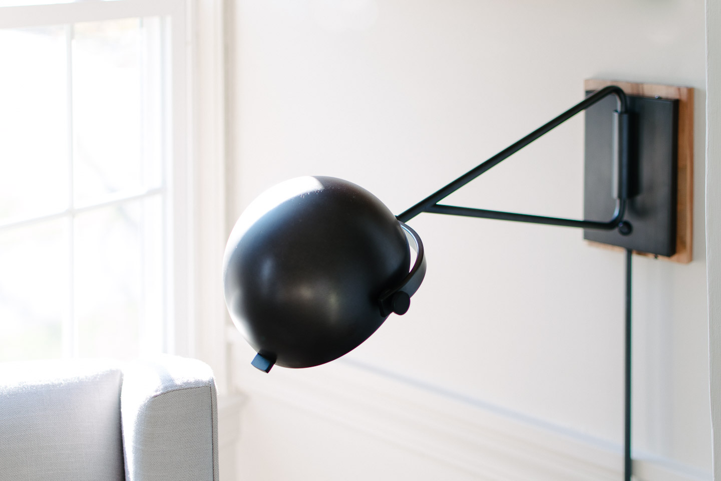
The rocking chair was another item we reused from our daughters nursery. Having searched to find something both unobtrusive and comfortable for our tall frames, we weren’t ready to give this up. The side table is actually a stool we painted black so it would work with the reading wall sconce.


Lighting was something we really needed to debate for the space, because it didn’t have any overhead lights and we didn’t want to spend more for our electrician just after fixing a bunch of code issues just last month.

So we created a lighting plan that addressed all the areas we would be using. The changing table, a general overhead light and the rocking chair/ reading area.


Overall we couldn’t be happier to start spending some major time in this space with our little boy!


Catch up on all the posts here:

The Design | Custom Artwork | Mid-Mod Dresser with Leather Pulls |

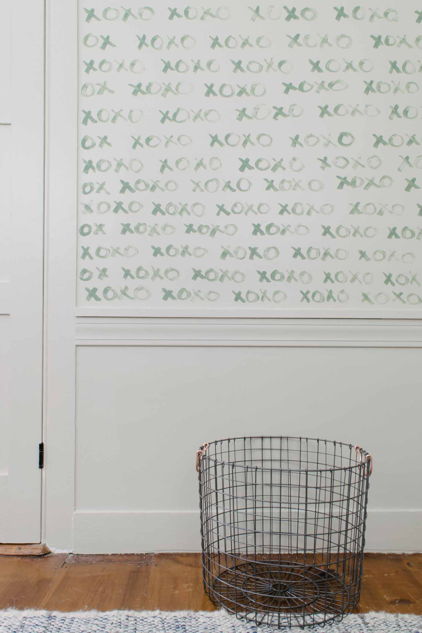
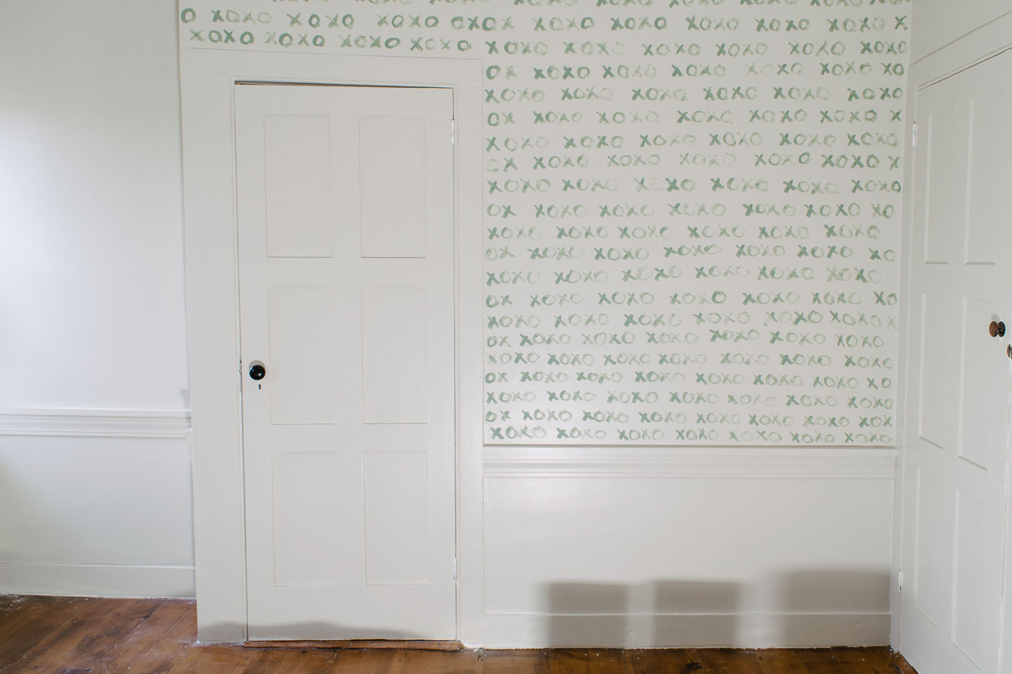
Updates | Nursery Closet | XOXO Feature Wall


Natural & Soothing Boy's Nursery Sources


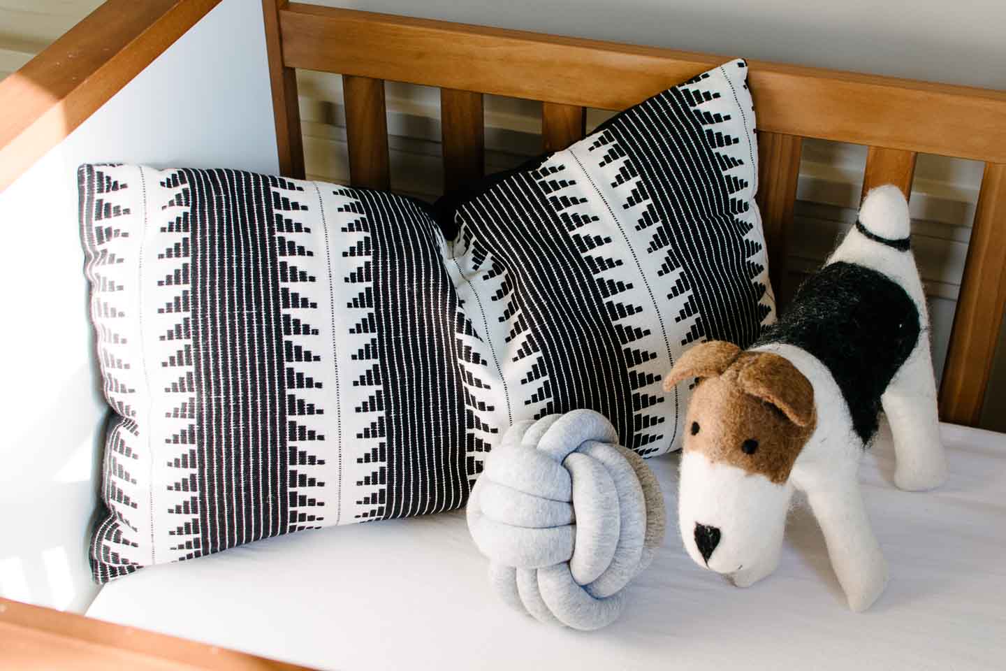
 Crib (Similar) | Crib Pillow | Knot Pillow | Mobile (2) |  Geometric Blanket | Rocking Chair | Side Table (similar) | Leather Pouf | Chair Pillow | Seagrass Basket | Lake Print | Horse Print | Brass Frame | Wild & Free Sign |  Shelf Baskets | Brass Giraffes | Wood Picture Frame | Quote Art | Brass Clock | Reading Wall Sconce | DIY Pulley Light |  Felt Baskets | Wire Hamper | Changing Pad | Triangle Shelf


Hopefully everyone who needed the extra time because of these crazy natural disasters has been able to finish up, it was so nice of Linda our host to extend the One Room Challenge for everyone.


Let's go check out all of the other

One Room Challenge reveal's shall we?

A Nursery Feature Wall With Love | One Room Challenge Week 6

A-Nursery-Feature-Wall-With-Love-One-Room-Challenge-Week-6-7430-e1510167897731.jpg

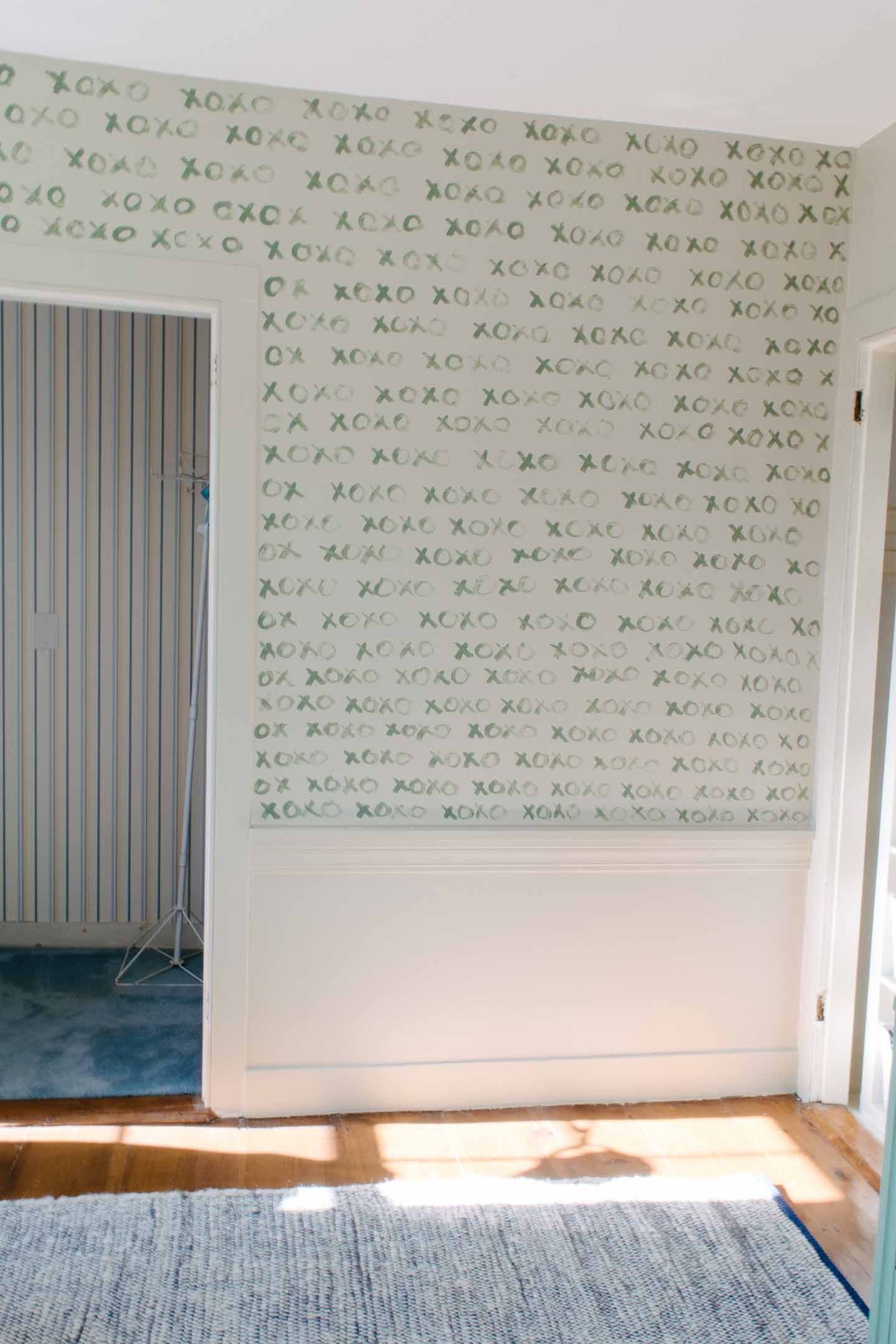
Well we did it, not in the first week like we originally had planned but all the way in the fifth week; we finally wrapped up all the nursery painting. It sure turned out to be nice that the One Room Challenge was extended another week.

Here's what lead us to this week:The Design | Custom Artwork | Mid-Mod Dresser with Leather Pulls | Updates | Nursery Closet

If your just joining us now we revealed the yellow wallpaper in week 1 that would need to be removed before painting the trim and walls (the same color) could commence. I figured it wouldn’t be fun to remove but I never imagined just how difficult it would be.

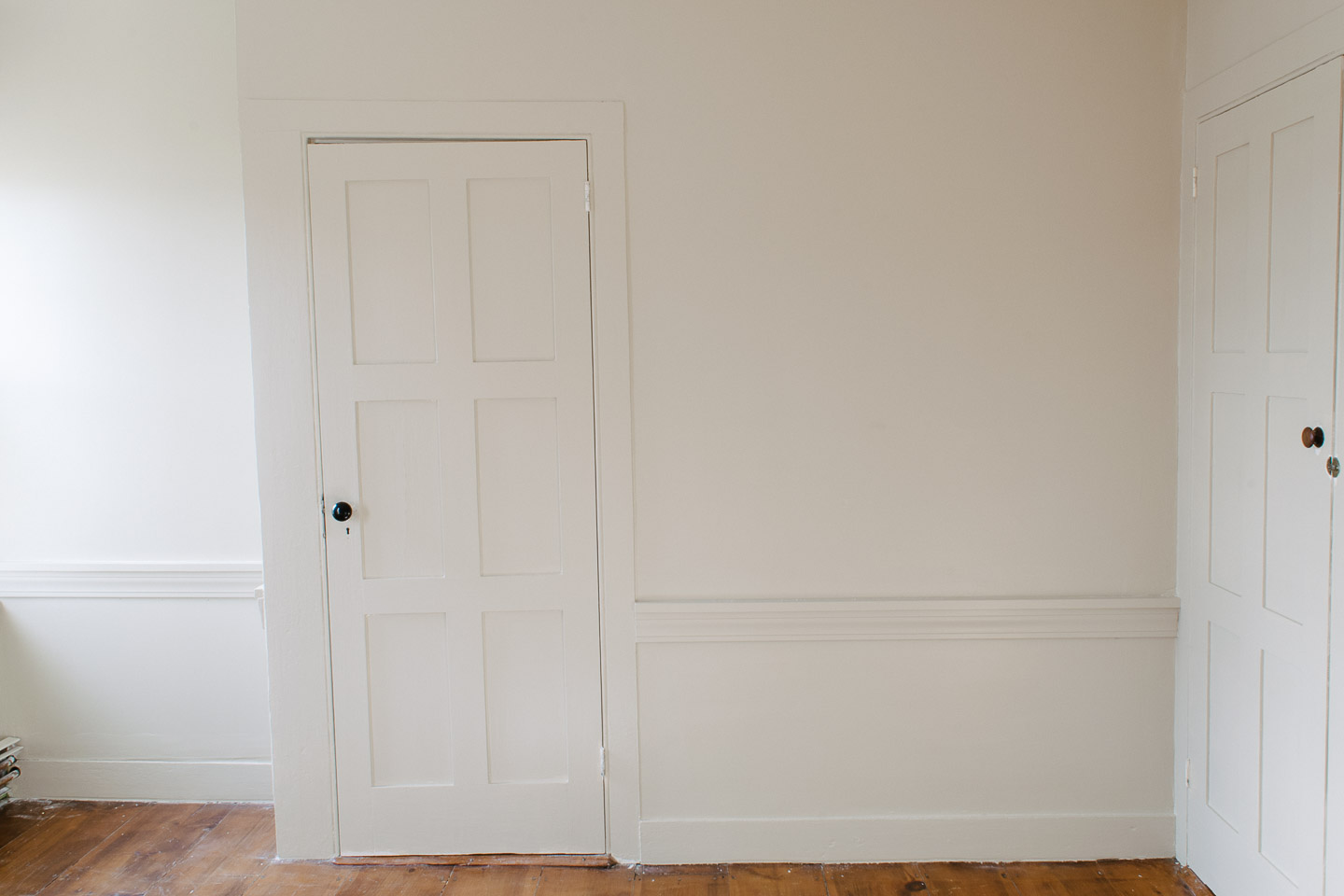
Here is where we started to refresh your memory:

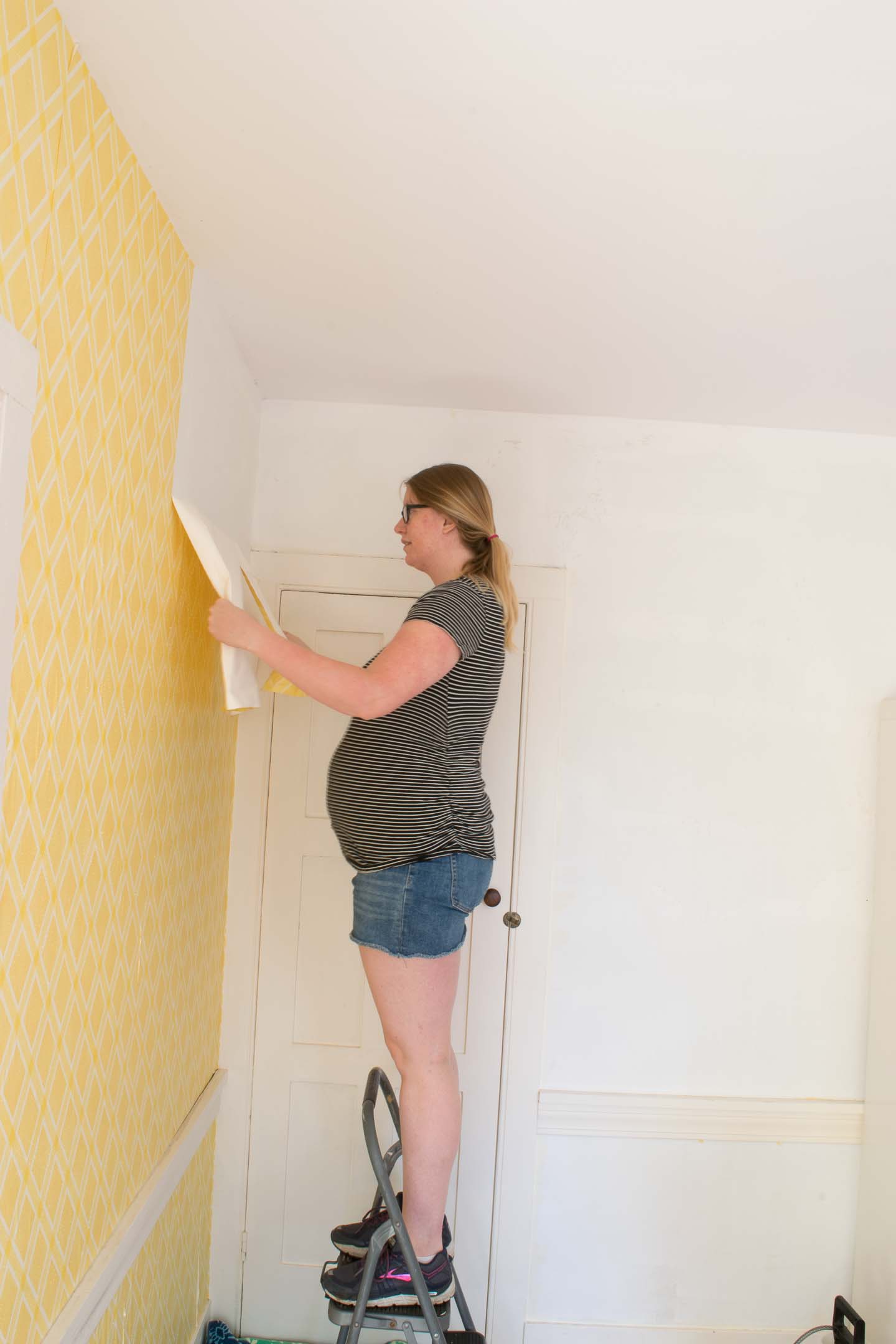
Wallpaper removal

This took a huge chunk of time because we actually have never had to remove wallpaper before. Therefore I was unaware that different types of wallpaper can need different removal techniques.

This wallpaper turned out to be some type of water resistant stuff from the early 70s. Apparently wetting down the paper doesn’t do much, who would have thunk it?!?

So I had to:

  1. Score all the paper with a little tool
  2. Wet everything down with a vinegar/water solution
  3. Peel off the top waterproof layer
  4. Wet everything down again
  5. Scrape off the backing and glue
  6. Clean the walls with scraper and sponge Two- three times

It was a process, but thankfully once I had done that part, Mitch had a day or two off from work and helped by plastering the walls in any spots that needed it and sanding. Then we had to clean the walls, again!


To say I will think twice before putting wallpaper back up anywhere in the house is an understatement!


Paint and More Paint

Then we started with priming everything since only some of it was primed before the wallpaper.

I did all my caulking after primer as per usual; I’m able to see issues better after getting that primer up. A painter also taught me the trick of dipping your finger in water before running it along the bead of caulking, turns out beautiful every time.


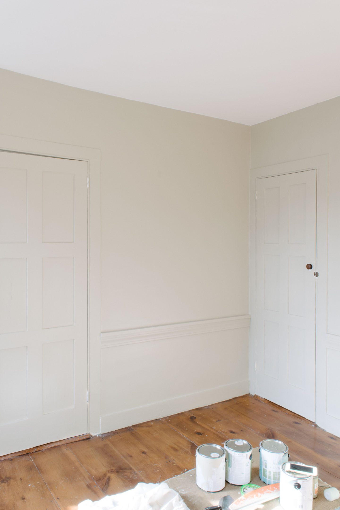
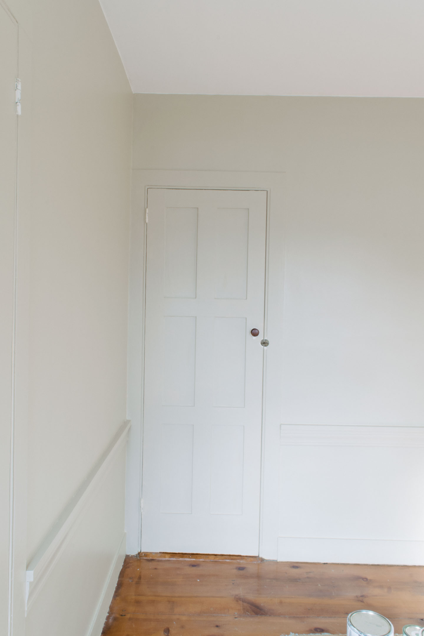
Then we put on two coats of eggshell paint on everything, trim, walls, and baseboard heaters.

Initially I got worried about the darkness but it’s really pretty wonderful. I will say my “neutral” room has turned out to be not so neutral anymore. But you will see that in the reveal shots!


We've since removed the doors and original (?) hinges so that the old paint could be removed and the hinges could be sprayed black.


Nursery Feature Wall

I wanted to do another Feature Wall since we have been missing the uniqueness of our last one from last spring ORC (we sold the tiny bungalow in September) .

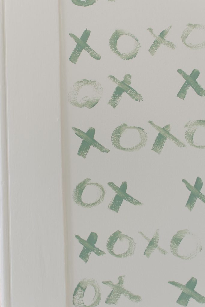
Before we even knew whether we were having a boy or a girl an idea popped into my head about painting xoxo on the wall in either green or possibly green with a pink here or there.

Mitch couldn’t visualize it but went along with the idea anyways and so here we are!


I polled everyone on my Instagram Stories about finishing under the chair rail and the majority leaned in the same direction as I did, leave it blank. I think if I had filled in the bottom section it would have excentuated the chair rail, something I was avoiding by painting everything the same color.


How to Paint The XOXO Nursery Feature Wall

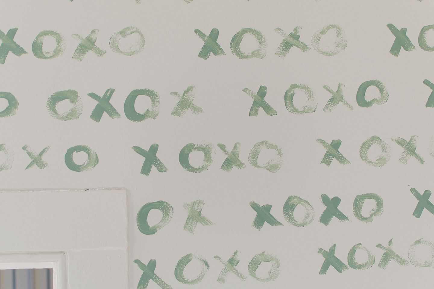
This was pretty simple but it still didn’t come out “perfect”, although I wanted a free hand look since it’s a message from mommy and daddy to our little guy... should probably be our handwriting (and you can’t read Mitch’s).

I recently saw an Instagram-er who did a painted feature wall and recommended painting a pattern in 12 x 12 blocks to keep things relatively straight. I really wish I knew who it was because without that piece of advice I’m sure things would have gone way askew.

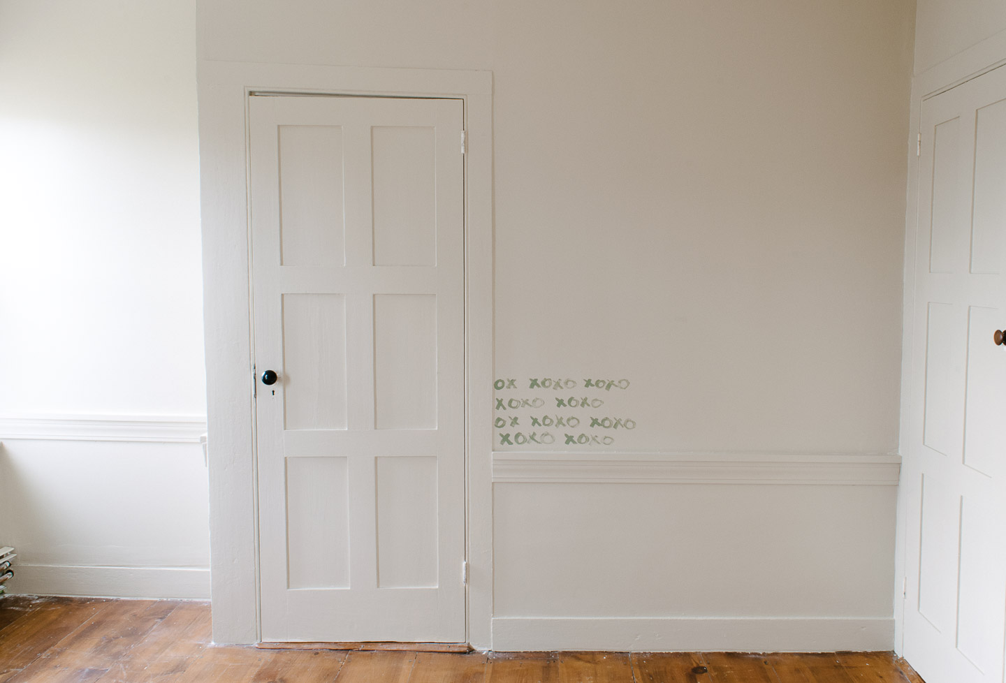
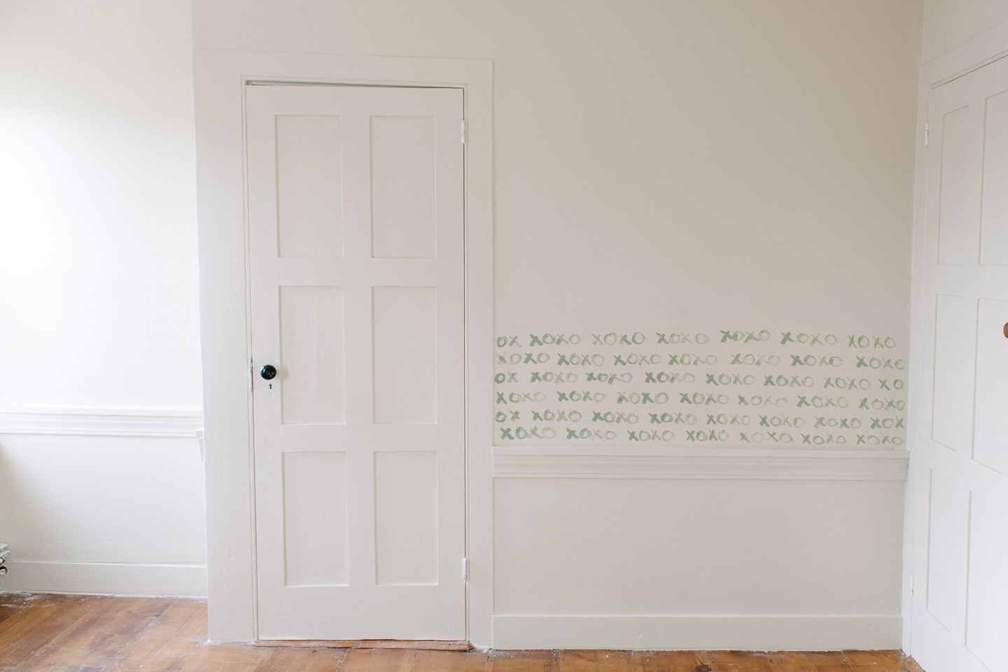
Here's the succession (I was working in the evening/night so not the greatest pictures guys)


Honestly, that was it, I worked in blocks up and then over (left to right) until I got to the top of the door frame and had to work right to left (which was a bit difficult) , and offsetting the “words”.


Inadvertently, I switched the xoxo pattern at my offset from xoxo to oxox and at the very top of the door you can see where the mishap had to be corrected.


The pattern being :

OX XOXO

XOXO XOXO

OX XOXO

XOXO XOXO


I can’t really tell and I think it was a useful mistake. If I hadn’t done that the pattern going up the door frame would have all started with an x.

Like this:

XOXO XOXO

XO XOXO

XOXO XOXO

XO XOXO

So keep that in mind if you want to do something similar, my font also got a tad bigger and a tad spread out as I reached the top. Still not a deal breaker for me but if you are a total perfectionist you might want wallpaper (I’m crying while writing that!)

Next week is the Big Reveal, and we still have so many little projects to complete! Shelving, side table, hanging artwork and the mobile, and then final touches! Wish all of us participants luck and check out what everyone else did this week on the One Room Challenge!

How to Make a Industrial Pulley Light & Nursery Lighting

How-to-Make-a-Industrial-Pulley-Light-Nursery-Lighting-7225.jpg

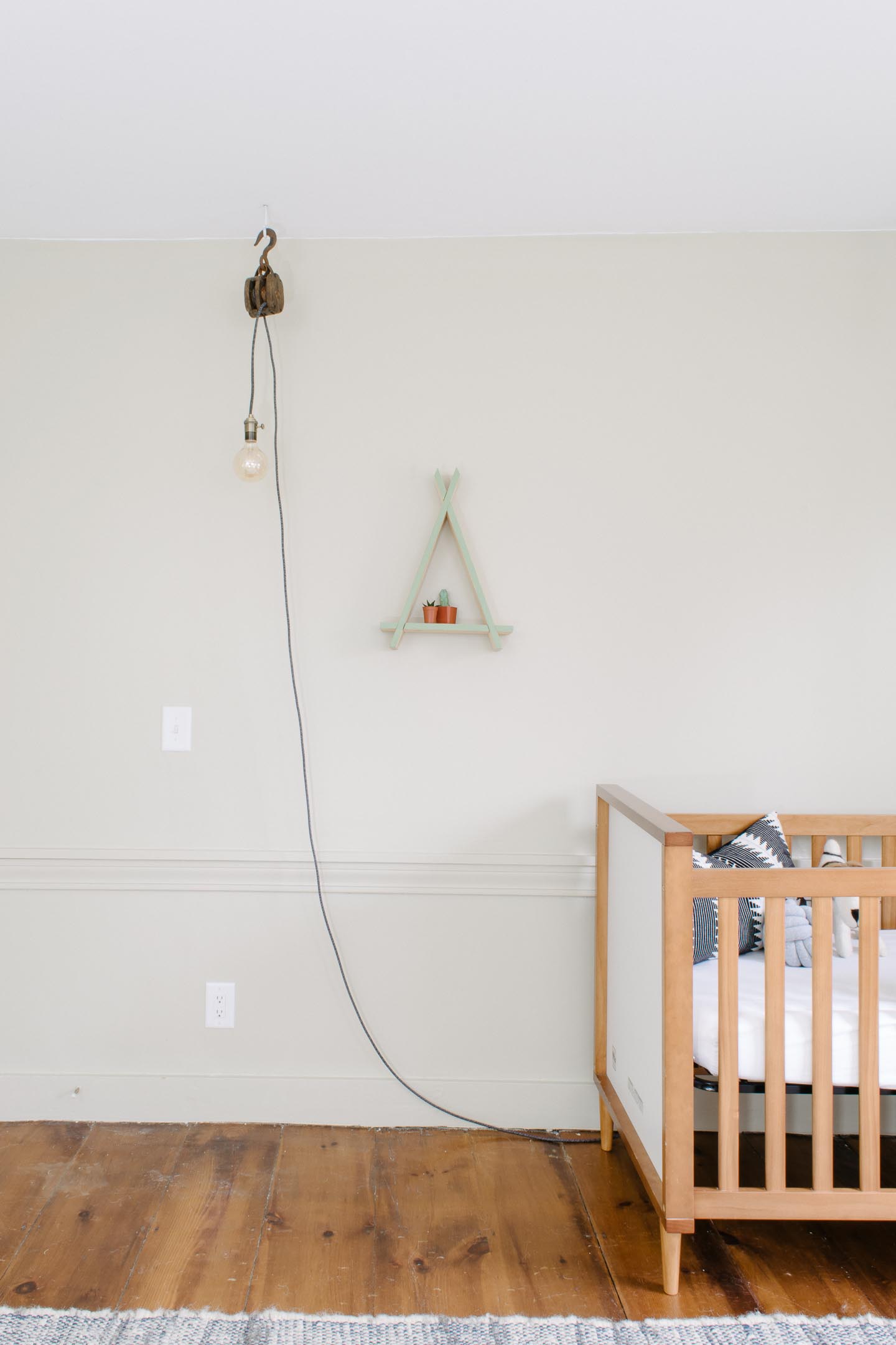
We were so excited about the new house that it took until we moved in for us to notice neither of the kids rooms had any overhead lighting in them, so an industrial pulley light is our solution. After a hearty, yet very fair bill for the electrician to come in and bring things up to code (and make sure the house didn’t go up in flames) we really didn’t want to continue adding to the price tag, so we’ve opted to leave ceiling light fixtures out of those two rooms.

Instead, we’ve put together a lighting plan to cover zones in the nursery, which of course makes me happy because it = more lights fixtures. I really love light fixtures like our DIY Sputnik Chandelier and Entryway Lights.

This post may contain affiliate links.When you click on a link and purchase I will get a small compensation at no extra cost to you, win win.  Read the full disclosure here


We decided on making/ buying three different fixtures.


1. A general “overhead” light in the form of this industrial pulley light hung from the ceiling 2. A reading sconce for at the rocking chair 3. A shelf light for at the changing table


That way we get the best of both worlds and can have general lighting and task lighting all without paying for the electrician and putting holes in the ceiling.


The General Lighting


To create general lighting we knew something would still need to be hung high, even if it wouldn’t be ceiling mounted.

I’ve certainly seen plug in bare bulbs that hang up from a hook in the ceiling, but we wanted something with a bit more character.

A couple of years ago my mother and I grabbed these pulley’s while at an antique show (how to go prepared to a flea market), and so I thought why not use the pulley to create a light? Seemed like a perfect industrial piece for a baby boy's nursery. Also something that would work well in his room for years to come which is always a win in my book.


How to Make a Industrial Pulley Light

We used Color Cord Company for the lighting supplies needed, they have some fantastic options for DIY lighting kits that you can make yourself and get a unique fixture for your space. This post was not sponsored, we just really liked working with all of the amazing options they had to offer!

Supplies Needed

Antique Pulley

Amber LED Bulb (1)

Metallic Keyed Socket (1)

Charcoal Tweed Fabric Wire

Wire Strippers

Lighter

Steps

- Check to make sure you have all the supplies needed - Prepare the wire by pulling back the fabric and exposing the wire casing, then cut back the casing to expose the electrical wires.

-Wrap wire into pulley as you will want it... making sure the plug or back section is far enough away from the light bulb so that they do not touch.

-Expose the copper wire and wire to socket

- Stretch fabric back over wiring - Take lighter and burn ends of fabric to stop fraying - Pull back fabric on plug end and strip back insulation to wires - Strip back wires to copper - Wire end to plug
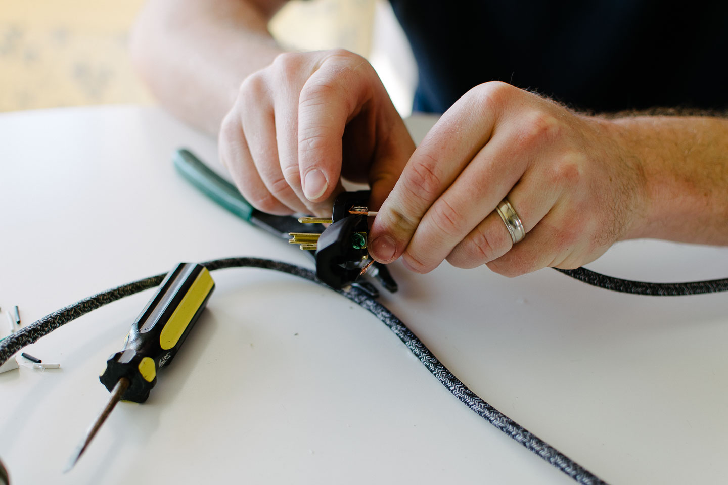
-  Voila! Now hang from a ceiling hook , screw in bulb, and plug it in!

 

We didn’t actually have this hung from the ceiling yet so here is the husband model showing the finished results off so well !


** You will probably have already noticed how very basic this tutorial is, with no crazy details on how to wire a light fixture. If you are not familiar with electrical, our advice is for you to hire an electrician and possibly learn from him before attempting to DIY a light fixture on your own. We are NOT electricians and therefore .....please do not try this at home without consulting with a licensed electrician.