Entryway Design Plans | One Room Challenge Week 2
/Last week we went ahead and caught every one up on where we are with our porch remodels and how that relates to our One Room Challenge entry space. This week, its time to tell you all about the entryway design plans. I was so excited to hear from so many amazing people either via social media or comments here on the blog, thank you guys so much for all the support. If this is your first time here, welcome! This past week we couldn't get to the full design plan because of a family emergency that left us having to re-evaluate what we think we can accomplish and when for the entry design. So we went ahead and got everyone up to speed on the remodel that led us to even have a front entrance to our little 1,000 SF Bungalow.
Now that we have a game plan ready to go we really can't wait to show off all the details.
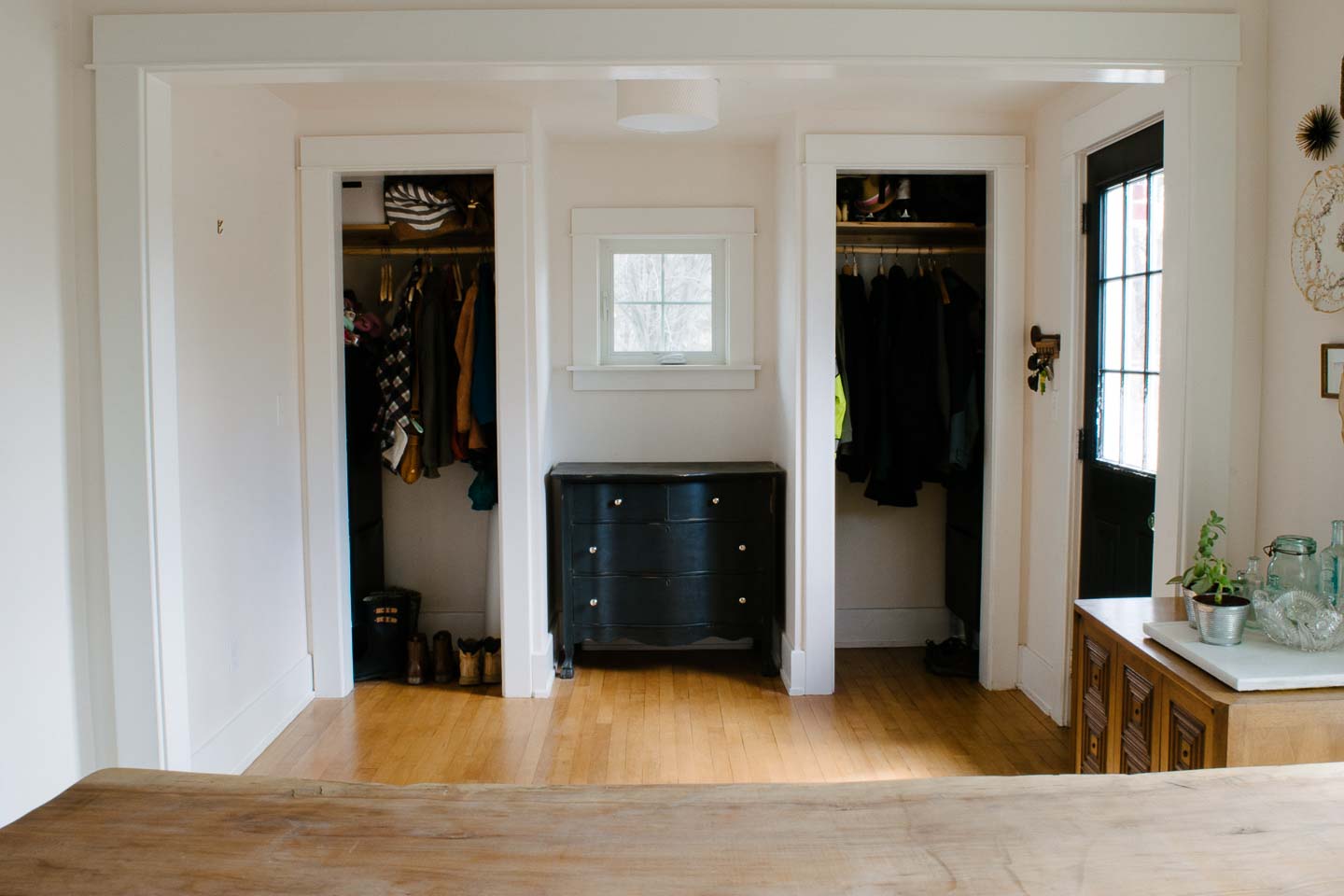
Entry Current Photo's
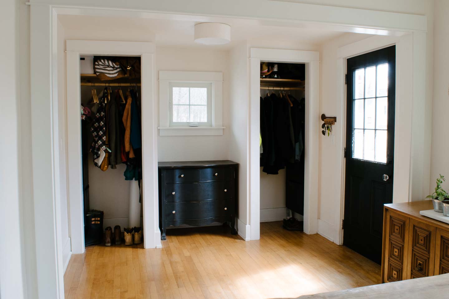
All of the molding in this room is brand new and currently matches minus the top crown piece. This is a custom piece that must have been crafted on sight, and as you can see from the picture below, its a solid routed piece that wraps around the sides instead of being mitered together.
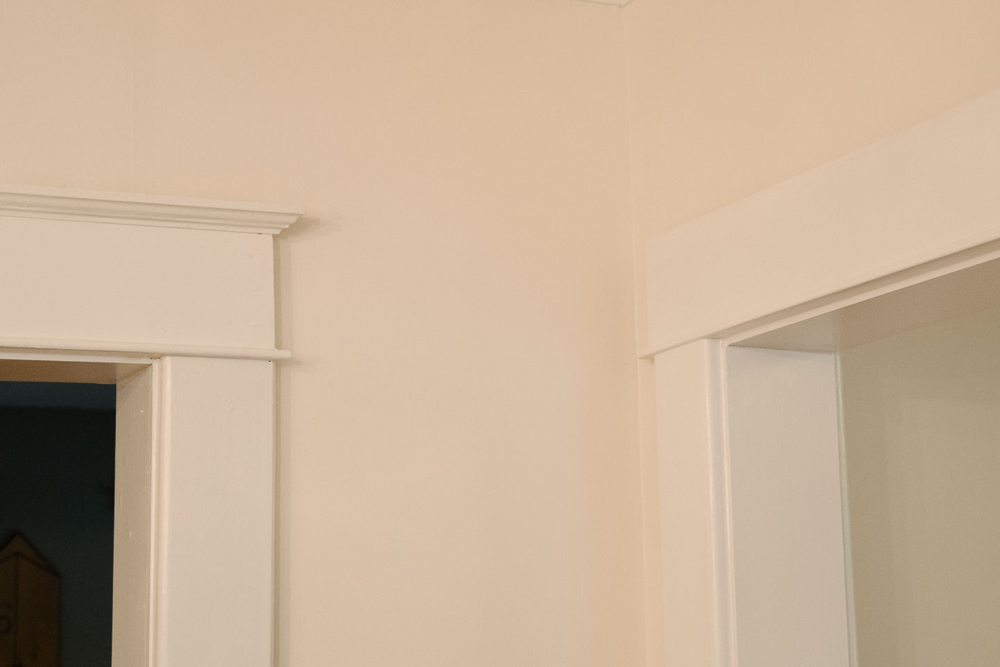
We may have a way to very closely mimic the original by having the crown custom made; we have been unable to find anything closely matching at our local lumber yards.
On a side note for anyone who maybe purchasing an older home such as this with custom woodworking you will want to match: You can actually get a router knife made for in the range of $250-500 that can be used to re-create woodworking indefinitely as you remodel your home. Its actually not that expensive if you have a large home with a lot of molding that needs replacement or repair (hello lead paint).
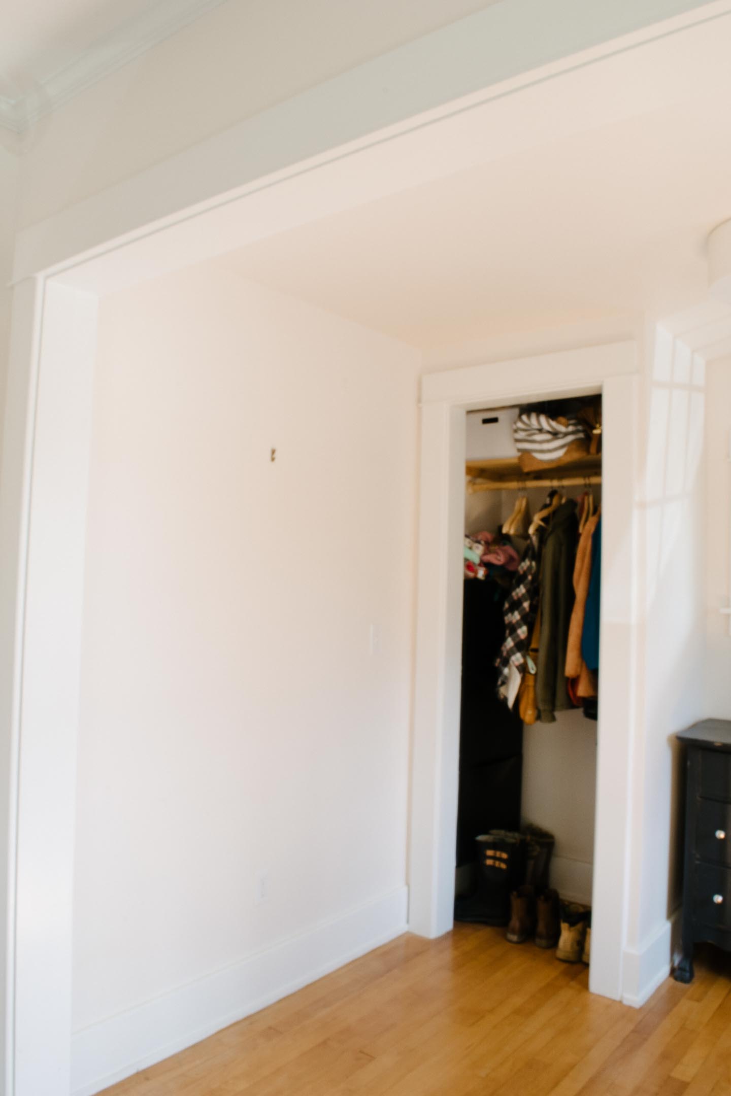
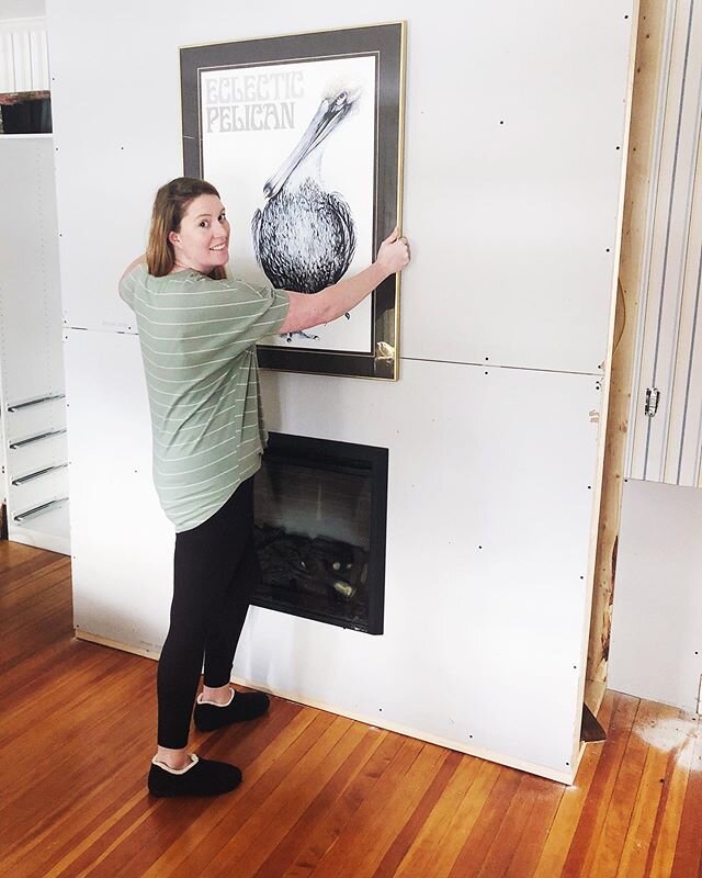
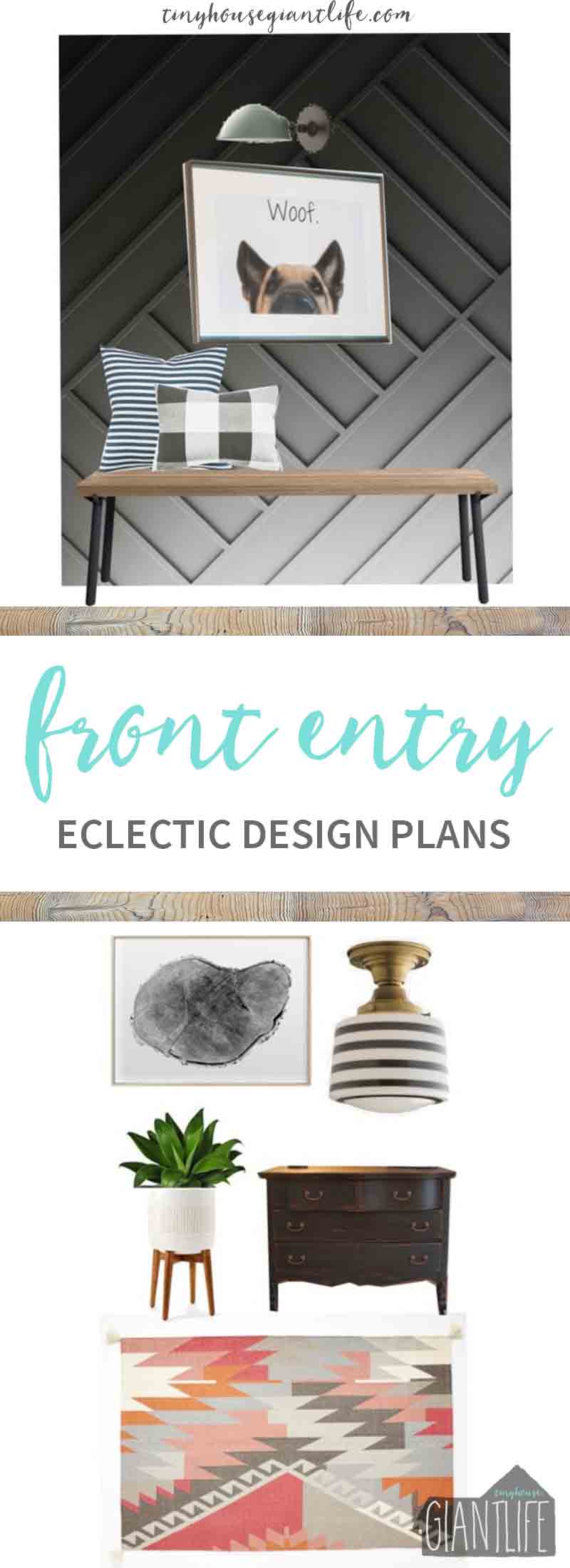
This wall is going to be turned into our new feature wall with a moody color I can't wait to show you and by re-hanging our Woof Artwork.
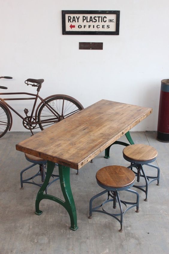
We also decided to create some bench seating underneath the art work with these small industrial bell legs I snagged last summer at an antique show. They are a mini-version of the bell legs we used for our office desk. Since I have been obsessing over green as of late (shocking to Mitch who only ever hears I want everything white) we are painting the legs a green similar to this inspiration picture:

The current light fixture is something we picked up at Ikea, and although it works great (its so easy to take down and clean with these little magnets), I really wanted something that gave off a little more light and had character. Currently, the fixture I'm eyeballing is a little out of our price range so we're thinking of doing a DIY version and tutorial for you all!
Our current hardwood floors are actually 2" clear maple that has aged into a not so beautiful yellow pine sort of color. When we went ahead and made the porches interior spaces, we decided to try and match the color and refinish all the floors at a future date.
The flooring we did find and use was actually standard width at 2.5" and stained a dark mahogany from a recycled building materials store. I think it ended up costing us about $250 (this room and the office) and we just inset a threshold to divide the dining and living room .
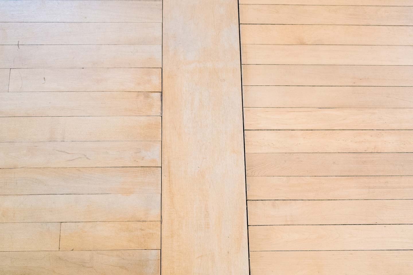
We couldn't work the boards into the current dining floor because of the width difference, and really didn't want have this major remodel bleed into other areas of the home anymore.
Our Haverly was only a month old and had colic to boot, so we weren't feeling up to creating more projects for ourselves.
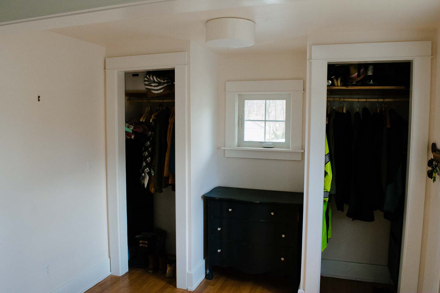
We can't wait to get some real closet doors up on these bad boys! Although having them open makes it easier to get things in and out, not so great for covering up our mess when folks come over. We went on a hunt to doors that match the originals and have found two that we will cut in half to make 12" wide pantry type double doors with vintage glass hardware (another antique show find).

That brings us to the black shabby chic dresser. Although this little lady is not technically our "style" since we have a deep love for a mid-century modern, we still love this dresser. It made a cameo in one of our best friends weddings as an alter and fits perfectly into the space. I love the challenge of mixing different design aesthetics in order to create something totally unique with a lot of heart. So, its a keeper for sure!
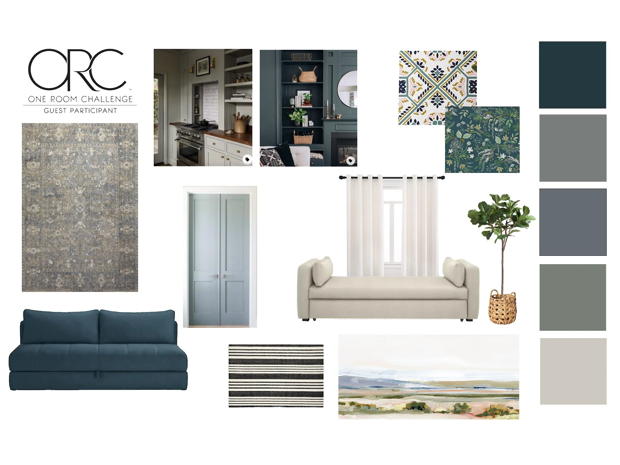
The Entryway Design Plan
(THIS POST MAY CONTAIN AFFILIATE LINKS.WHEN YOU CLICK ON A LINK AND PURCHASE I WILL GET A SMALL COMPENSATION AT NO EXTRA COST TO YOU, WIN WIN. READ THE FULL DISCLOSURE HERE.)
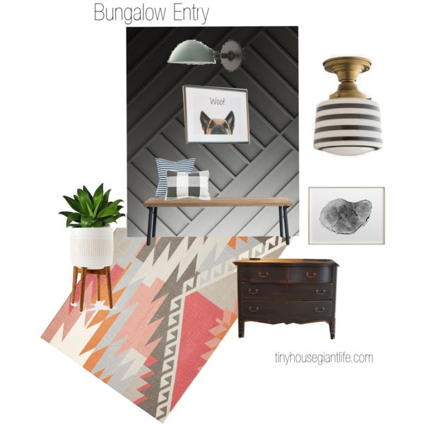
So we are off to finish the feature wall, the closet doors were being worked on when we got the call about our family emergency, so we have those as well. Wish us luck, and please go check out all the other wonderful blogger's who have joined in on the one room challenge!


