Designing Multiple Seating Areas in this Large Living Room
/How we are designing three distinct seating areas, creating more function, and balance in one very large living room.
Read MoreHow we are designing three distinct seating areas, creating more function, and balance in one very large living room.
Read MoreWe're in the midst of painting the nursery for this fall's One Room Challenge, but while we work on that I thought it might be a good time to reveal our plans for the living room
Read MoreDon't you love that grey area between something being rustic and eclectic, using reclaimed materials always provides something extra special to a design.
Read MoreIt became quickly apparent into the porch remodels that a door that swings into the small office space was not going to work well for us. The first thing that came into mind was to use a sliding door, but the typical "barn sliding door" really doesn't fit in our bungalow.
Read MoreIn a previous post we discussed how we used a coloring page of our living room to make some design decisions, one of which was to lighten up the back wall of the room. We nailed down a pattern we really liked but ultimately changed it last minute because it looked too "young" for the room.
Read MoreI joke with one of my best friends (who also happens to be a designer) about how we run into so many design dilemma's when working on our own projects. We both say it has something to do with loving so many different styles, it makes it hard to pull the trigger. We don't seem to have the same issue when guiding our clients into making design decisions. You just don't have the same perspective when it's your own space or home.
Really, I think we all get like this. Designer or not, when we are making so many decisions in a short time frame, we all can get overwhelmed and doubt our decisions.
Then there is the budget... so much pressure to get it right the first time because who has the money to do it a second? Not me, and I doubt that's how you want to spend your hard earned money either.
So we end up fearful, stuck and with a million design dilemma's.
If I do this will it look like?
What happens if I move it over here?
I like the color in the store but what about in my space?
A few weeks ago we discussed the living room plans including a large rug, slider door, and our dilemma: the coffee table. Since then we have gone round and round and found more dilemma's, so finally this weekend I created and computer design to try and make final decisions.
Needless to say the computer didn't really help! I (just like most clients) got lost switching things around in an effort to see EVERYTHING I could possibly have and ended up two steps behind where I started.

So I went back to my trusty solution, a coloring page.
First I take everything out of the plan that we haven't determined. Like the coffee table, rug, and light fixture.
Then I make sure I have all the items in the room that we will be reusing. Like the big brown sectional. These are the items that are non-negotiable (Can someone please help me negotiate with Mitch about the sectional?! Its just not working in this small space lol).
Finally I put in one idea for each dilemma. Which meant a big square coffee table and big drum shade light fixture.
Once I have an initial design I render the picture in black/ white and create a coloring page for printing.

You would think I (or anyone else for that matter) could just make six different designs and line them all up to make a decision.
What most of us actually start doing is wanting to mix and match to the umpteenth degree. Its brain rattling, and leaves you feeling anything but confident in your decisions.
There is something about the act of making the little decision on what color to use. It starts to break the ice and build our confidence back up little by little.
If you absolutely hate something... You could always print another.
So you start making these mini decisions bit by bit and then POOF big decisions get made! All of the sudden you see a color you hate, and it lets you know you're going with the second idea not the first.
For us, one little afternoon of putting the page together and then coloring solved pretty much every issue. The big square coffee table? Not going with it at all, and we figured out what we will be diy-ing in it's place with a complete build plan!

The brown couch with greige walls makes for a pretty brown and dreary room, those two things arn't changing . Mitch loves that freaking couch, and the wall color is amazing for little fingers and muddy dogs. What? Just being real over here about the mess of a much used and loved house.
We decided to create a light accent wall behind the couch and even think we may have finalized a stencil pattern.

The coloring even helped me decide on accent pillows to brighten up the couch.
So you see, for us this process really packs a lot of bang for our buck.
Some different styles of dining rooms coloring pages are located in this post. Look for different living room styles to print for free in the coming weeks when I get a resource page going with all the free designs you can print and color yourself.
I've been seriously thinking about offering these interior coloring pages for your own personal spaces. Contact me or comment below if you really think you could use something like this for your design dilemmas, I'd love to work together.
What do you do when your stuck?
As we have been wrapping up the dining room projects and styling for the big reveal next week, we have been discussing whats up for our next #finishthatspace, the open concept living room.
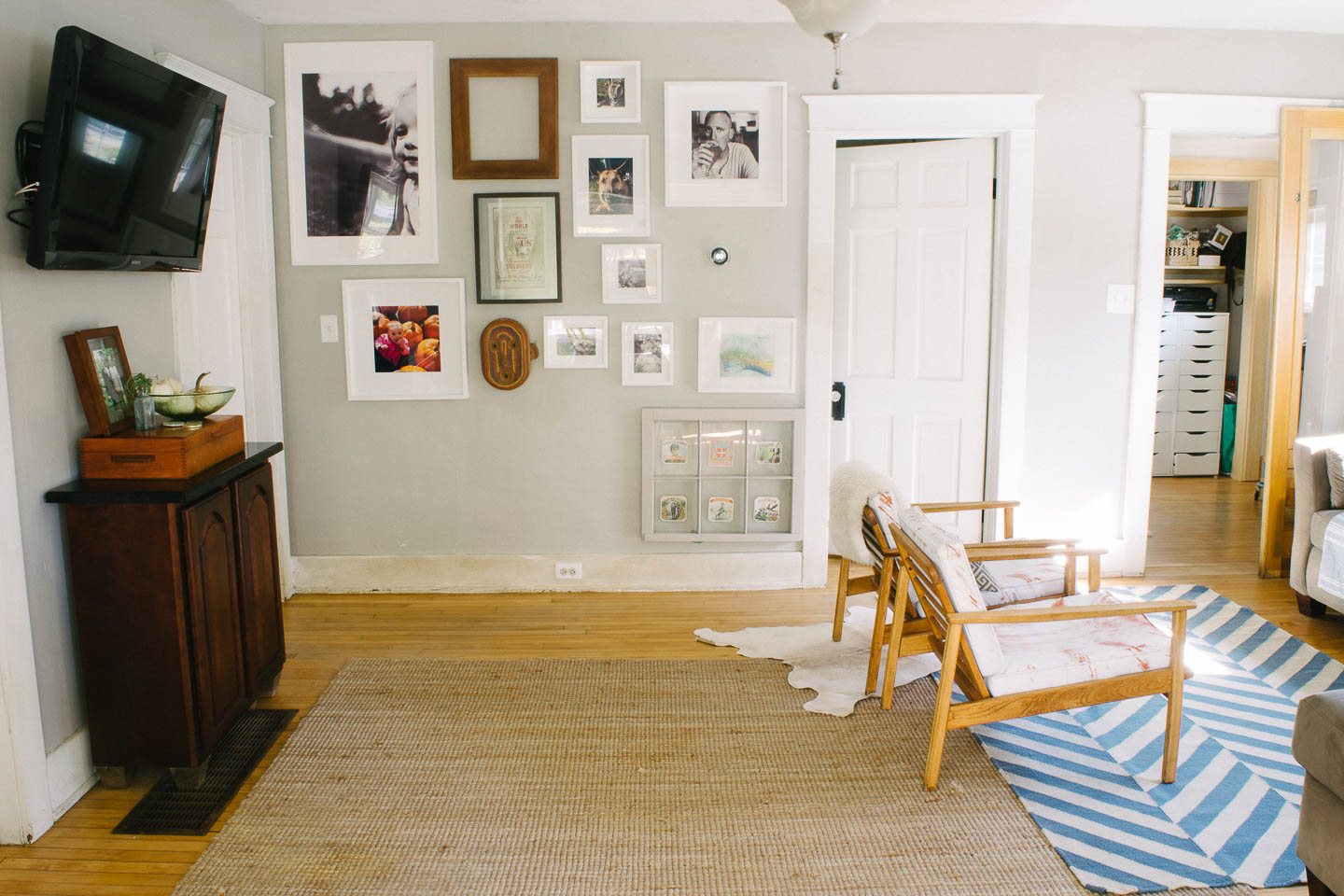
Our winter gallery wall is going strong so you won't be seeing any changes, but I do still need to fill that empty frame, hopefully I can make a decision and find a great piece for the spot.
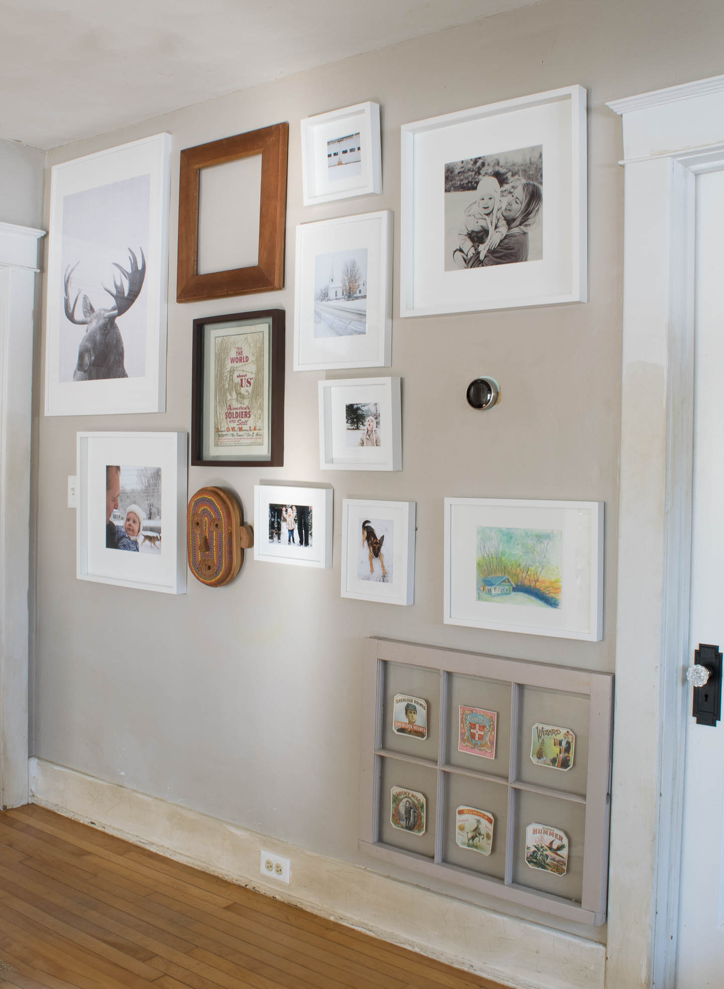
Making decisions on this space has gotten a little hairy over here. Seems like every time I start designing overwhelm hits with the amount of stuff we have already half started, or really want to complete.
If you watched our house tour video then you've seen the space if fairly "complete" (except all the painting needed ASAP). We spend most of our days in this room since it connects literally every other room in the house. Haverly plays all day in this room, and the dogs sleep under the gallery wall (as you can see from the mud stains on the white wood work- yuck!) We really want the space to function as best as possible for us.

Changes like swapping out the fan/light combo for a new light. One in which we don't have to worry about picking up Haverly and her head hitting a fan (#tallpeopleproblems). Or a full sized rug that fits under the furniture and doesn't slide around during play time.
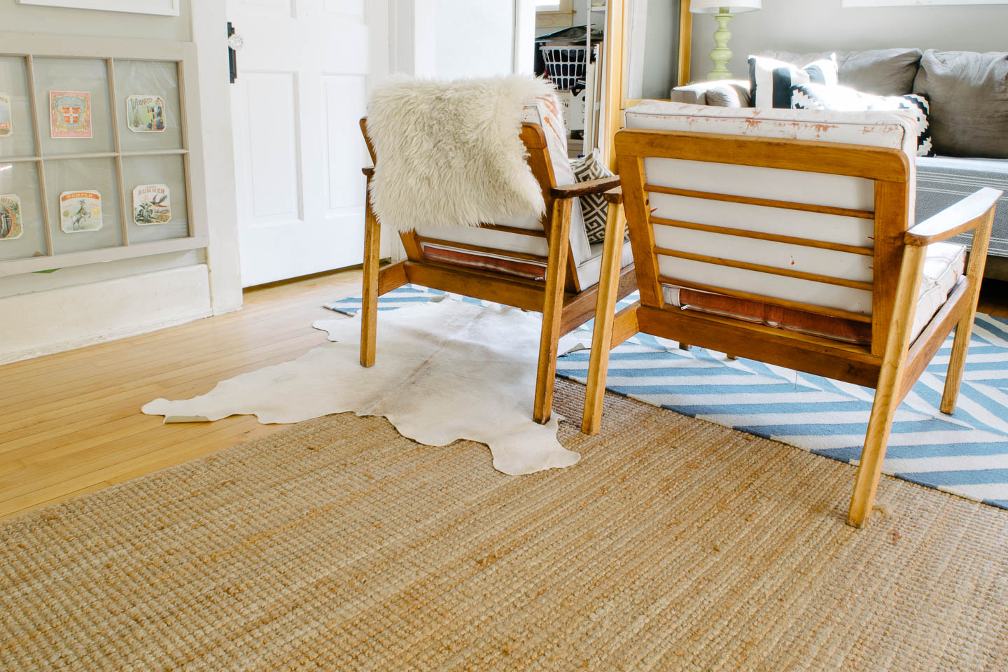
This rug from world market is currently the big contender because of its durability and for the price tag. We need an 9'x 12' rug for this space (which is why I currently have multiple rugs in the living room) , that size tends to come with a hefty price tag!
Were ready to finally re-do the cushions on our vintage mid-century chairs I found two years ago at the Brimfield Antique Show (They originally came out of a hotel in PA from the 60's). Recently Joann's had a sale and the perfect white tweed upholstery fabric grabbed me for like 75% off (ummm yes I'll take that steal).
Another big project that still needs completing is the sliding door into the office. I've been back and forth on purchasing some "barn door hardware" or DIY-ing something ourselves. You can find some really wonderful tutorials from other bloggers who have successfully made them.
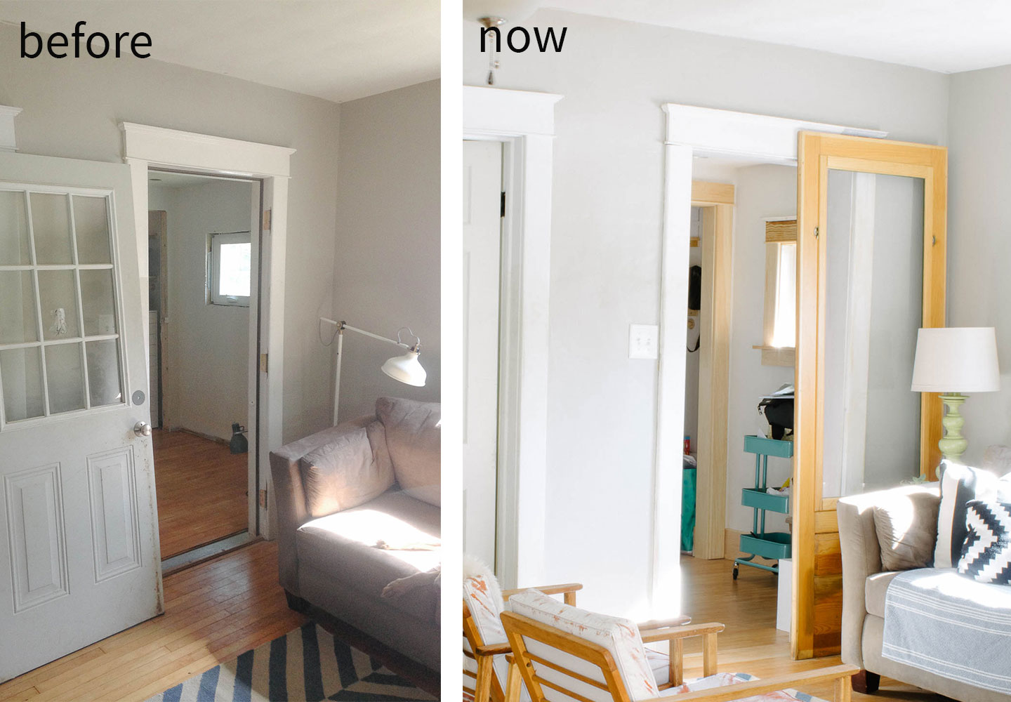
In this case I'm really not sure if its worth the effort and modest savings . We found the door (which is actually a exterior porch panel and not really a door) at a used building materials store for 20$ last year. Typically it would cost a bit more to find or build a door so our savings could be used towards quality hardware.
And then the coffee table....We gave my sister the vintage bench that we had used in the living room. It was just too long for our space with the current couch. I love it dearly, and didn't want to see it go, at least it looks amazing in her loft so I can't complain much.
The size of a new coffee table is really scrambling my brains. I'm thinking a large square table will help to lengthen the seating area and fill into the room a bit more but its such a big decision.
Like this large white table:
Putting in a huge coffee table terrify's me. Giant people+ giant dogs does not = fitting into tiny house. I think some spacial planning is in order to determine what size table will be adequate without creating a heavy piece that just bottles up the area.
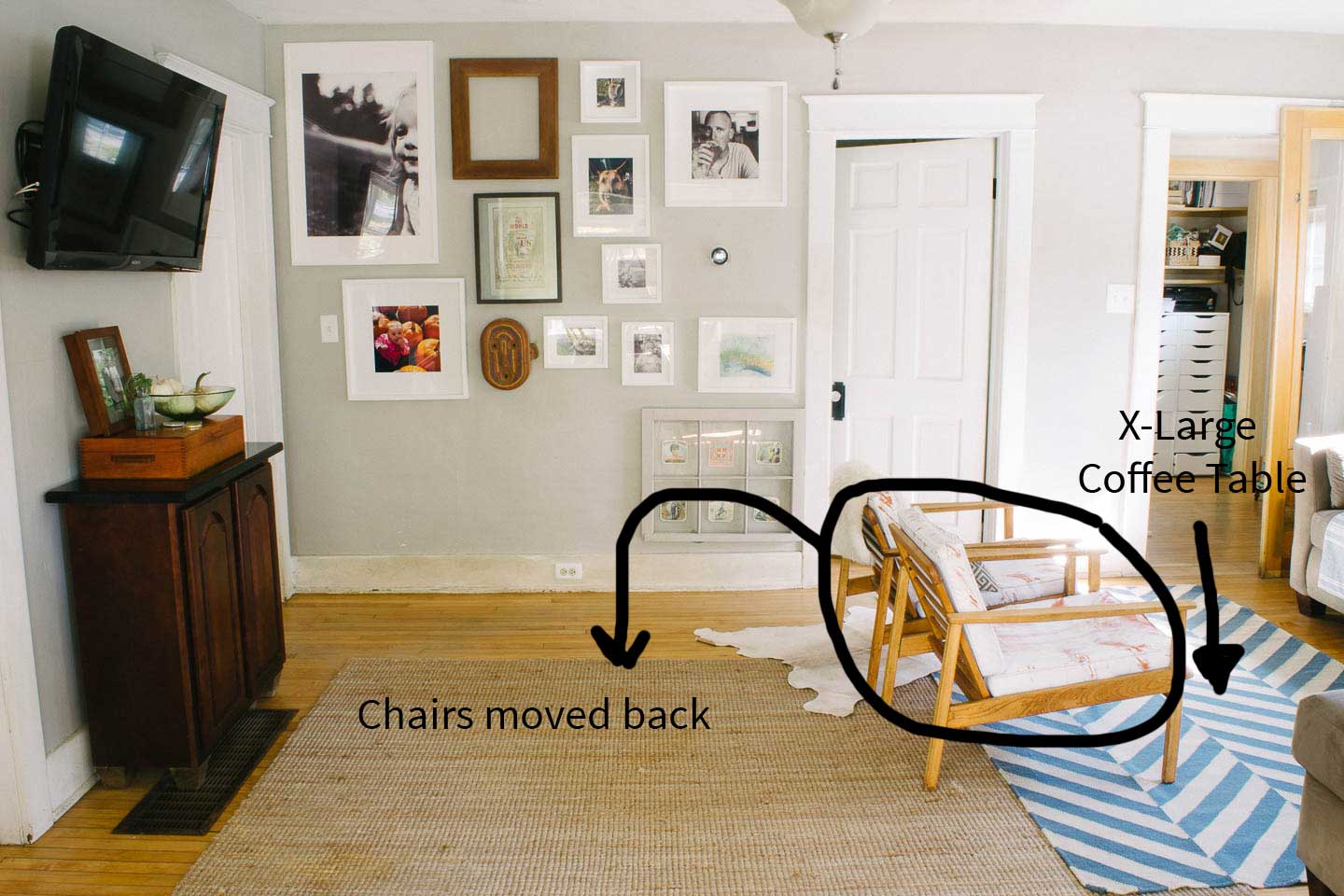
That's not even all of the projects we are rolling out for this room! We also have...
Wish us luck because were gonna need it to get most of these projects done! What do you think about the coffee table in this open concept living room? Extra large or keep things at a standard size?

Follow along with our Giant adventures as we fix up this 1847 Historic Colonial in Western Massachusetts.
P.S. Expect lots of wallpaper removal and don’t say we didn’t warn you!
Powered by Squarespace.