Designing Our Ideal Dining Room: The Full Refresh
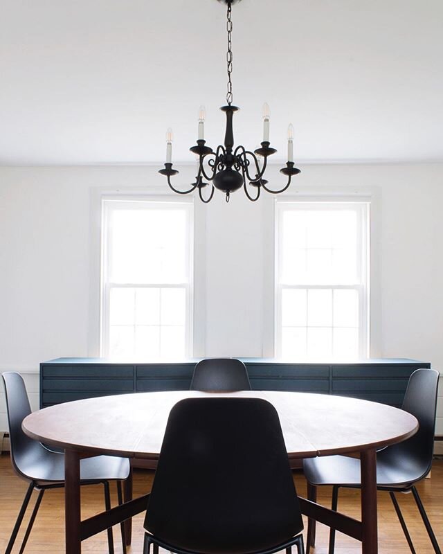
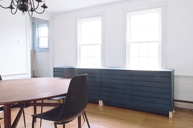
/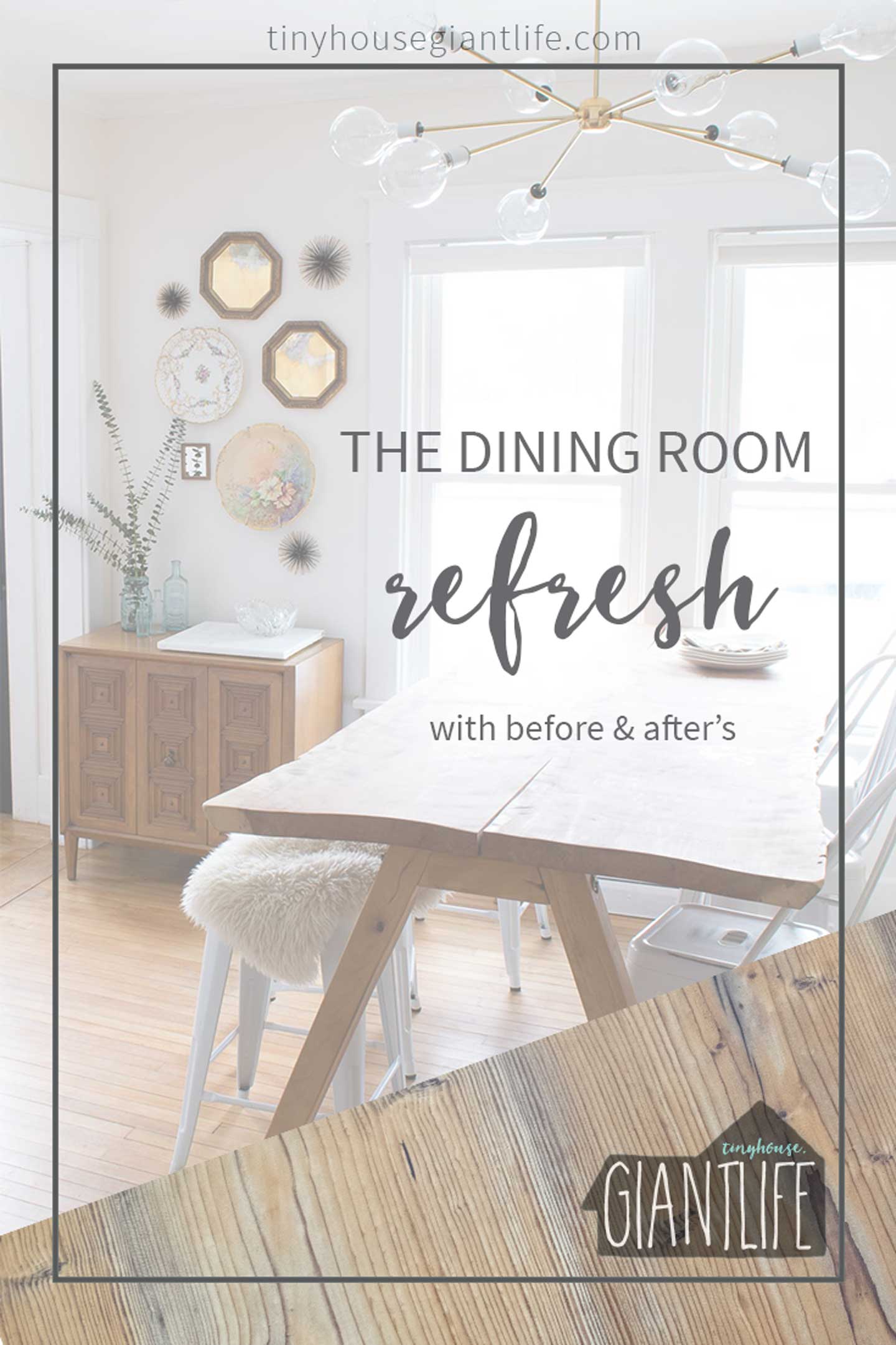 This dining room refresh has been in the making for a few years (to say the least).
If you read our post with the dining room before photos, you're aware we had a phase even before this dining room refresh.
The house has been in constant renovation status for the last 6 years and we have been working hard in 2016 to #finishthatspace.
That being said, nothing ever seems fully complete, but projects we have been wishing and dreaming about, or desperately needed to complete, have been.
Dining Room Refresh: The Steps We Took
1. Keeping with the Era
We have always tried to think about the timeframe in which our home was built when making design decisions. Sadly for too long we believed this home was originally built in the late 1800's and was just a cabin/cottage originally. In Mid- 2015 on our fifth Anniversary we went on a deep hunt for more information and stumbled upon the truth.
We have one of the first pre-fabricated (brought in from the train station with horse & buggy) bungalow catalog homes in Hadley, Ma. Listed as a MA Historic Commission home; named the Benjamin Denio Home.
Our craftsman window and door casings were always something we believed had been added to the home in the 20's. It didn't have enough of a traditional bungalow look (enclosed porches added in the 50's, and no front entry to speak of).
Needless to say, when taking down the wall between the enclosed porch and dining room, we made sure the opening mimicked the current 9' opening in the household.
This post may contain affiliate links. Read the full disclosure here.
2. Add Something Bright & Shiny (or two or three)
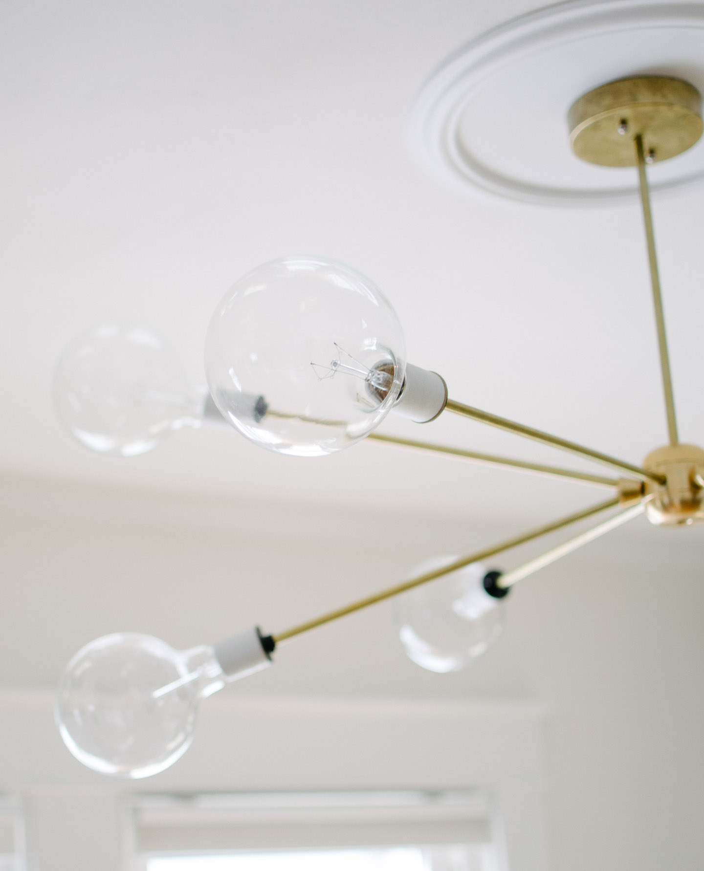
You can read the full tutorial on our DIY sputnik light here.
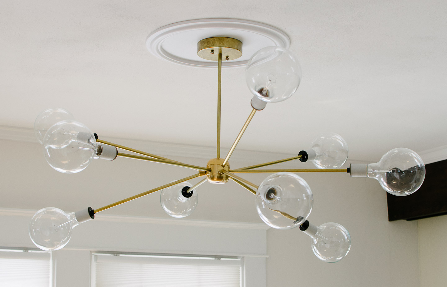
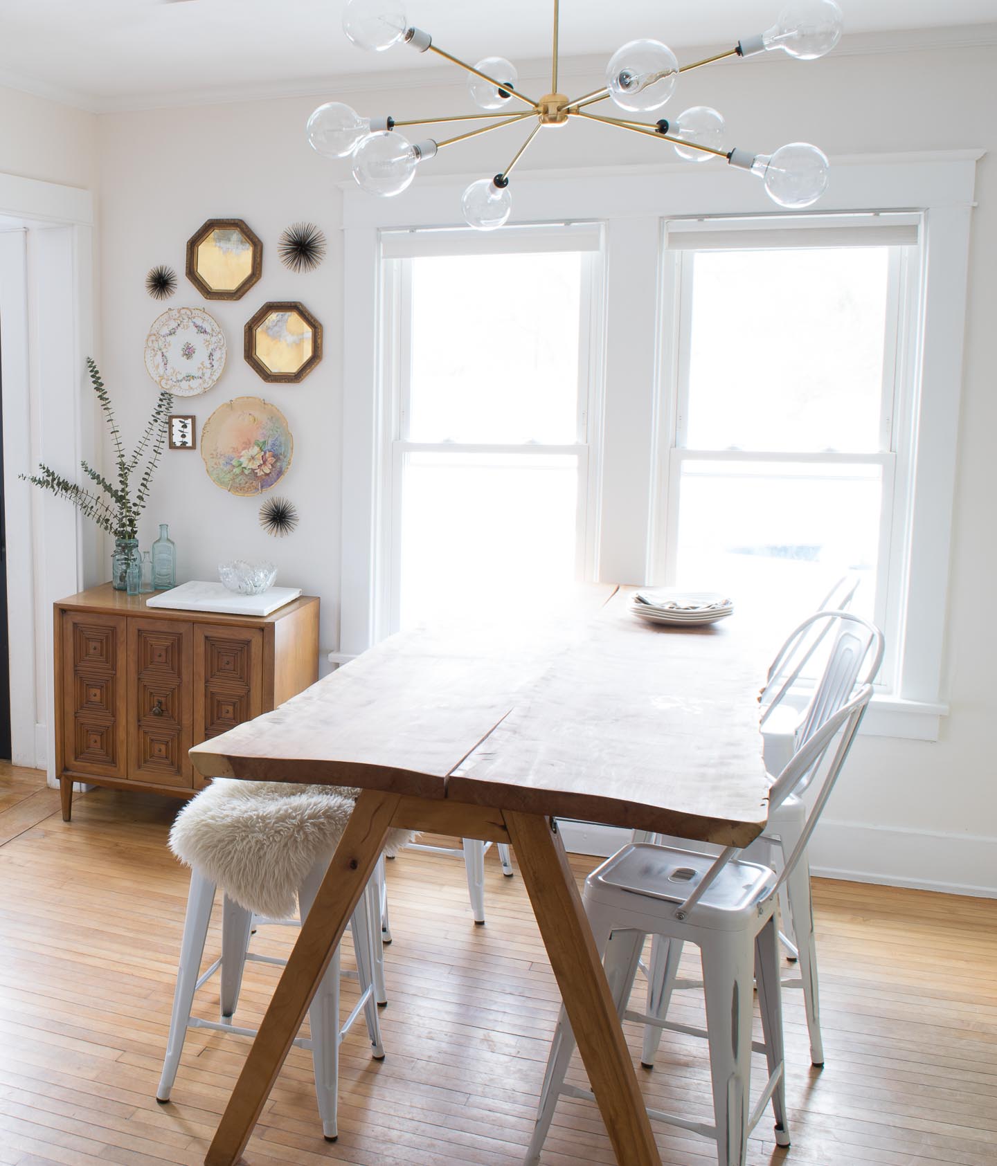
I really wanted a light fixture that would really brighten up this space and provide adequate light when working on projects. We hit the jack pot with this fixture and made it at a price we could afford, the fact that Haverly calls it "bubble light" is just icing on the cake.
3. Bring in a Signature Color
Its no surprise to our neighbors that we like blues, teals, and greens. The exterior of our house with its bright paint job and almost matching 67' Chevy Bel Air Station Wagon have explained who we are and where we live too many times to count.
"O yeah your the one's with the teal house... your kinda obsessed with that color huh?"
Or " Yes! You have a matching house and car, with like 5 dogs right?"
Haha, yep thats us. Sadly, minus 2 dogs in the last 6 months....

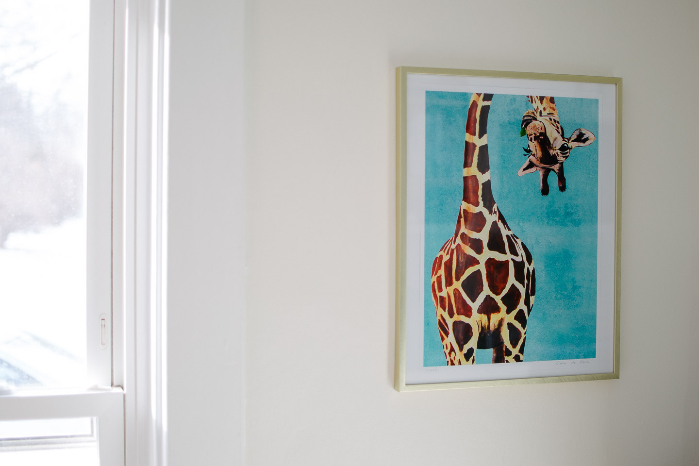
We decided our artwork would need to be a giraffe print somewhere along the line, apropos of who we are as giants. When we saw this teal giraffe print it was a given! What a great way to brighten the space, in our opinion.
4. Putting our money where it counts
When discussing our designs and subsequent purchases we tend to lean towards making sure things are made ethically. By no means are we perfect and only purchase ethically made items, but it is a large factor in whether or not we purchase something.
Putting our money where it counts by sourcing local, small business, USA made, and/or ethically produced products just seems like the right thing to do in our current economy. If that means that we just can't have everything we ever dreamed of, well we have a feeling we will live, and live a more fulfilling life.
In the case of the dining room this meant DIY-ing a light fixture we could afford because the only ones we found were out of our price point. Ordering the print through Etsy.com and re-using so many vintage finds or heirlooms. It makes us feel great to know the history behind our finds.

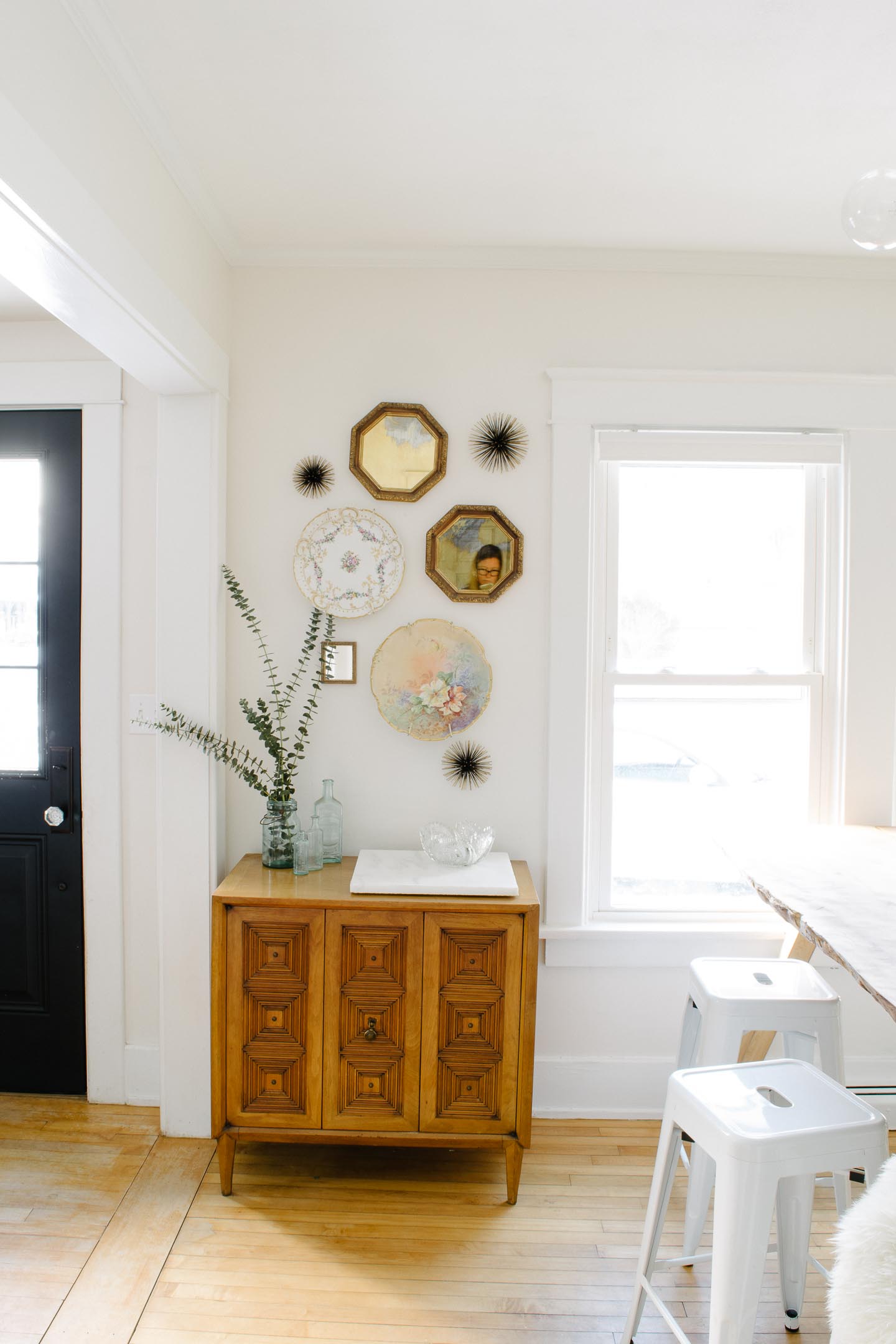
I originally picked out this bowl on Etsy because it is so gosh darn cute, but then remembered I had hidden this crystal bowl safely away a few years back. The marble is from a local reclaimed building materials yard and is perfect for serving drinks on top of.


I have an obsession with these antique blue jars my sister used for her wedding center pieces (its a good thing she let me steal hoard like all of them after her big day).
Before & After's
It feels very nice to finally have this room back in order. Of course it will only be a hot second till Mitch, the toddler, or one of the dogs makes a mess of things. Thats just life in a small crazy household.

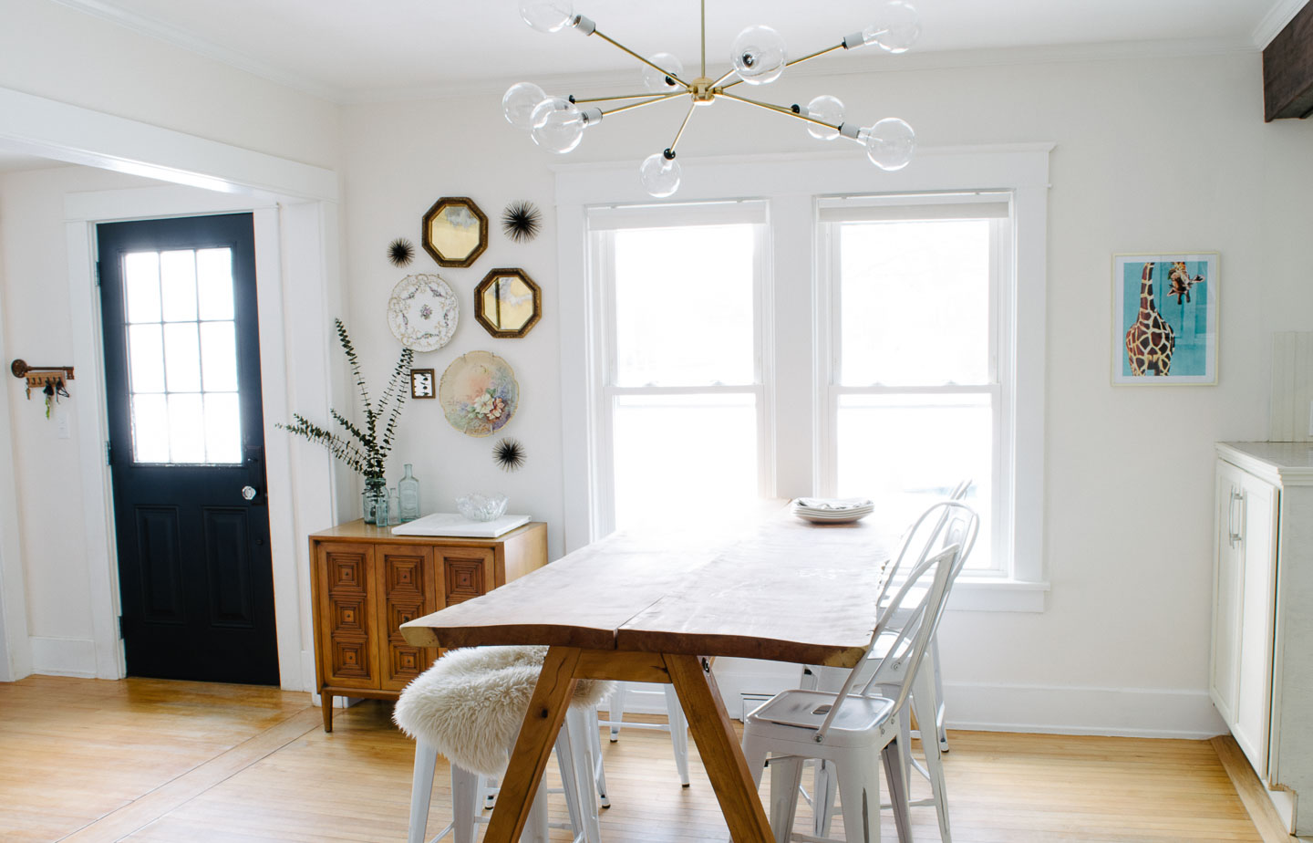
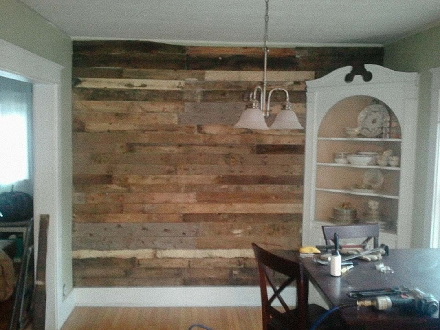

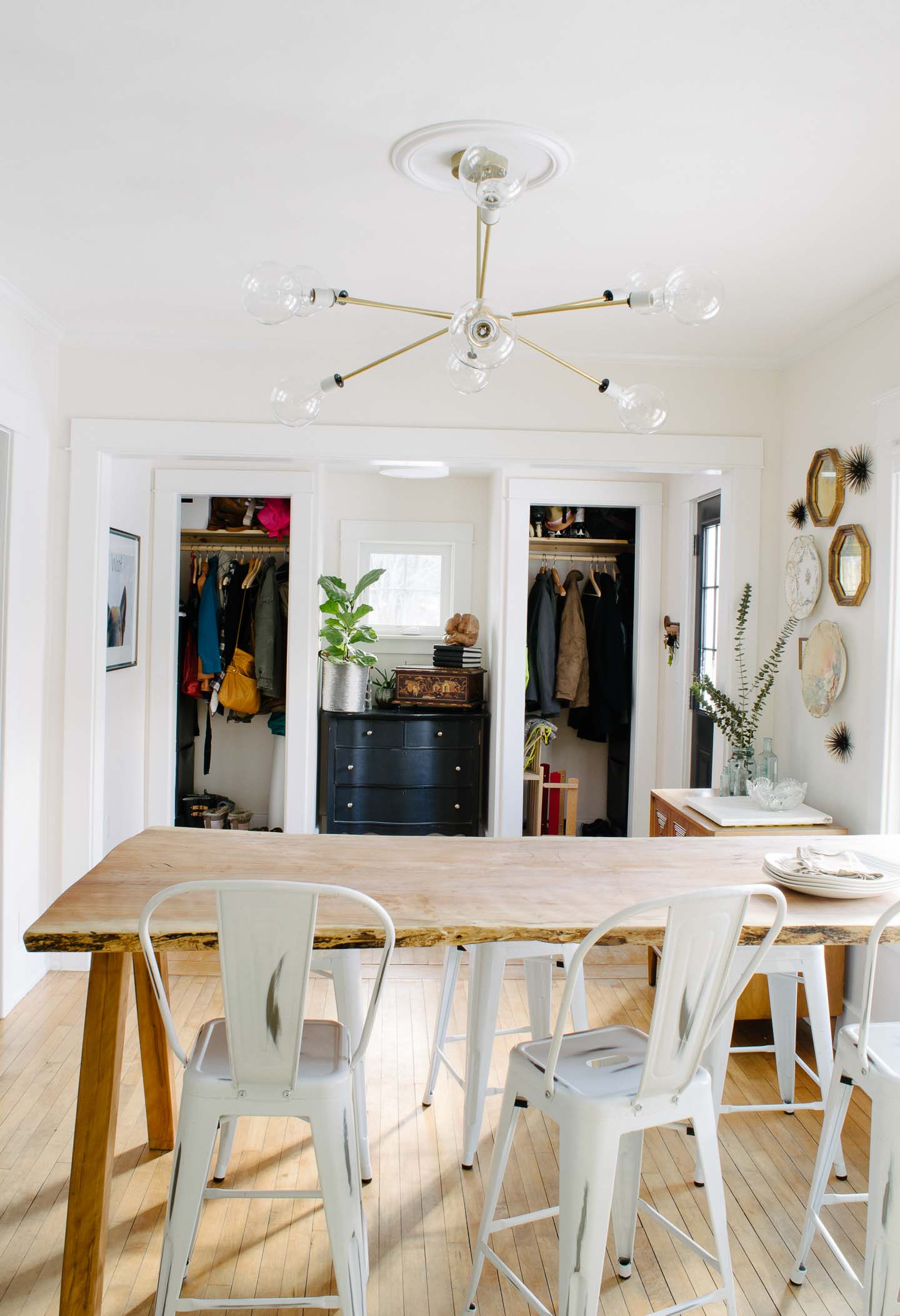


That white blob on the wall is actually our door bell. When our electrician asked where I wanted it and told me he couldn't get it into the entryway for various reasons. I told him right above the baseboard, he looked at me like I had three heads.
At the end of the day he comes back to me and says "okay it's all finished and I'm never installing another one of those suckers up near the ceiling ever again! It's genius!"
I of course didn't think it was genius at all, just made sense. Why have that ugly thing up high on the wall it doesn't really make it louder?"
Reality Check
The really hard part about having an open concept household is that you can see all the unfinished spaces. So until all the big stuff is done (like closet doors in the entryway), most of the rooms still feel unfinished. Thats why the big push to get a bunch of projects done in 2017, so we can move on with new adventures.
What do you think of the refresh?


