How To Install The Perfect Gallery Wall ( & Never Adjust Again)
/I have a love hate relationship with my living room gallery wall. It's beautiful, fun, and represents our family but far from the perfect gallery wall.
Read MoreI have a love hate relationship with my living room gallery wall. It's beautiful, fun, and represents our family but far from the perfect gallery wall.
Read More
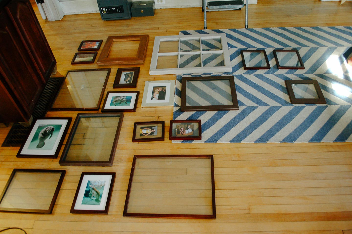
I have to admit, I’ve got a hoarding problem, hoarding of picture frames for a future Gallery Wall. Seriously, I’ve been collecting picture frames since college (which I’m purposefully omitting how long its been since I went off to school). I already had a collection big enough for a gallery wall in our livingroom when we first bought this place in 2010, so I had Mitch spray paint all the frames brown. Yep thats right, brown, the most boring matchy matchy thing I could think of.
I’m sure you already guessed that it didn’t take but two seconds for me to hate an all brown gallery wall; what was I thinking anyways?
I’ve always been the eclectic collector type. That's the reason I had all these unique frames to begin with, but I’ve also always had a bit of a problem embracing that crazy eclectic side. So the brown, matchy matchy frames stayed up, for way to long. When I took them down for a new paint color on our walls, I even stored them all wrapped in paper as to not get damaged so I could use again, possibly all white!
Thankfully, I came to my senses while going through the Magic Of Tidying process last year. All the frames got donated (but should have been burned), so I could start fresh with a new gallery wall design. By new I certainly don’t mean all brand new frames or items, but new and fresh; as to not fall into the big black hole of matchy matchy.

Around the same time I pulled down the brown frames I had also taken about a million pictures of my new born girl, Haverly. Which I’m pretty sure, given my facebook feed, every single parent does.
The pictures were actually starting to turn out really great and I was wondering, "what do photographers do with all of these wonderful pictures of their families?". I vowed that if I was going to take the time to create these beautiful photos, I wouldn’t just let them sit in the digital world.
While sipping my morning coffee and looking at these photos and items, they remind me of so much to be grateful for. So, the easiest way I’ve found to keep the wall fresh with these beautiful pictures, has been to rotate them seasonally.
So I set out to find some examples of gallery walls I liked and found a couple floor to ceiling walls I just loved.
Photo by Mary Prince Photography - Design by Jennifer Clapp
Above the art and frames seemed so cultivated and eclectic but didn't seem to overwhelm the space.
Design by Turnham Designs
It seems many of the photos hung are actually artwork and while I have a few pieces, the majority are photographs.
Photo by Elizabeth Metcalfe Interiors & Design Inc.
The photo above caught my eye because of the clean lines, with all those photos I worried too many frames and colors would take over our small house.
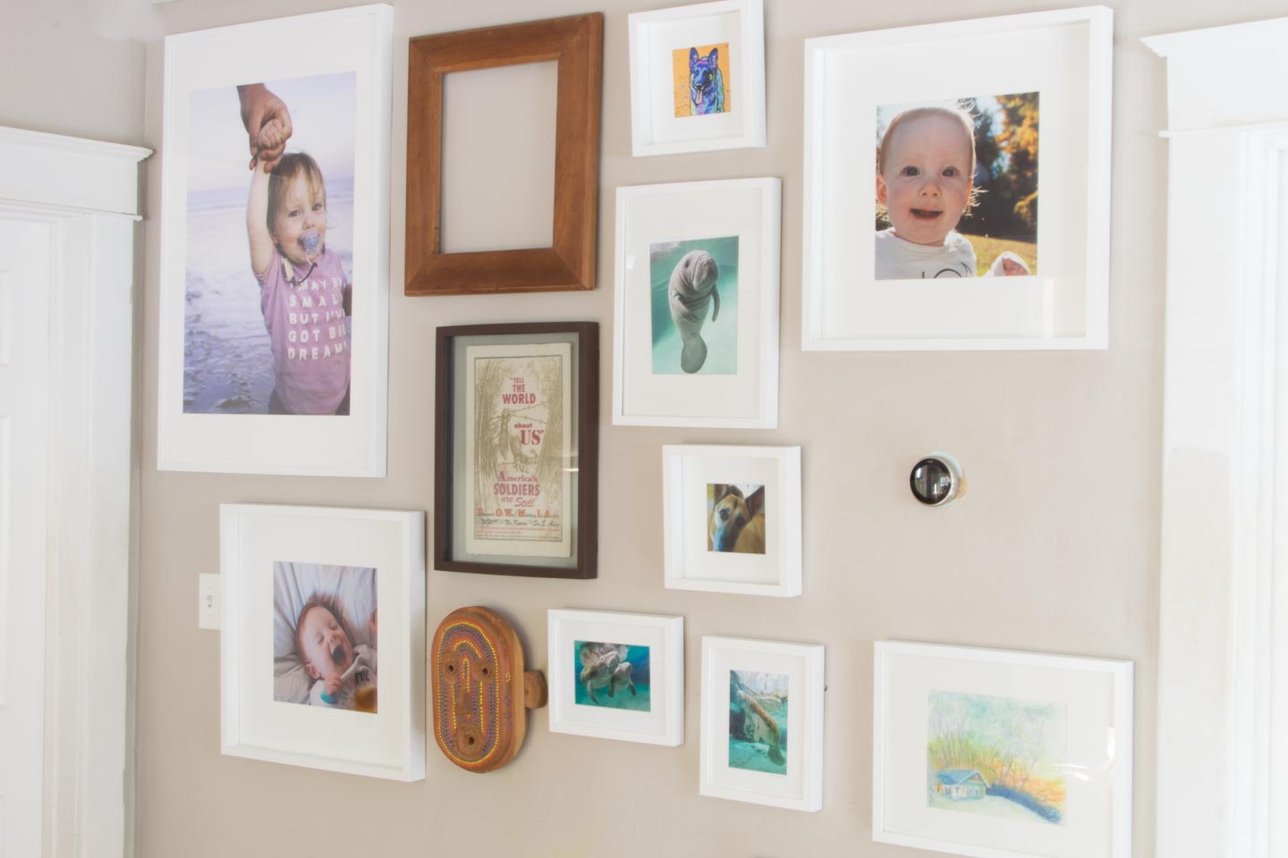
So I ended up with a mix of all my inspirations. Almost all the way ceiling to floor, mostly white frames with some pops of color in the art and photos.
The very first thing I did was went shopping, in my very own home. I grabbed the old bins and boxes that have all those little items I’ve found, inherited, or saved over all these years. If it made my heart sing and I could hang it on the wall; well first it went in the gallery wall pile. I had five things that were unique and that spoke to our family by the time I was done.
Then I grabbed my Mom and went on a little trip to Ikea for frames.
Every husband's dream to hear....IKEA
I first picked out the few frames I would need for specific peices I’d have up year round. Like the art our neighbor created for us depicting our house (on a day with such an amazing sunset).
I also went ahead and picked a large frame at 24” x 36”. I knew that in order to have a full sized gallery wall that potentially went completely floor to ceiling I would need some larger peices. That way I didn’t overwhelm the space with too many small frames of all different shapes and sizes. I also picked up a few 20x20’s and 12x12’s in all white, that way the pieces I already had at home could really pop.
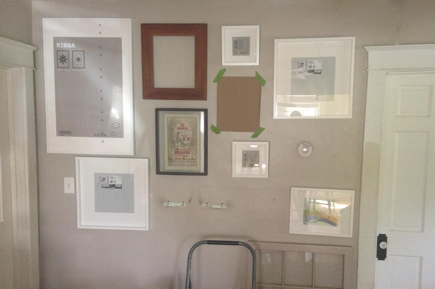
Once I had all the frames I thought would work in the space I went ahead and layed out the gallery wall both on the computer in my design software, and on the wall with brown craft paper.
If you’re really unsure of how to layout a large scale gallery wall then just start doing it. All the brown paper in the world isn’t going to help you if you can’t visualize the outcome. The picture here shows my layout with all the old brown frames I still had.

Start putting the holes in the wall (yep, you heard that right). You will quickly see what you hate. As soon as you see what you hate, you can narrow down too what you like.

What are some holes to fill at the end of the project from you moving things around? Otherwise your standing around with brown paper cut-outs and going crazy trying to make sure it will be “perfect” from the start.
Since the orginal gallery wall was created, switching over to a different “seasons” pictures has been relatively easy. I just go through all of my favorite photos for what ever theme I currently want. Edit them and potentially put a preset in Adobe lightroom. Finally upload them to print. This last time I switched to a fall themed wall it only cost me $24 to get all of the new prints from Costco’s photo center, including the big print of our daughter Haverly.
For our family, printing new photos every couple of months (or longer if I just cant find the time), is worth the effort and money. We want to feel a sense of awe with our small space and our lives. That's accomplished with a quick style change on our gallery wall.
The ratio of dogs-to-house has always made dust and dander an issue. We are constantly vacuuming and dusting and cleaning it seems. The white frames get very dirty and show all the dust right away. I just run lightly damp rag along the edges to clean them up. I have a feeling these white frames could look dated a lot sooner than I think because of the amount of dust we have to clean off them.
Anybody else have some good ideas for displaying photos in such a small house?

Follow along with our Giant adventures as we fix up this 1847 Historic Colonial in Western Massachusetts.
P.S. Expect lots of wallpaper removal and don’t say we didn’t warn you!
Powered by Squarespace.