Time For The Nursery Design! | One Room Challenge Week 1
/We announced on Instagram a while ago that we were adding a baby boy to the Kuc (Cook) family, but in the hustle and bustle of buying this big historic colonial, we never got to a blog post about it. So what does this have to do with this fall's One Room Challenge in which we will be a guest participant? A little baby boy's nursery design is on the docket!

For last Spring's One Room Challenge, we participated as a guest and finally completed our entryway (only to move a few short months later!). We really couldn't resist partaking in another round this fall because of the overall feel of togetherness and camaraderie that Linda from Calling it Home and House Beautiful have injected into this challenge. SO here we go on another 6-week design challenge that will take some guts (while still living out of boxes in the new house) but will be well worth the reveal glory!
The Nursery Design Story
Originally we thought a joint room was going to be in order in the "Tiny Home". Since we only had the two rooms with a small office, the kids would need to room together. That wasn't really a problem in our minds since we had chosen to live a "smaller" lifestyle in order to live comfortably within our means. When we got the bigger home (in order to become a multigenerational family with the addition of my mother), it turned out that the children would have two separate rooms.
I still haven't ever revealed Haverly's nursery (it's coming soon I promise) from the Tiny Home, but it was a tad bit colorful- which we loved- but this time I was interested in something different regardless of whether we were having a boy or a girl. So I started designing something with a lot of neutral elements and invoked a calm mature feeling to relax in while trying to breastfeed for the long hall (I would like to get longer than 2 months this time around).
When we found out baby Kuc would be a boy, we were ecstatic, although Mitch had kind of decided since having our little Haverly (Have-er-lee) that he would be happy with only being a "girls" daddy....but I didn't miss the sparkle in his eye at the ultrasound! So my neutral pallet really started to come together at this point, with the addition of greens after I found an amazing large geometric blanket from a local maker (it needs to be large for mama's long legs).
The Nursery Design Plan
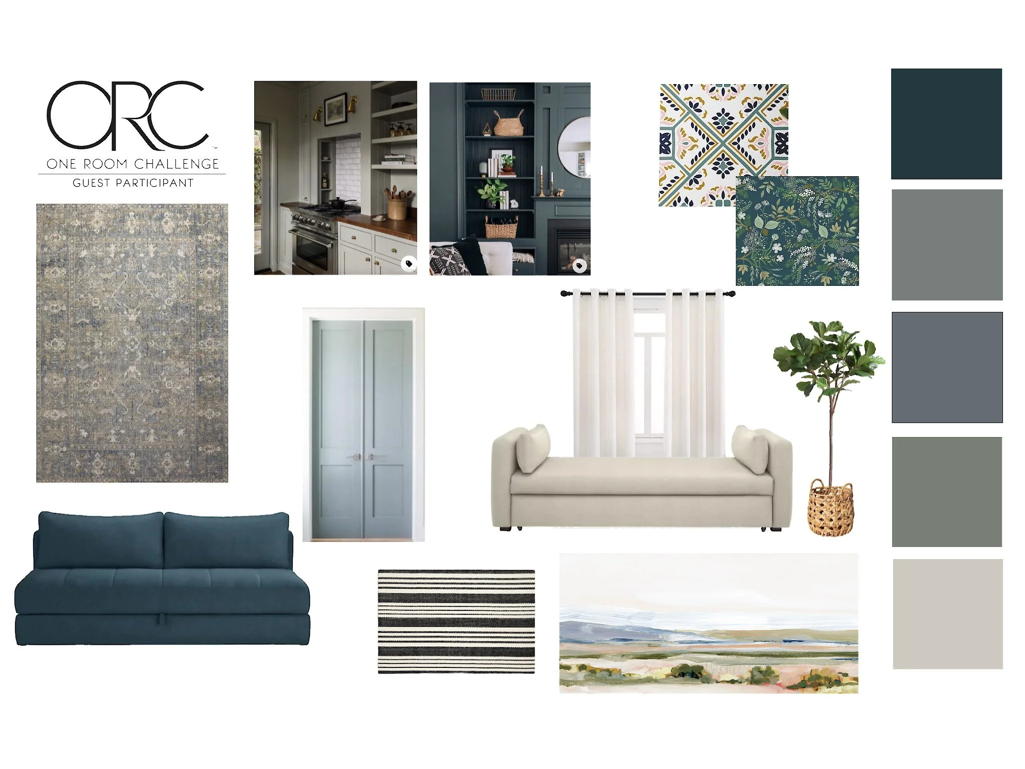
Once we found out baby Kuc would have his very own room, I started a mood board (exact measurements wouldn't be obtained until we closed on the Colonial).
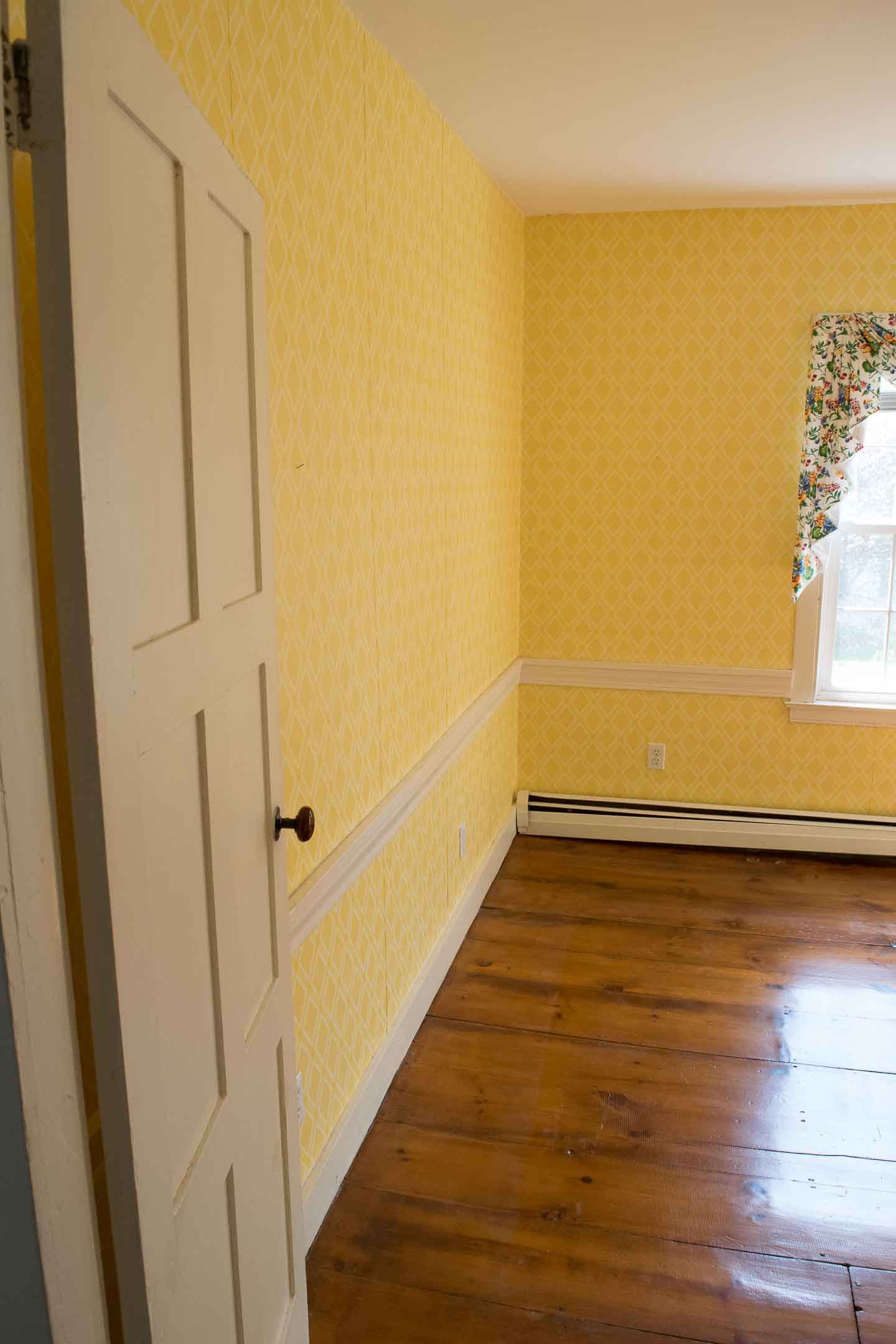
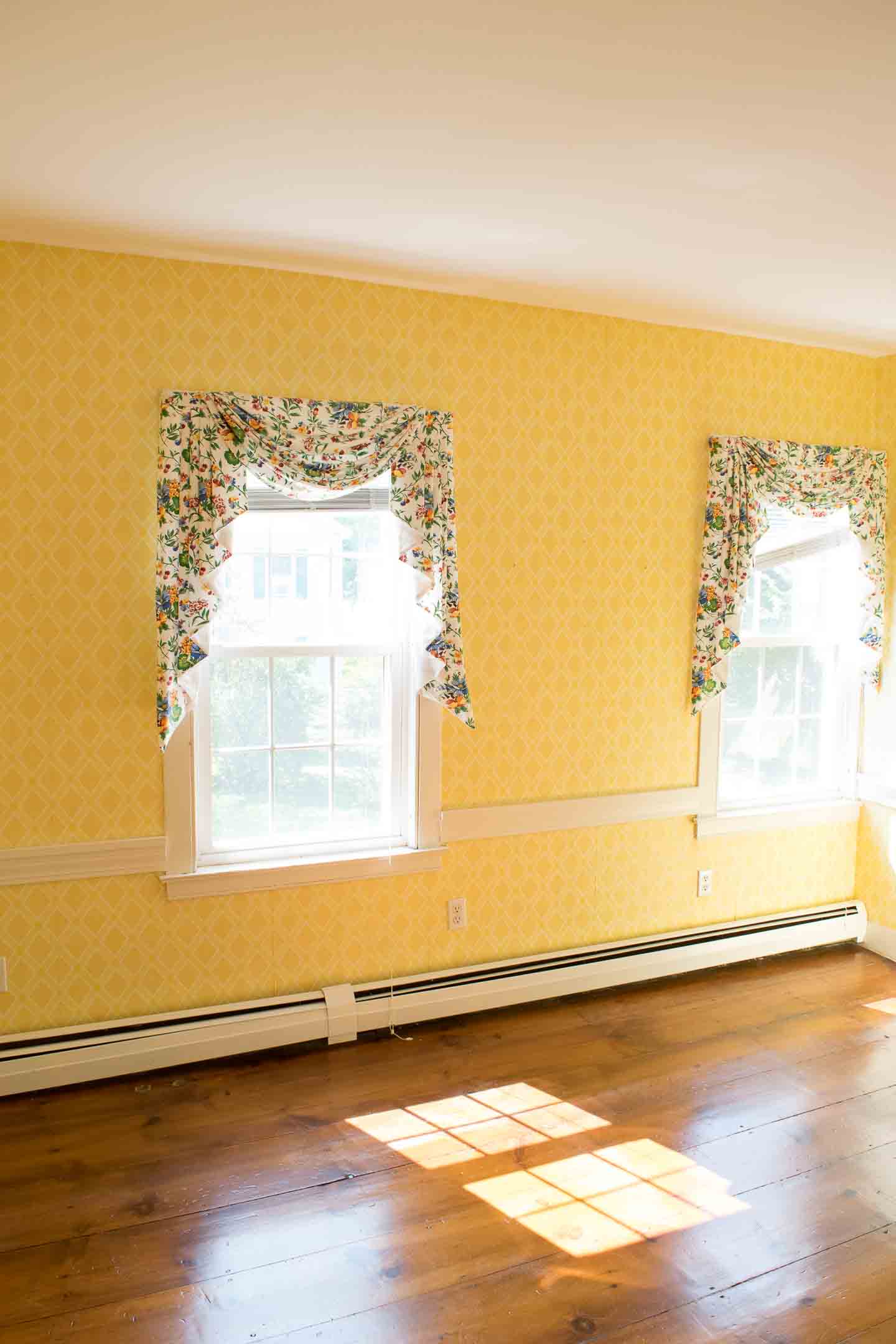
Before the Nursery; YELLOW Wallpaper Everywhere!
This room has some fantastic natural light which get amplified a little too much by the yellow wallpaper, so I think you can guess what we are working on this week. But the original pine floors, doors and molding add so much character and charm to the room.
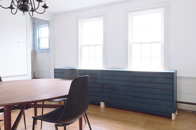
We've decided the walls and trim will be the same light-neutral color and our accent color will be a rich green pulled in on the new dresser and blanket. The crib and rocking chair we used for Haverly will be re-used in the space, so we can use those funds for the countless other projects needed in this home.
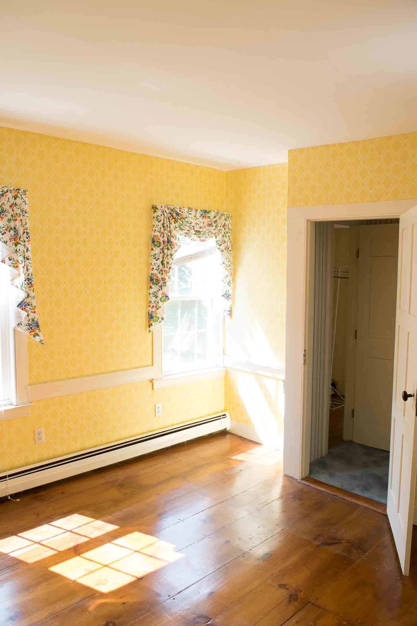
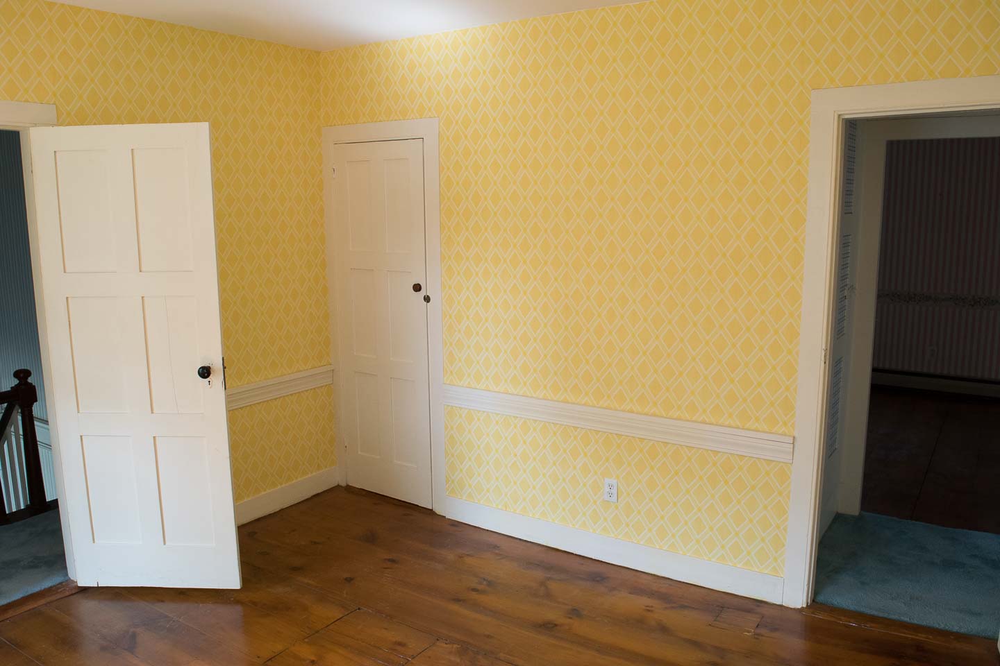
We couldn't resist DIY-ing another feature wall (like in our first ORC) but this time think of a faux-wallpaper block print on one of the walls, a couple of DIY light fixtures (which seems to be our M.O. at this point) , and some type of shelving in the nook next to one of the windows. All while keeping with our signature eclectic mid-mod aesthetic, which I feel will look fantastic with the historic colonial's architecture as a backdrop!


